Tuesday, April 3, 2012

Excavations: The artist's early abstract period


Recalling artist-mentor Edward Betts in my previous post led me to dig deeper into a studio corner and pull out two paintings that I've saved from the mid-1980s. I was just starting to paint then and was experimenting with his abstract approach and some of his methods like layering paints and acrylic medium over texturized surfaces.


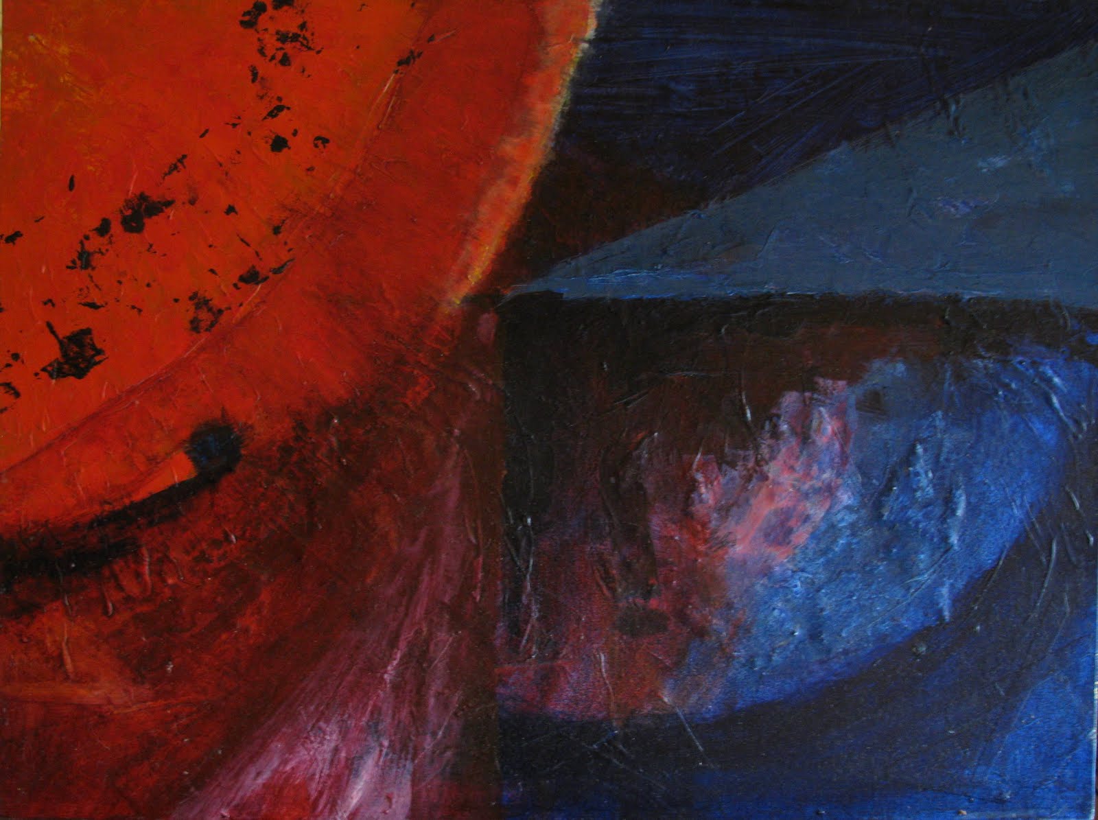
The first is "Warmfront" (copyright 1986) in which I contrasted warm and cool colours for the effect of something warm and fluid breaking into something cool and geometric.


The second is "The Inspiration of Wings" (copyright 1986):


I can still remember almost holding my breath through both of these paintings as layer by layer, interesting colours and effects developed. (Archaeologists, take note: Beneath this section of "Warmfront" are dried coffee grounds, now almost 30 years old.)


I have a fondness still for these paintings and like to pull them out from time to time. But now consider the following Exhibit A:


...and Exhibit B:


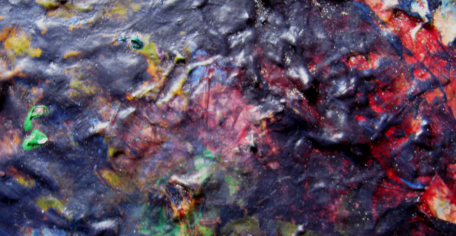
The colours and movements are rather exciting. In fact, as I look carefully, I think Exhibit A and Exhibit B just might make better paintings than "Warmfront" and "The Inspiration of Wings." And these two Exhibits are sections of my dried palette in its most recent state!


Maybe this explains why I moved quickly through my abstract period -- asking myself if I really wanted to spend my energy producing something that was likely to be upstaged by the accidental splashings of paint.

Tuesday, March 20, 2012

The Upside Down File and Leonardo

When I first got serious about painting, one of my great mentors-by-book was -- no, not Leonardo -- but Edward Betts, late 20th-century painter of magnificent semi-abstract seascapes of coastal Maine. I still return to his original book Masterclass in Watercolor and still play with one of his suggested exercises -- to look for the possible compositions that can be found in newspaper photos turned upside down.


The trick is to ignore the subject of the photo, blur your eyes, and look for a lively spread of dark and light tones that establishes strong directions -- a composition that could make an interesting painting if you plugged in colours and your own content. Close encounters between football players can be surprisingly useful, but even talking heads or crowd scenes can work.

When I find a good sample (and sometimes it comes with viewing sideways), I might keep it on file or do a quick sketchbook study. The objective, when you paint, is not to reproduce the newspaper image exactly but simply to get down the gist of it as a starting point.


In my Betts-Wannabe phase, it was only natural that I turned to my Upside Down File for my long-ago series of paintings (never realized) called "Howe Sound Creeks." In those days (long before the Sea to Sky Highway was "improved" for the 2010 Olympics), we commuted every weekend to our cabin north of Squamish and came to know every season of the mountains along that roadside and the creeks that pour down them.

This clipping looked like a promising start for my first painting:


Here's the resulting painting. I had fun working on it but can't say I was wildly satisfied with the outcome, finding it too rigid and formalized:

However, this first try was serendipitous. At that time, I was using the flat side of styrofoam egg cartons as palettes, and I noticed that my final mix of colour on the palette made for a very exciting mini-painting on the creeks theme:


I decided to use this as the study for a second painting:


Hmmm....not half as good as the accidental egg carton version! So it was about this time that I decided to return to the Howe Sound Creeks Series another day.

And what does this have to do with Leonardo, anyway? Well, I think my clever mentor Edward Betts offered his students a convenient modern adaptation of an exercise that Leonardo proposed to his own students in his Treatise on Painting.


"I will not forget to insert into these rules, a new theoretical invention for knowledge's sake which, although it seems of little import and amusing, is nonetheless of great utility in bringing out the creativity in some of these inventions. This is the case if you cast your glance on any walls dirty with such stains or walls made up of rock formations of different types. If you have to invent some scenes, you will be able to discover them there in diverse forms, in diverse landscapes, adorned with mountains, rivers, rocks, trees, extensive plains, valleys, and hills. You can even see different battle scenes and movements made up of unusual figures, faces with strange expressions, and myriad things which you can transform into a complete and proper form constituting part of similar walls and rocks…. Don't underestimate this idea of mine, which calls to mind that it would not be too much of an effort to pause sometimes to look into these stains on walls, the ashes from the fire, the clouds, the mud, or other similar places. If these are well contemplated, you will find fantastic inventions that awaken the genius of the painter to new inventions..."

Tuesday, March 6, 2012

End of Winter?


When this splotch of golden yellow appears in the garden (this year, along with an unseasonable late February snow) I know that we're truly on the verge of making it through another winter -- because these crocuses and I have a pact that goes back to 2005.

At that time, I had an early-spring realization that along with "getting older" (not to be confused with actually Getting Old), I was also getting more sensitive to the potential downs of winter's darkness. I resolved that the only antidote was to meet winter head on and plan something to look forward to, along about mid-January. Once I had decided this, things began to fall into place for an anticipated painting I'd already titled, "Depths of Winter."

First, at work, a matte black flower pot showed up next to the garbage can. (Packrat alert! Packrat alert!). "I know!" I thought. "This year I'll force some bulbs for that pot -- bright yellow, maybe." As I envisioned the dark/bright contrasts my painting would have, I spotted a dark blackish teapot in a thrift shop window. On a summer walk in VanDusen Gardens, I picked up some dark and dramatic Himalayan pine cones, and autumn brought the delivery of my crocus bulbs. As I planted them for "forcing" (I now prefer my invented term "inviting"), I began to set up my still life against an old black patterned skirt. When the bulbs flowered in my studio in mid-January, the almost-finished painting was waiting for them -- and here it is.


"Depths of Winter" (copyright 2006) is still one of my personal favorites. I learned so much, dealing with the shadows and the tones of yellow, and it always brings back to me the emotions of that time. The garden catalog cautioned that "invited" bulbs might not prevail when planted outdoors after their first indoor flowering, but these golden yellow beacons have unfailingly come back every late winter. We've almost made it through!

Tuesday, February 21, 2012

Frequently Asked Questions

When I went searching for my pen-and-ink drawing with the bit of wasp nest resting on a desiccated magnolia leaf, I came up with a small stack of 6" x 8" pen-and-inks I'd done twenty years ago. At that time, I was very engaged in drawing and had become fascinated with the patterns in JT's bandanas played against the shapes and designs of shells, seedpods and dried flowers.
I can remember working away, small stroke by small stroke (or dot-by-dot, as for the magnolia leaf) to develop the shapes and tones. The darks and the shadows in this one must have taken me 3-4 laborious passes of cross-hatching:--
And this next one, in fact, was left unfinished because I realized its completion might require another year of my artistic life -- with dubious outcome.

Thinking about the time I spent on these small drawings, I recalled an article I'd once read by a painter who worked out of doors on urban subjects. He described his common experience of having a casual audience gather to watch him work. He said he didn't mind this at all -- unless someone asked the one question that made his blood boil: "Hey, how long does it take you to make one of these paintings?"


He perceived this inquiry into "production time" as a very low-brow response to the painting process. (Imagine the tourist in tropical shirt and baseball cap, tapping Leonardo on the shoulder and asking him the same question. "...and by the way, don't you know her smile's kinda crooked?")


So this author/artist had mulled things over and devised his own satisfactory answer to this Frequently Asked Question. The dialogue now goes like this:


Question from uninvited commentator: "Hey, man, how long did it take you to do this painting?"
Superior artist, after pregnant pause: "My whole life. It has taken me my whole life to get to this point."


Well. That should put a stop to any further intrusive questions.


Personally, I think the deadly FAQ is a natural enough one, especially coming from someone who doesn't paint and is wondering what it might involve. Documenting the development of my own paintings, I've found it revealing to learn that for a typical still life, I average 15- 20 hours on each one, preliminary sketch to sign-off (not including "all my life to get to this point.")


There are lots of ways to look at time. Rainer Maria Rilke suggested this viewpoint for artists.


Being an artist means: not numbering and counting, but ripening like a tree,
which doesn't force its sap and stands confidently in the storms of spring, not
afraid that summer may not come. It does come. But it comes only to those who
are patient, who are there as if eternity lay before them, so unconcernedly
silent and vast. I learn it every day of my life, learn it with pain I am
grateful for: patience is everything.

Tuesday, February 7, 2012

Colour -- and the gifts of grandmothers

A few months back, while I was mixing paint for "September Stripes," a whole world of colour suddenly flooded back to me -- in the afghan I had as a child. What followed from this flash was an interesting few days of recovered memory colliding with colour theory and warm thoughts on the unintended riches of certain family legacies.

My remembered afghan was authentic in three ways:-- It was made in the traditional "granny afghan" design of multi-coloured squares bordered in black. Its yarn, in the thrifty spirit of mid-1940s wartime, came from either salvaged worn-out sweaters or scant leftovers from newly knit ones. And it was crocheted especially for me by my grandmother who was called "Granny."

Granny, who lived with us for many years, seemed flawless to me -- as each of her grandchildren in their individualities, was to her. How was it possible then, I would wonder as a 5-, 6- and 7-year-old, that she had made a Big Mistake with some of these colours? In fact, as much as I tried, I could never wholly accept a single square as ideal -- only two or three rows together at most. It was only later that I realized the construction of the squares depended entirely on the amount of yarn available.

Whenever I would snuggle under my afghan (which I could distinguish in an instant from my brother's -- something no one else could do), I'd carefully put on top the two squares with my favourite colour combinations. One of these contained the rich and pale yellows of "September Stripes". The other had a three-row sequence of blue-toned pastels.


I was astonished how clearly these colours came back to me. Once I'd remembered my favorites, others came through over the course of a few days -- arriving in small parcels, like the balls of varied sizes in my grandmother's workbag. There were the ones I didn't like at all:-- a very dark brown with a deep dull maroon, a chestnut brown with a dull olive green, and a sickening pale pink with a half-hearted tan. As a child, I'd mentally move a colour or two to another square, trying to make them work, but these ones were mostly beyond redemption.


Last to arrive from my memory bank were the almost-rans, the colour combinations that intrigued me: an emerald green with a wan beige; an intense orange with an intense turquoise; a 3-row set of rich cherry red, dull blue-green, and a green-tinged off-white. I'd look at these again and again, making mental adjustments that might bring them into the "like" category (what if this orange were paler, this green softer?).


As you see, I resolved to try to reproduce the remembered colours in paint. In the hours I worked, it occurred to me that almost every one of these samples, good or bad, could form the basis for a lesson in artists' colour theory -- something for which my grandmother would have had no use. Except for her grandchildren's afghans, she crocheted exclusively in white, making intricate doilies for the arms and backs of upholstered chairs (definitely old-fashioned by the early 1950s!)


Nonetheless, it seems I owe to her my great love for colour and a fair bit of sensitivity in its use. And along with this meditation on colour, I had another rich thought:-- that some of the legacies children receive are obvious, and some are less so and sometimes more important.

Among my friends now are grandmothers, great-aunts and aunties who are blasting away almost non-stop on behalf of their cherished little and not-so-little ones:-- knitting, crocheting, quilting, sewing, cooking, felting, baking, story-telling, singing, play-acting, writing, scrap-booking, photographing, recording, event planning...with creations that include hats, blankets, sweaters, toys, stuffed animals, costumes, favorite foods, tall tales, family histories, surprise (or not so) parties, uniquely designed cakes, never-stale cookies...the full meal deal. (My mouth waters just thinking of a nourishing bowl of Mrs. Gnome's Track Soup, with sides of yams and sticky rice, topped off with a whole plate of Grandma's Rainbow Cookies!)

And I've wondered, as I painted the colours that Granny bequeathed me, just what legacies from grandmothers, great-aunts, and aunties will be remembered 40-50-60 years from now by Aedan, Aiden, Alanna (please!), Alexa, Alyssa, Andrea, Chantel, Christian, Corbin, Fred's and Bruce's kids, Gavin, Jaymie, Juniper, Logan, Matthew, Merritt, Nyah, Ocean. Time will tell.
Tuesday, January 24, 2012

"Everything about the wasp except why"

A few months ago, I re-read a favorite book, A Species of Eternity by Joseph Kastner. It's an engaging history of the adventures of the explorer-botanist-naturalists of pre-colonial and colonial America and touches on how their discoveries were viewed in Europe. I came across something I'd never noticed before: In the 1700s, Parisians would pay more than the price of a pearl necklace for the nest of a North American paper wasp!

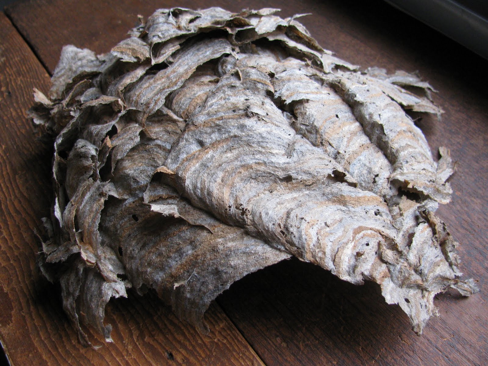
Well, I'm with Paris all the way on this one -- and JT knew the way to my heart when about ten years ago, he brought home an end-of-season partly dismantled wasp nest. If you've never seen the inside of one of these elongated globes, a revelation awaits you. The architecture is astonishing -- a series of five 6-sided egg casings (rather like slices of beehive) are stacked in descending size, with a "button" at the top.


The hive structure is encased by layer upon layer of wasp-recycled paper:-- newsprint transformed into rippling patterns of grays, dull yellows, light blues, and actually metallic-sheened silvers and golds. How do they do it?


What art could improve on this wonder? -- and yet, I was compelled to do something with it. I got out my coloured pencils and did a large drawing, just enjoying the experience of interacting with all its intricacies, all the ripples in its paper.


And not a moment too soon!! About a month later, now into the depths of winter, I walked into the studio one morning and found about three dozen groggy wasp youngsters staggering along the walls. ("Where are the trees and grass Mom told us about?") In family fashion, I captured as many alive as I could and put them and the entire hive outside. But I saved the outer wrapping and the little button (the cells of which had been empty all along) and later incorporated the latter into a pen-and-ink drawing called "Abandoned" -- which featured all kinds of empty nests, as it were.


Recently, I've been doing a big studio clean-up and still couldn't bear to throw out the wasp paper (or the button). My eyes happened on a second-hand picture frame I'd been given, the kind that has a linen mat which in this case was soiled and scratched. I realized now was the time to give it a new lease on life -- collaged with wasp paper!


The outcome is truly fabulous -- and I'll have to contemplate what kind of future painting I might make that would be worthy of it. Meanwhile, I again had the thrill of hanging out with the wonders of wasp-dom -- for one thing, how the layers of paper are "felted" together to create passageways for incoming/outgoing wasp workers.


I recalled again a line from Dylan Thomas' A Child's Christmas in Wales. Among the "useful presents" under the tree (distinct inferiors to the useless/fun presents), he lists: "...the books that told me everything about the wasp, except why."

Tuesday, January 10, 2012

"Mismatched"...oh, so very mismatched

At my final job, the preparations for a major office renovation involved all hands on deck to de-clutter closets and store rooms -- a dream activity for artist-packrats and a task for which I quickly volunteered. Intercepting a dumpster-destined box of never-used and outdated "company mugs", I found treasure: one of the untouched mugs had shattered into a fascinating variety of shards. I *HAD* to do something with it -- the varied sizes and shapes of the pieces, the white of the cracked edges against the black ceramic.

I re-wrapped and saved the pieces carefully, and for a couple years my mind played with what to do with them. In late 2011, I happened upon an old cotton shirt:-- black, white, and gold plaid. Ta TUM! I'd place the mug shards against the folds of the shirt!!


I began a study in pencil that quickly showed me that this was going to be One of Those Bright Ideas, the kind that never pan out. Just too fiddly.


Well, what to do? I'd become enthralled with the way the plaid design warped and zigzagged through the fabric folds. But I could see that I needed something bigger than the mug pieces to play against it. My glance happened on my old wool felt hat that hangs inside the studio door.

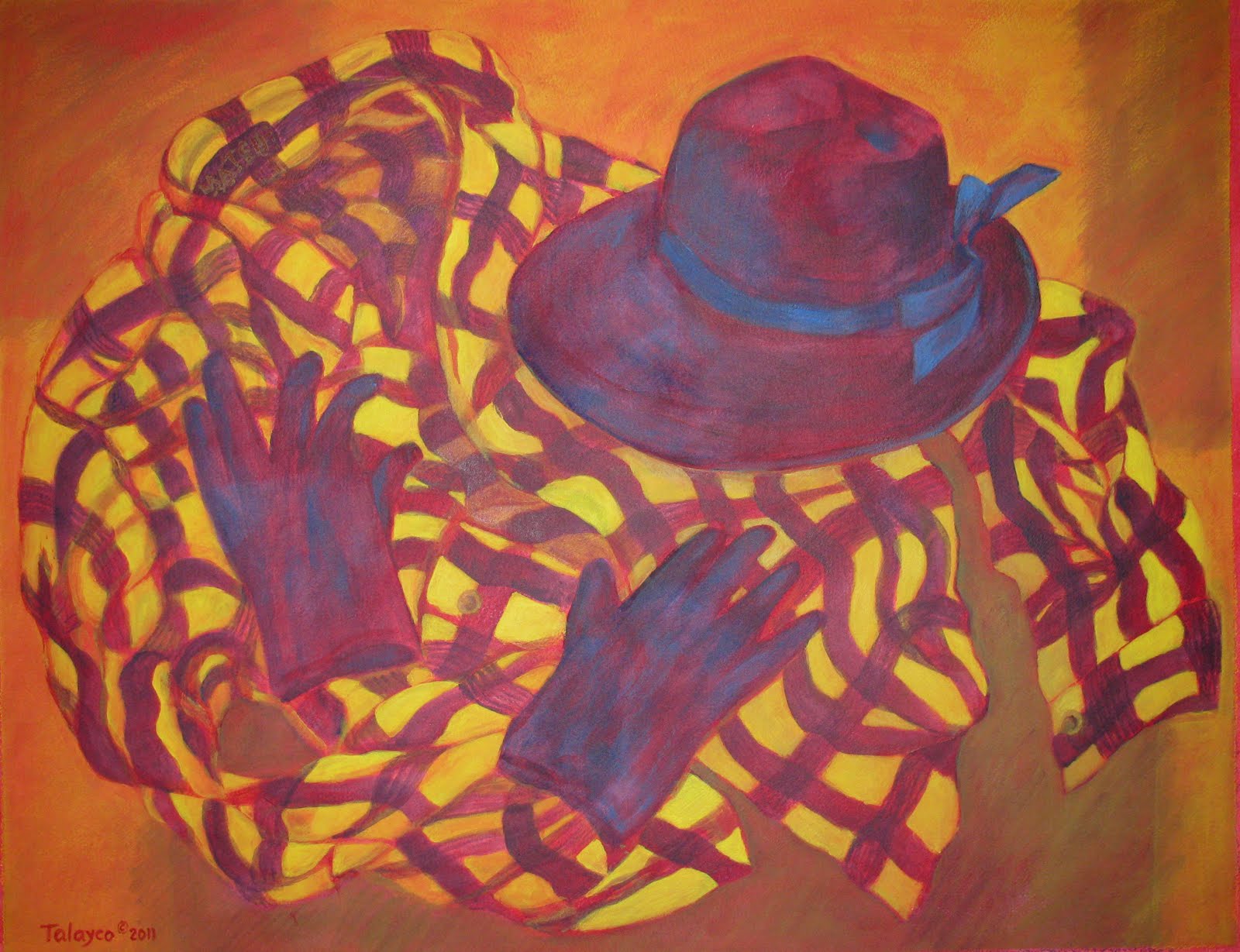
I've saved this hat for poor nostalgia. It was the height of elegance in the late 1960s, worn with my first "grown-up" suit, both gifts from my mother when I graduated from university. A decade later, it had lost both lustre and relevance but it came along to BC with us, where it had a 5-year reincarnation as a cool weather hiking hat. Now the memory of the 3/4 length gloves I'd once worn with the suit brought to mind...a currently elegant/relevant and very beautiful pair of leather gloves that a dear friend brought me from Italy. Exit mug shards. Enter black hat and gloves.


In the final painting, I think I managed to pull off what I had in mind. You can see the plaid design evolve and watch for the first appearance of cuff buttons here.The painting's title reflects the mismatch with my original intentions, the mismatch in eras and tone of the various pieces of clothing, the mismatch of the plaid design as it snakes around the old hat and the beautiful gloves. Here's "Mismatched," copyright 2011.


Thank you, VF mug, for taking a detour on your way out the door to inspire my funkiest painting yet. And thank you, VF friends, for keeping in touch and cheering me on. May you always choose the right accessories and may you correctly button your plaid shirts so that you are never...mismatched.