Tuesday, December 21, 2010

"A Brown Study" -- at 65


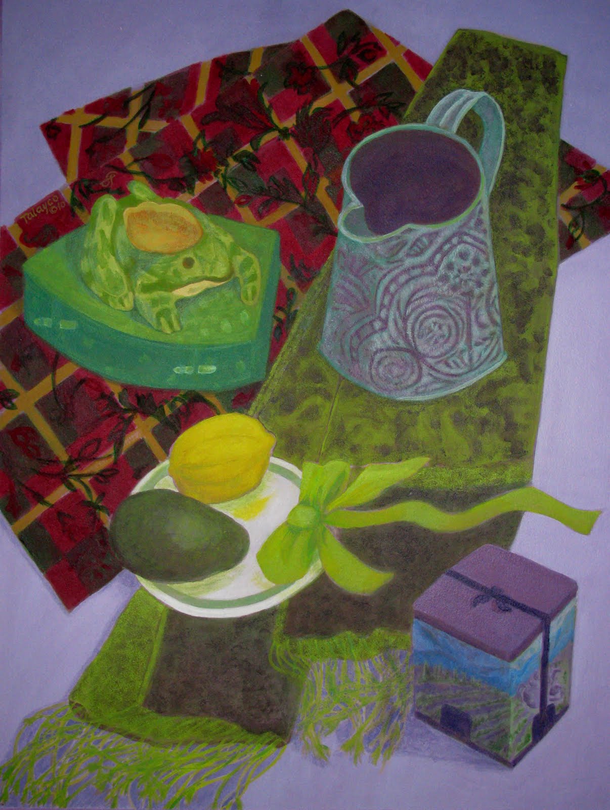
Some months ago in my reading, I came across that old Victorian expression "a brown study." She sat at the window in a brown study. Today we'd say "lost in thought." Within a week, I happened to find another reference to brown in a wonderful book COLOUR: TRAVELS THROUGH THE PAINTBOX by Victoria Finlay. She's an Australian journalist who relates the history of various artists' pigments as she travels in the 1990s to their geographical sources. About brown, she notes:

Social anthropologists B. Berlin and P. Kay in a controversial 1969 study researching colour terminology found that every human society distinguished between dark and light although some had no words at all for specific colours. In cultures that named three colours, those were black, white, red. The fourth and fifth to be added (in other cultures) were green and yellow in either order; the sixth would always be blue. Only at that level would there be acknowledgment of brown which, inevitably, was the seventh to receive a name.
Well, interesting; and at that point, I conceived the idea to do a painting entitled "A Brown Study" which would play on different shades of brown. When I found our old brown teapot in the basement (sans lid, which had broken), things began to hum. My beautiful raku-fired vase presented greyer tones; a tannish teak dish came out of a studio corner; it was "that time of year" when the ornamental gourds call me and this striped one took me back to brown's roots in yellow and orange. When I put them all together, I decided to break the common rule (aren't they made to be broken?) to avoid placing things in the absolute centre of the composition. Cascading branches from our old pear tree (its trunk is shown above) would, I thought, break the dead-centre stability and project forward into space.

I did a quick preliminary study, grabbing a small blue-green panel that I had on hand, and thought there was something magical about the brownish objects set against the sea-toned background. Then, when I laid in the first burnt sienna underlayers, (you can see the evolution here) I knew I'd find it hard to sacrifice that orange glow. So, as is usually the case, it didn't turn out quite as planned.

What did turn out is that this is my 65th logged painting, my 65th year (this journey was related previously -- and it's the best I've done so far.


Tuesday, November 30, 2010

Speaking Sushi

They say one's early years are the best time to learn a second language, before the brain's circuitry gets set in its way. That seems as good an explanation as any for why I don't speak sushi -- I came too late in life from too far away to bond deeply, as most Vancouverites do, with raw fish and seaweed. Mind you, I've enjoyed some great lunches with my friend Rumi, but that's because of her tactful guidance in menu choices, her deft wielding of chopsticks, the gracious way she seems truly not to notice when my eyes are bulging from having carelessly downed way too much horseradish, and most of all, the pleasure of her company.

I guess that's why I tend to smile favourably on sushi restaurants and couldn't help but take an interest when a new one went up last year along my bus route, right where I sometimes get off to make a transfer. First the "for lease" sign was replaced by a scrawled "coming soon" notice. Then tradespeople went in and out the curtained doorway for several weeks, and eventually a homemade banner announced the next week's grand opening. Then, remarkably, fate intervened and that very weekend, a car went out of control, ramming right through the new windows. But the new restaurant rose from the ashes (or shards) and finally opened six weeks later.

The hand-made signs were replaced with formal graphics, and I made a memory drawing of a scene I'd glimpsed from the bus one dark autumn morning: A very tall guy whose splotchy jacket echoed the circular motif of the restaurant's graphic design.


Not long afterwards, the new Hime Sushi restaurant gave me an opportunity to observe how instantly and creatively the mind fires -- or misfires. One drizzly Saturday morning, I was standing under its awning waiting for my bus. Cold and a little sleepy, I absent-mindedly noticed the hand-lettered menu on a large whiteboard inside the door. Suddenly, my mind snapped to attention. I'd never heard of stuff like this! And in the space of what must have been less than a minute, I'd read and analyzed the six menu items as follows:

1) BORB FULGHAM
Why does this remind me of "bulghur wheat"?

2) ANAREA AGRO
Maybe this is their vegetarian menu? ...Because of "agro"? Oh, don't be silly.

3) MALANI MANSARAS
This doesn't sound anything like California rolls...or tempura...or
okinomi-yaki.

4) DEVE PANNER
In fact, this menu is sounding more South Asian than Japanese. Is this like
"paneer" maybe, that cottage cheese kind of stuff?

5) ASHOK PURI
Ashok? I think I once knew someone named "Ashok"....

6) COLLEEN RILEY
Colleen Riley?? Colleen Riley?? Wait a minute, what's going on here?

Now thoroughly wide awake, I noticed a small printed card taped to the top of the whiteboard: "Enter to win free dinner for two," and written across the empty lines where people were to record name and phone number: "Congratulations to first winners!!" I quickly reviewed the "menu": Barb? Andrea? Melanie? Dave? Lack of sushi fluency had led me astray, but it looked like Hime Sushi's management had done a pretty fair job of interpreting the bad handwriting of their customers. First the car crash, now the contest. Good fortune surely follows them.

Tuesday, November 9, 2010

Full Circle: Spices and Punk Cabbage


"Okay, I've started the last in the Astrological Plants series," I announced from halfway down the stairs after a mid-September studio session, excitedly calling out the name of the sign and its flora.

JT heard me from a distance and, with just a touch of yuk in his voice, called back, "Spices and Punk Cabbage?!?!?"

Okay. He knew I must have said "Pisces" -- which is not only the last in my 12-piece series, but with a nice symbolism, is also the final sign in the astrological year. (Unplanned; I didn't paint them in order). But from two rooms away, the name "Skunk Cabbage" had become distorted.

Pisces is ruled by Neptune, and of the plants assigned to Neptune, it's said: "Little is yet known concerning (these) plants...it is probable that plants possessing strange and occult properties...belong to (this planet)."

And there is something occult, I'd say, about the way the large yellow capes of Skunk Cabbage burst up through the coastal wetlands, as early as late January -- sometimes in an expanse of dozens of flowers, without evidence of the huge floppy leaves that follow. Far from occult, of course, is the plant's odour which contributes its common name.

Neptune's colours are black and white (as in skunk?) deep blood red, mauve, lavender, burnt umber, burnt sienna. From the first splash on the paper, I felt it would be eerie good fun to try to bring these colours together within my usual complex symbol system. You can see Pisces' evolution here.


-- and TA TUM, the whole completed series here.


I've been asked about the source of the personality traits in each sign's painting. I select them from lists of "emotional characteristics" and "intellectual characteristics" in the book Astrological Keywords by Manly P. Hall (1958) -- and "select" is definitely a key word in the process. (Would I, a Gemini, have selected "duplicitous" as one of the traits for the Gemini painting?") I admit: I tend to reject the more negative descriptors and then check the positives against "natives" of each sign who are people I know and like.


It happens that two awesome Pisces women have played important roles in my life. One is an almost-lifelong friend, originally a penpal from the age of 12. The other is the remarkable Uber-Boss of the two non-profit organizations where I spent my last and happiest working years. Coincidentally, both have birthdays on March 13th. Characteristics: Compassionate; check. Introspective; check. Philosophic; check. Intuitive; check. Executive; check. Sensitive; check.

As for the success of the Pisces painting, I'm pretty pleased with it. It's kinda skunky. It's kinda punky. It's more than a little bit funky. And now, what to do with the whole Astro-Plants series? Maybe I should delve into my horoscope for....a sign.

Tuesday, October 19, 2010

Paper: The senses remember


With one last painting to go in the Astro-Plants series, I ran out of paper (the backyard wasp's nest wouldn't do) and had to hike out (2 bus transfers!) for a pristine 10-pack of Strathmore Gemini 140# Cold-Pressed 22" x 30" watercolour paper. The very description is mouth-watering. Back home, I savoured its weight and texture with a satisfaction that was almost physical. Well, no wonder. Paper and I go a long way back.

I spent most of my first eight years in a little paper mill town in the foothills of NY State's Adirondacks. In that simpler post-WW II era, it was a child's wonderland of endless summers roaming free and unaccompanied in fields and woods, and winters of deep snows and crystalline games. For adults, though, the horizons and pleasures must have seemed smaller. When our family had out-of-town guests, for example, the major entertainment was a tour of the mill, conducted by my father who was its Chief Engineer (shown here).


Of course, I would tag along -- ordinarily, the mill grounds were off-limits to kids. We'd go on a Sunday, when visitors wouldn't be in the way of the skeleton crew that kept things moving. In the timeless design of millworks, the building descended in steps along the slope of the falls. We'd enter at the street level of my dad's office and walk down deserted hallways to the wire-cage elevator that could carry a full shift of men to the depths -- a device open on both ends, which I found rather scary.

Scarier still (though I was an old hand at mill tours) was the clanging roar that literally shook the mill building -- the great metal rollers that (at tour's end) spewed out huge ripply expanses of newsprint, the mill's stock in trade. But it was an earlier stage in the process that's imprinted in my memory -- the pulp room, the place where sulphur hit wood chips in a great steaming mass.

Outdoors, the sulphur sat in a storeys-high yellow-green pile ("Why can't we play in it?"); indoors, its taste and smell pervaded the whole working part of the mill, and we'd be breathing it before the elevator hit bottom. (When we first came to Vancouver and I spotted the North Shore's conical sulphur pile, my heart skipped a beat). My father would hold us back a minute with a cautionary, "Careful now," and we would almost glide out onto the wet floor -- wet from the steam of the brewing pulp. Great vats of this greenish-yellow mash churned and burbled, producing a humidity that made your clothes stick.

Fast-forward to the mid-1980s, when I read a fascinating book that chronicled the reactions of American workers whose traditional industries were rapidly computerizing. One interviewed mill worker said (and yes, I remember it almost verbatim):

I've worked in the pulp room for 20 years, and my job is to keep the mash brewing with the right mix at the right rate and the right temperature. In my new job, I sit in this glass room looking out over the vats, and I look at these gauges and they're supposed to tell me. I used to work down there in the room, and you didn't even have to think about it. You smell it. You taste it. You feel it. The minute you walk in the room, you know if things are brewing up right. They say this new way is better, but I don't know.

I knew exactly what he meant.

Whether or not "the new way was better," the Gould Paper Company's days were already numbered. By the mid-1950s, my family and those of all my friends had moved on as the men (yes) found greener pastures in the post-war economic boom. The mill limped along, with different owners, until it folded in 2000. The town is still there, less vibrant I'm sure than my memories.

But for me, there are so many legacies from those days: Among them, a treasured friendship, an intense rapport with the natural world, and a thrill at the whiteness of paper.

Thursday, September 30, 2010

Dark stars, autumn roadsides

Two more in the series Astrological Plants of the Squamish Valley -- and the year's not over yet! For several months, I've been looking forward to switching colour gears and working on these two signs together: Sagittarius and Capricorn. Sagittarius is ruled by Jupiter, associated with the colours blue, violet, purple, red-indigo, deep midnight. Capricorn is ruled by Saturn, associated with indigo, grey, black, dark brown, sage green, mottled tones. My aim was to "work in the dark" to create a strong tonal contrast within the overall Astro-Plants series.

Here's Capricorn, which can be viewed in progress here.


The plants assigned to Saturn include leathery-leaved plants like holly, ivy and wintergreen so my choice of our omnipresent salal seemed a natural. (To non-locals, the name's pronounced "sha-LALL" -- as in the Latin name. But maybe everyone knows this if salal truly is omnipresent -- years ago, we saw salal in a Parisian florist's sidewalk buckets). Salal's scrumptious-looking deep blue-black berries, dried in quantity to last the winter, were a staple of traditional First Nations diets. My mouth was watering as I tried my first -- and last -- salal berry. It tasted just like eucalyptus-flavoured Mentholatum. The painting's rather austere, but it's turned out to be one of my favourites.

Along our Upper Squamish roadsides, salal is often the background to an abundant autumn display of snowberries -- the plant chosen to represent Sagittarius.


You can view it in progress here.

Jupiter, the planetary ruler of this sign, is the champion of berries of all kinds so I couldn't miss with this choice. I know snowberries from our years in the East and, wisely I think, never gave them a taste. I don't remember their growing as abundantly there as they do in our coastal valleys. The sight of them hanging in bright white bundles against the rich dark coppers, deep magentas, and olive-blacks of wet fading leaves has always stirred me.

Wednesday, September 22, 2010

I spy...tiny little eyes

I've noticed the Province of BC has a new tourism ad based on the children's game, "I spy...." That's the game in which one person says, "I spy something purple..." (for example) and everyone else looks around and tries to guess what it is.

Nice try, BC, but not as truly spectacular as the real-life game I witnessed one hot day on a crowded bus played by an enthusiastic father and his two small sons. The dad spoke with an English accent and had a unique (English?) twist on the script, at least one I'd never heard before. His opening line was, "I spy with my tiny little eyes..." I wondered if he was on leave from the Royal Shakespeare Company -- he was that into the whole drama of the thing. The 5-year-old could barely wait his turn and had a witty originality in the objects he selected. The 3-year-old enchanted with his carefully enunciated lisp: "I thspy wiff my tiny little eyeth." Everyone in the front of the bus, including a tough-looking tattooed adolescent, was completely mesmerized.

The tourism ad and the memory of the tiny little eyes brought to mind a painting I'd made in 2007, another under the heading of "I couldn't resist giving it a try." I assembled all my cat figurines (most of them gifts, one hand-me-down, one outright purchase) and a bunch of semi-related stuff and tried to bring them all together. The outcome is "White Cats and Rumi-Blue" -- with a salute to my friend Rumi, originally a work-buddy with whom there was an instant bond on the subjects of cats and the mellow softer-than-navy colour that pervades this painting.

I know everything that's wrong here...so many objects, so many tiny little eyes...but I still like the cats and the colour! I thought I'd learned the lesson with a 2009 painting, "The Wishful Bird" ...but still too many small fiddly details.

The little guys below arrived too late for the "White Cats" painting -- a parting gift received as I walked out the retirement door at the end of 2009. I spy their tiny little eyes and know that I can just enjoy them without trying to put them in a painting.

Tuesday, August 31, 2010

Let's raise a glass!


This 2007 painting, titled Very Special, was an experiment in working with dark tones. Very Special indeed since it stars the bottle of Courvoisier (contents long since emptied!) we'd brought home from France in 1995 -- possibly our last ever, since this delectable cognac is now hitting $90 a pop in BC liquor stores.

But it seemed a good choice to help me savour some seasonal memories. So many notable events have happened for me in the August-September period; it's really beyond statistical chance. Every job change I've ever made, geographic relocations, family milestones,...and how about this August's 40th anniversary for John and me?!

Reflecting on this season, as I do every year, I realized it's a big anniversary for my art work -- ten years since the August vacation when I decided to hunker down and do art consistently, productively, regardless...regardless of not having gone to art school, regardless of working full-time, regardless of this, regardless of that. Oh, I'd been drawing steadily for more than 25 years, taking courses when I could, starting to paint from the time we moved to Vancouver -- painting and repainting, but never talking about it much, never showing people what I did.

In August 2000, that changed. I would produce. I would talk about it. I would exhibit --digitally, at least. I gathered all my resources, books, sketchbooks, notes, and decided to set annual goals -- and meet them. I chose as my log book my newest sketchbook from my May birthday and inscribed a frontispiece with the counsel that has meant so much to me from the time I first read it in Balzac's novel Cousine Bette.


/

In the novel it's a cautionary note, reflecting unfortunately on Stanislas, the young artist who has so many gifts and possibilities -- but whiles away his attentions and comes to nothing.

In that first year of my new program, I focused on drawing intensively, based on an exercise I'd read about: "Draw on a roll of paper. Draw every day for a year. Do not unroll your work until the end of the year." With the support of my priceless home team, the roll was never left behind as we travelled back and forth on our weekends, and in 365 days, I missed drawing only on three. At the end of the year -- on our Aug-Sept 2001 vacation at the cabin -- John took my picture at the roll's unfurling.


/

From then on, I set an annual goal for painting, sometimes based on volume, sometimes on a particular area of study. In my fourth year, I gathered my paintings and had a personal consultation at Emily Carr -- a big milestone in itself, which yielded some new insights. Fast-forward to the 2009-2010 goal to complete the Astrological Plants series, a goal I'll achieve on schedule, finishing the final one in September. Looking in my log book this morning, I discovered something kind of neat: When I finish Astro-plants, I'll have completed 64 logged paintings since my resolution of ten years ago. I think I'd better hunker down, whip out an additional painting this September, and make that a total of 65 -- for my 65th year.

Now there's cause for celebration! Cheers. Good Health. Happy Days.

Tuesday, August 10, 2010

Airheads: Sublime to ridiculous?

Working on two paintings at a time (as I did with Scorpio and Aries)
seems to be the best way to bring the Astrological Plants series to harvest.

This time, I decided to work together on Libra and Aquarius, the remaining Air signs, playing in different ways with the same design elements I previously used for Air in Gemini -- the upward-pointing triangle with crossbar, the whirling symbol from Neolithic patterns, and the butterfly reminiscent of the swallowtails that visited our Upper Squamish garden.

Libra is ruled by Venus and thus shares its colours with Taurus -- green, blue, yellow, pastels, and the metal, copper. The wild columbine is surely a plant Venus would smile on (so I'vedecided -- Venus' plants are many, prominent among them are roses and lilies). I've read that the "columbine" name comes from the flower's shape "said to resemble a dove (columba)" -- I don't quite get this, but it's nonetheless a graceful association for this joyful plant of coastal fields and highlands.


You can view Libra-in-progress and then switch to something completely different....! Aquarius.


Aquarius is ruled by Uranus, a planet which (like Pluto and Neptune) was unknown in classical times. Their discovery presented a dilemma for later astrologers who had to think fast to make some creative connections between new planets and known astrological signs and the things the signs connect with in human affairs. The colours that have come to be assigned to Uranus are described as "electric tones, light azure, silvery white, striped; a profusion of glaring colors creating a harmonious result." Check out the evolution here.

My sourcebook continues: "Little is yet known concerning the plants of Uranus...(They) may be similar to those of Venus and the Moon...It is probable that plants possessing strange occult properties such as mistletoe and orchids belong to (Uranus and Neptune)."

Well, Lobaria pulmonaria is certainly "strange" and I've loved it from first sight -- it's a flat hand-sized lichen that grows in leathery fistfuls, often in the clefts of trees, bundled with licorice ferns. Blown to the ground, a clump could last for weeks in the moist air of Upper Squamish but whenever I brought some back to Vancouver to sketch and study, the ripply sheets would dry out and flatten within a day. And it's "occult" enough that, after my first sighting and a lot of searching, I had to contact UBC's Hort Line to find out what the heck it was.

Interestingly, the common name "lungwort" is attached to some other wild plants, probably because they were used in healing lung disorders. (And here's an odd reminiscence: The sheets of Lobaria resemble the dessicated paper-thin section of a cancerous lung that I happened upon in the filing cabinet of my first Canadian boss, who was a pulmonary specialist.)

It was fun to work on these two paintings in tandem -- switching back and forth between the soft greens of Libra and the electric tones of Aquarius.

Tuesday, July 27, 2010

Seasons in the Fantasy Forest

CG Jung says, "The creative mind plays with the things that it loves." In our family, one creative mind plays with prime numbers and geometrical constructions; the other plays with shapes and colours. And both of us have been intrigued by an ever-changing optical illusion that floats above us at the therapeutic pool where we've been swimming weekly for over a year.

You can share the fun. Here's how it works.

The pool 's setting is itself therapeutic -- a beautifully landscaped 20-acre property where a number of health and rehab facilities are situated . We learned recently that once upon a time, before the health care crunch, these grounds had a full-time gardener -- and it shows. The pool building itself resembles a huge greenhouse, with glassed panes on three sides. Its shape is something like a giant quonset house, with the south wall angling inward to connect to a low building wing with office and locker rooms. The straight-sided east and west walls open onto mini-courtyards. The longer south wall looks out on a groomed abundance of shrubs and huge deciduous trees.

Now here's the fascinating part. Because of the angled panes of this wall, each horizontal segment reflects whatever rests on the pool deck. When we swim, late Fridays, there are always a dozen or more multi-coloured 4-foot lengths of tubular foam (fun to wrap around yourself, like an inner tube). Remarkably, their reflections -- repeating in triplicate up the three rows of glass -- are just the size of the branches on the outdoor trees. AND this view of trees with pink/purple/yellow/blue/green "branches" changes with the seasons and the related length and light of day.

Want to join me in a visualization experiment? First, here's a section of the south wall of the pool and, outside, the bare branches of shrubs and trees. (Digression: We arrived one Friday to hear the astonishing tale of a raccoon who'd somehow entered two nights before -- via the automatic door? -- and, when accosted the next morning, quickly made its way up the vertical struts and across the horizontals to sit as remotely as possible until more or less humanely captured by a wildlife rescue person on a ladder).

Next, the main foliage shapes -- shown in grey so you can picture the variables. In spring, they're lime green; in summer, rich green; in fall, vibrant red-orange; and in winter, non-existent.

Now for some foam tubes on the pool deck. Mentally flip them upward to reflect in all three horizontal sections of the glass.

Finally, here's an expanse of pool water. Its reflections are most evident right now, in ripe summer, when they float against the sky around the treetops, looking like mystical auras. Almost more mystical is the winter view:-- By 4 pm, it's black outside. Inside, big orange overhead heat lamps have replaced the ordinary light fixtures, and the window panes reflect back tongues of orange flame dancing around the scarcely visible tree trunks.

It's all like a fabulous light show, with wonderful variations depending not only on the season, but the wind and weather conditions. Creative math minds might wish to calculate the number of variables. Creative colour/shape minds can just sit back and trip out.

Tuesday, July 6, 2010

Martial Arts - Protective goggles recommended

When I first introduced my Astrological Plants series, I heard back from two friends, within a day of each other. "When will you do Aries?" (her sign) "When will you do Scorpio?" (her sign) The first message gave me a smile, the second a laugh-out-loud. Because wouldn't you know? Both these signs are ruled by Mars so it's no wonder these two gals are a tad...assertive, shall we say?


There's only one thing to do with folks like this. Meet them head on. (I should know, having worked with them both for a couple of intense years. ) So I decided it would be fun to work on the Aries and Scorpio paintings at the same time, playing differently with the colours assigned to Mars: all shades of red, dark orange, dull greens and browns. Here's Mars, which you can see under development in the usual slideshow.


And here's Scorpio, with its own slideshow here.


Not surprisingly, the plants assigned to Mars have sharp edges. Aries' hops, which we were pleased to find abundantly growing up and over an old stable on our property, are no doubt "volunteers" from an early 20th-century hops industry in the Squamish Valley. It's no kidding that the "beer that made Milwaukee famous" was due in part to the prized hops of Squamish, as well as those of Washington and Oregon. The soil and climate apparently contribute a unique buzz in the fermentation process. (Brewed rather than fermented, the papery flowers make a soothing tea which JT likes to make. Tastes like warm beer to me). If the distinctive teeth of the leaves remind you of something on the illicit side, that's because Humulus lupulus (don't you love it?) belongs to the Cannabis family.


Scorpios' Common Burdock has its own distinctions, beyond the one familiar to all walkers in wild places who come home with trouser legs full of sticky brown burrs. We've found plants growing majestically up to six feet in height. When late fall frosts hit our moist coastal valley, the whole plants with their pyramidal shape became glittering "Christmas trees" full of sparkling silvered balls, the frost crystals a quarter-inch long.


A true red colour is so far down the list of my personal preferences that I'd not bothered to refresh my supply of Cadmium Red paint, but Aries and Scorpio demanded the full punch and I had to make a special trip out to get a new tube.

Tuesday, June 22, 2010

A Window on the Twilight Zone


I once had a boss who could perfectly (and I mean perfectly) reproduce the theme music from The Twilight Zone. I can hear it now...

Something so astonishing has happened in my small world that it deserves an unplanned post. If you read my previous account (and you'll need to, for this to make sense), you're familiar with "Winter Window" -- the painting that just didn't come together. On June 15, I'd made the final decision to trash it. On June 16, I wrote and posted the sad story. On June 17, I was rummaging in a corner of my studio and turned over a panel that had its face to the wall. What to my wondering eyes should appear but a preliminary layout, transposed over a 10-year-old unsuccessful painting, of....an earlier try at "Winter Window" that I'd completely forgotten I once did. No kidding!

Click to enlarge and you'll see the grand plan.

Looking closely, I recognize in the drawing the paperwhite narcissi that I'd forced for blooms early in 2008 -- the year that the stability of our family routine was disrupted. I can remember now, sitting on the floor to get a close-up view at geranium level (vs. my recent failed attempt to imagine an even closer view). I'd obviously gone this far with the layout and then put it aside.

Already, though, it's much more promising than Failed Version 2010. The window panes are off-centre, and the spaces are more broken and interesting with leaf shapes -- I just might give this another try! Maybe I could work in a cactus, which currently occupies the window sill. Maybe those yellows (from the failed underlayer) could be kept for another recent addition to the window garden, a half dozen yellow kalanchoes rampantly returning to their wild trailing state. Maybe I could capture the vague tree forms outside the window. Uh-oh. This is sounding dangerously like getting carried away with cool ideas. I think there was a lesson about this I promised myself to remember...


*LATE-BREAKING* - This just received at the Twilight Zone post. To prove that many things are possible, my supportive and inspiring friend the photographer Judy Andrus Toporcer has used her wizardry to "paint" the photo source for Failed Version. Click on the image to enlarge it and take a look!


Tuesday, June 15, 2010

Things That Grow in the Dark -- or Don't


I've often laughed at a habit of mine -- the tendency I have to check
into the studio between working sessions to see what's happened since
the last time I was there. I'll finish a morning session and then
some hours later be unable to resist opening the door, looking to see
how the morning's painting is going...as if it would be any different
from when I left it.

I've recently realized that this is no laughing matter. In fact,
what's there when I open the door is a sure indicator of whether
things are going well or not. When things are on track, something
does happen between visits. Just as novelists talk about their
characters taking on a life of their own, there's a sense in which a
painting does, too. Whether or not I've consciously mulled things
over, time has passed and I've moved along to a new space. When I
revisit the work-in-progress, new possibilities present themselves,
solutions to problems seem possible, next steps are clarified. It's a
stretch to call this a "dialogue" with the painting, but it's a good
feeling when we're cookin' along together.

Earlier this year, I decided to capture the view toward my studio
window, an idea that's intrigued me every winter, when houseplants and
wintering-over geraniums are clustered together, leaning into the
scarce light. "Winter Window," it would be called, and this year I'd
do it instead of just thinking about it. The scene before me, as shown
in the photo, was my guide.

As I began, I imagined myself down at geranium-level, looking up
through the leaves. I had the plants and the window as models, but
the viewpoint was entirely imaginary. For the first week or so, it
was quite stimulating, but gradually I began to realize that I had no
impulse to check on it during the day. I knew nothing was happening
behind closed doors; somehow, it wasn't giving back.

When JT asked how I was doing and I heard myself say, "Oh, I'm
grinding along on this dumb painting," I knew it was pointless to
spend more time on it. The top part was too empty, and the bottom
part too full -- and no tentative salvage operations made a
difference.


I recalled the words of one of my mentors: Sometimes you can learn
more from a work that fails than from one that succeeds. I recalled
another painting on which I'd pulled the plug -- and the lesson I'd
learned then (two years ago) but forgotten. Some artists could bring
off my idea of "being down among the geraniums" -- but for me, working
only from an idea -- from "imagination" -- is risky business. I need
to start with a strong structural underpinning, a solid pictorial base
-- a lesson I'll try to remember.

So: Goodbye, Winter Window. Maybe another time, in a different way.
For now, it's been turned upside-down and received some preliminary
marks for an entirely different painting that will go over it.


You can view its short failed life -- and ponder how it might be reincarnated here.

Sunday, May 30, 2010

Botanical Roots - Nature or Nurture?

Recently I met a new (to me) Kelly, and across an age gap of perhaps
35 years, we enthusiastically exchanged views about our name (she's
"Kellie" and glad she's not "Kelli"). It made me think how natural
are the human impulses to both want to belong and want to
differentiate ourselves.


There's no one I know in my family who's like me, who would have
relished making the field sketch which recently morphed into
"Taurus/Rosa nutkana." Or is there?


On my father's side, traces of his immigrant family are lost three
generations back in the mists of rural Ireland -- though surprisingly
this strain produced some fine engineers, with a gene that must have
passed me by. My mother's history offers more fertile ground for
investigation, with a clan that goes back to 18th century South
Carolina. One side is distinctly rural, based at a centuries-old red
earth cotton farm which finally went bankrupt just before the Great
Depression -- but not before "my daddy's farm," as my mother called
it, gave her the first impressionable ten years of her life. The other
side of the family was always urban Charlestonian -- small business
owners, some would-be musicians, several crackerjack administrators,
and a few notable eccentrics.


And it's here, at the convergence of urban and eccentric, that I looked way back and connected with "someone who I'm like" -- my many-times-great-grandfather, John Linnaeus Edward Whitridge Shecut(1770-1836).

JLEW, as my great-aunt's archives abbreviate, was a doctor, inventor, small entrepreneur, novelist, co-founder of the Charleston Philosophical Society, and the first person to catalog the flora of the American Carolinas in Flora Carolinaeensis, a book that can be found on Amazon.com, along with his very bad novel inspired by The Last of the Mohicans. His botanical studies, including the one shown here, are housed in the Charleston Public Library.


My mother's arts were almost exclusively social, and she claimed to see only one colour -- her favourite, green. Yet she would exclaim about sights like the pattern of sunlight on a tree branch or the way new buds unfolded; things sometimes reminiscent of her early years, like the grape arbour on "my daddy's farm."

It's tempting to see a family history in what captures the eye like this assortment of leaves that I enjoyed packing onto one page -- but what's the thread, nature or nurture?

Wednesday, May 12, 2010

Artists Are From Venus

According to astrological indicators, "artist" is one of the favoured occupations for those born under the signs ruled by Venus -- two signs, Taurus and Libra. Not a bad line-up for the Taurus crowd:-- Redon, Turner, deKooning, Delacroix, Inness, Church, Rossetti, Frank Stella, Jasper Johns, Gainsborough, Rossetti, Mary Cassatt, Rousseau, Dűrer!

And here in the middle of Taurus' reign (April 22-May 22) is the latest in my series Astrological Plants of the Squamish Valley -- "Taurus/Wild Rose."


In the first flush of beginning a new painting in this series, (and I have another two under way now), I always forget how long each of them takes. There are lots of preliminary layers to build up, lots of fiddling around with templates for the lettering, and many minute-by-minute decisions about what to place where and what colour to use, all within my overall plan for the graphic motifs for the signs, elements, and alchemical correspondences.

As I work away, I ruminate on things like: How many wild rose varieties are there? (Alberta's official wild rose is evidently a different variety than our BC rose of the Nootka). Wasn't the Western Garter Snake the perfect correlation for the earth signs? Why don't I re-read Mary Renault's novels (popular best-sellers in the 1970's-80's -- was it really so long ago??) that first introduced me to the labyrinth at Knossos and the significance of bulls and snakes to the
Mother Goddess? Ruminate step-by-step with me, if you like.

Tuesday, April 27, 2010

Thanks a million!


You don't have to read the biographies of too many artists to find dark and dubious doings in their personal gardens of Eden. Frieda Kahlo and Diego Rivera. Alfred Stieglitz and Georgia O'Keeffe. Picasso and Mistresses A, B, C, D, Etc.

But there are exceptions, the sculptor Henry Moore among them. Looking back on his long career and recalling his wife's encouragement from their earliest days together, when he was an unknown artist with a vision of creating huge sculptures, he paid her a touching tribute -- so simply expressed, but no doubt of the greatest importance to him: She even helped me move the stones.

What would I say in tribute to my guy's lifelong (it seems that way after 40 years) encouragement? He bought my first sketchbook. He brought home the notice by which I found my first painting course. He gave me my drawing table and built all the rest of my studio furniture -- bookcase, mounting boards, compartmentalized table tray to my own specifications, huge flat drawers to store artists' paper. He took me to Paris to buy my Julian easel. And more. He even helped me gather The Giant Plants.

When we used to drive to Upper Squamish every weekend, I gradually came to notice along the highway the occasional patch of humungous plants that resembled Queen Anne's Lace -- very large Queen Anne's Lace, 10-12 feet high, flowerheads almost three feet across, surging upwards from dense thickets of 4-foot long leaves. As the summer ripened, the flowers gave way to giant seedheads...and I had to draw them! Once I shared my compulsion, my wish was halfway granted. Always too pressed for time to stop on our way out and back, we had to make a special trip, requiring one vacation afternoon...and a lot of trust. The plants' location nearest our house was just north of the Second Narrows Bridge, in a triangular patch of land surrounded by the highway, the cloverleaf access lane, and a busy Marine Drive.

John sized up the options, found the one place he could feasibly drop me off and pick me up, zoomed to the shoulder and said, "Now!" Armed with garden clippers (which proved barely adequate to the task), I jumped out and scooted through a gap in the cloverleaf traffic while he headed off, confident that some way or another, before too much time passed, he'd be able to double-back and pick me up.

I was able to clip the plants' 3-inch stalks only because they were hollow tubes, dried and brittle with the season. I grabbed three of them and made it back across the highway to my pick-up point, shedding seeds all the way, radiantly happy with these wonderful finds and with the man who made it all possible, shown here (incognito) holding the largest:


In the end, the largest drawing I made just wasn't large enough (but still so satisfying to work on) and I realized that nothing less than a 10-foot canvas would do this subject justice.


I've since learned that The Giant Plant is Heracleum mantegazzianum
(which sounds like another name for "humungous"), banally called "Hogweed" and considered a noxious weed that's said to cause skin rashes. In our own garden, it has produced a millions -- well, tens of thousands -- of seedlings since the year we collected it and this year, again, we'll let just one of these come to fruition. The seedlings grow rampantly and the ones I didn't weed when they were penny-sized now have roots like carrots and have to be dug out with a shovel. It's a task that nonetheless makes me smile as I remember the gift and the giver. Thanks a million, JT.

Tuesday, April 13, 2010

A Cat in the Studio


Looking through some old sketchbooks, I found a quote I'd copied by the artist Giorgio de Chirico (1888-1978):


We must hold enormous faith in ourselves: it is essential that the revelation we receive, the conception of an image which embraces a certain thing, which has no sense in itself, which has no subject, which means absolutely nothing from the logical point of view...should speak so strongly to us...that we feel compelled to paint.


I remember being surprised that de Chirico had written such an impassioned statement. I'd thought of him as a cool customer, whose obscure symbolic paintings have never much appealed to me. In fact, when I looked for some examples, I was surprised to see the colour in them. The ones I'd first seen of his were all black-white-grey.

But then I remembered an anecdote told (I think) by Janet Flanner, who was The New Yorker magazine's Paris correspondent from 1925 to 1975 and whose collected articles and notebooks cover a delightful range of things 20th century and European. It seems that a young journalist couple of her acquaintance was travelling in Italy in the 1950s, when de Chirico was in his prime. They happened upon the village where they knew he was staying and dared to knock at the door and ask if they might interview him. Graciously, he agreed and the two young people entered the studio, bringing with them their Siamese cat who couldn't be left in the car.

It would make a good story to say that the cat's reaction to de Chirico's art led to the scene that followed, but more likely it was the dislocation and the unfamiliar surroundings. In any case, the cat took one look around, leaped from its owner's arms and roared around the room, tearing through drawings, upsetting finished and unfinished paintings, spilling a good bit of paint onto masterworks in the making. At last, the panicked couple was able to catch and calm the cat -- and survey the damage. Of course, they were overcome with embarrassment and mild terror at the artist's probable reaction. Remarkably, de Chirico's concern was entirely for the cat. "The most important thing of all," he gently said to them, "is that no living being should be afraid." Now there's a man who's not at all a black-white-grey kind of guy.

As for our own two cats, Nikolai and Sasha, don't picture them lounging comfortably in my studio as Nik is shown in the drawing above. They are greatly intrigued by the door that's always closed to them, and that's the way it will stay. Two other cats reside there permanently, both of them gifts, both of them deserving a special environment, both of them (especially the fabric one) needing a place to hang out -- that's safe from cats!


Tuesday, March 30, 2010

Accidental Artist


"All artists have accidents, and the better the artist, the better the accident." Did I read this somewhere? Did someone actually say it? Or did I invent it as I lurched from one accident, mistake or oversight to another in the production of my Feb-March painting, "The Improbable Pond"?

My first accident was to pursue it at all, once I'd assembled the set-up. Viewed with caution, it seemed even at that stage to present some problems. But then I remembered the words of one of my esteemed role models, Mary Beth McKenzie. She and my other favorite, Harriet Shorr, are women in their 70's now, enduringly successful NYC-based artists, who in their student days bucked the art school trend in abstraction and have continued to paint in a representational manner (where things look like the things they are). I return again and again to their books and their thoughts about the process of art and about being an artist. Mary Beth writes (in A PAINTERLY APPROACH):

Growth for an artist is generally slow and unconscious. Real progress takes place over a long period of time....Unless you approach painting with a highly experimental attitude and are willing to take risks with your work, your progress will be extremely slow. It's important to continually challenge yourself, to set up problems for yourself in order to develop your technique and to experiment with new ideas. Vary your approach: try different mediums, different sized canvases, unusual points of view, more ambitious compositions. Always try to extend your reach. In this way, your work will continue to change and develop naturally. You must evolve as an artist, and this is really a lifelong process.

With her counsel in mind, I took a deep breath and leaped into "The Improbable Pond." I think I've been moderately successful in bringing it all together although the outcome is different from what I'd originally expected I would do with it. The sequence of its development is charted (can I say "by popular demand"?) at this Picasa link. Go ahead. Take the plunge.

Tuesday, March 16, 2010

Packrats 'R' Us

Seashells, pine cones, interesting stones, pieces of driftwood, thrift store ceramics, small family heirlooms, leaves, birds' feathers, dried flowers and seedpods, almost an entire wasp's nest (minus the central core that spontaneously combusted into live wasps in the middle of one January), mugs with broken handles, lush houseplants rejuvenated from almost dead stalks tossed out by co-workers, patterned fabric remnants, bottles and boxes with striking shapes/labels/colours, odd bits of rusted metal...just some of what makes my studio a congenial place for me to do art. (One thing I'll miss about work is those inevitable intervals of office renovations and relocations when whole boxes of promising material had to be thrown out....or redirected...to me!)

Too much stuff? Well, not for the likes of packrats, and I was encouraged to build my stash by the Pack Leader (as the cats call him), child of the Great Depression and collector of cast-off nails, pieces of lumber large and small, miscellaneous nuts and bolts, every type of electrical fixture, lengths of string, wire, cord, molded plastic packaging, odd bits of rusted metal...


What's more, packrats' passion puts me in good company. One of my heroes is Edgar Degas, particularly for his drawings that sparkle with life and movement. It was disappointing to learn of his rightwing politics and aristocratic condescension -- but very funny to read how such a fastidious man of the boulevards was also...a confirmed packrat! Here's an account given by Ambroise Vollard, one of the early dealers of various 19th century unknowns who later became known as the Impressionists: (from Bernard Denvir's PRIVATE LIVES OF THE IMPRESSIONISTS)

The most heteregenous objects were to be seen there (in Degas' studio)side by side. A bath, little wooden horses with which the artist composed his pictures of racecourses...easels, too, with canvases half-finished on them....Once an object had found its way into the studio, it never left it, nor changed its position, and gradually became covered with a layer of dust that no flick of a feather duster came to disturb. The painter would have been very astonished if he had been told that his studio was not perfectly tidy. One day I brought him a small picture that he had asked to see. As I undid the parcel a scrap of paper, no bigger than confetti, flew out and settled on a seam of the floor. Degas pounced on it. "Do take care, Vollard! You will make my studio untidy."

My own treasure trove lies somewhere between Degas' dust-covered hoard and the practical assembly of objects made by contemporary artist Janet Monafo, for whom I have some admiration. Scroll down in this link to see what she's done with her ever-expanding collection of kitchenware -- proof that packratting is quite a practical eccentricity. If our family didn't have this propensity, how would I have been able to do this 2005 painting ("Splash") that still brings a smile to my face? (When the painting was finished, I at last discarded the three pairs of aged and defective swim goggles.)


Thursday, February 25, 2010

Am I painting yet?

John and I occasionally play a family word game, based on our
different usage of the word "yet." (His less standard usage is, I
think, a 'Muricism from some early years spent in the Midwest states).

Our conversation might run like this:

J: "Are the cats upstairs yet?" (Meaning: Are they upstairs still? I
saw them go up a half hour ago.)
K: "Yes, they're still up in the sunny window. They haven't come down yet."

Hold this train of thought while I consider my Astrological Plants series. I've been thinking a lot lately about what is/isn't painting and whether what I'm doing with this series fits in.

These details of "Leo" pose the question. Do these drawn symbols, the splashes of orange/yellow texture created by applying plastic film, the collaged patches, the lettering, constitute real painting? Or just using paint for -- a design? an illustration? Certainly, the leaves of the plant are closer to the Right Stuff. In fact, this kind of treatment (the loose brush strokes building up the form, the easy blend of colours) would be called "painterly" by folks who have spent a lot of time moving paint around to create what in general is called a painting. This is what I have a great aim to bring to my real work -- but meanwhile, I'm determined to finish this series. Maybe I should just describe the pieces with that ever useful and ambiguous term "works on paper."

Years ago, when I took drawing courses at Vancouver Community College, my teacher (who made his living part-time from his paintings) told a story about meeting old art school colleagues, also "real artists," who laughed at him and said, "You're not still painting!!" Presumably, they'd dropped painting and moved on to trendy ventures like filming hour after hour of wind blowing through the leaves of a tree and displaying the film on three adjacent TV screens. (Not kidding: I spotted this at the Vancouver Art Gallery on my last trip. Can't we just sit outside and directly experience for ourselves the wind blowing through the leaves?)

I'm not sure we can blame it on Picasso -- the questions and debates go back much longer, with variations over time. But the famous film maker Jean Renoir, in his exquisitely touching book RENOIR, MY FATHER, relates this story:-- The artist Renoir was asked, "Who is the better painter? Picasso or Derain?" And he answered: "Derain, because he makes paintings." (which is not to say that that old rogue Picasso couldn't make grand paintings if he wanted to, but it's not his paintings that caused the stir).

So, yes, I'm still painting. But am I painting yet?

Tuesday, February 9, 2010

It's in the Stars

Our years of part-time living at Cloudburst, our property north of Squamish, finally brought together for me a plan for a series of paintings incorporating several of my long-term interests:--calligraphy, botanical illustration, and the symbol system of Western astrology. In 2007, I began to work on "Astrological Plants of the Squamish Valley." So far, I've completed Cancer, Leo, Gemini, and Virgo. Taurus is on the easel now. Maybe, just maybe, I'll finish the twelve zodiacal signs this year.

At the very least, the final product will be a great achievement in making order out of chaos, or at least complexity -- somewhat like the work I used to be paid to do??!!?

Here's how I play my game: The personality traits assigned to the 12 signs of the zodiac are widely known, but less well known is the assignment of almost anything you can name to a particular sign or its ruling planet: physical characteristics, occupations, geographic locations, and -- relevant to my series -- colours, metals and plants. With Gemini (my own sign), the painting incorporates the colours of its ruling sign Mercury, the image of a local plant that matches the traditional Mercury flora (a somewhat subjective assignment on my part-- but how could Black Twinberry be anything but Gemini's?), the Latin and common names for the plant, the glyphs (symbols) for Gemini and Mercury, and the sign's traditional image, The Twins. Virgo, the second image shown here, is also ruled by Mercury so I've played differently with Mercury's colours, which are blue, violet, slate, soft browns, and spotted, plaid and checked patterns.


But wait. There's more. Astrological lore assigns each sign to one of four elements -- earth, air, water, fire -- and so I decided to indicate these, using traditional symbols from alchemy:-- Air and fire are upward pointing triangles (air's with a midline); earth and water are downward pointing triangles (earth's with a midline). Thinking along these lines, though, I began to feel that astrology and alchemy perhaps represent a male worldview and that my series ought also to represent the feminine principle. Or maybe this rationale was just an excuse to do something, finally, with the images in a marvellous book I happened upon years ago -- Marija Gimbutas' THE LANGUAGE OF THE GODDESS.

Marija Gimbutas was a Lithuanian-American archaeologist who was the first to propose that the distinctive patterns on Neolithic pottery and monuments represented aspects of traditional goddess worship -- and the basis of long-standing matriarchal cultures all across Europe. Her book provides lavish documentation of these marks and patterns and suggests their relationships to aspects of the Goddess:-- fertilizing, energizing, regenerating, life-giving, etc., from which I selected likely correspondences with the four elements. Finally, I've added local "fauna" for each of the elements: Bee (fire), snake (earth), snail (water), butterfly (air).

It's quite an extravaganza, as you can see, about which one might ask some questions. The first: Why? Answer: Just because I feel like doing it. The second: Are these what you'd really call paintings? Answer: To be considered at a later date.