
And why should I complain when I'm cozily wrapped up in my Zodiac Café series? If you've lost the thread, my plan is to expand my themes beyond the Zodiacal portraits to still lifes and settings. Just another wacky idea but it's fun to work in a series and see how one idea bounces off another.
I wanted to do another "Beverage of Choice" still life, inspired by the many types of coffee packets and tea containers either tucked away in my cupboards or saved in recent months for just this purpose. I started playing with a set-up – giving myself a little laugh with the sunbather basking in the teapot. She's simply holding a place for the lid that was missing in action at the thrift shop where I found a classic Sadler Brown Betty teapot.

Then I chose one of the small panels I'd made in my holiday Semi-Abstract Workshop to paint over and use as the base for a study.

This one had been a spin-off on the works of the artist Nicolas de Staël. As I splashed down this checkered tablecloth, I smiled to think what he might do with a bunch of coffee and tea containers.

How close or how far apart should I place these objects, some of which I'd now rearranged (or eliminated)? And what about the background? After a few experiments, I kept the suggestion of a figure in the distance.
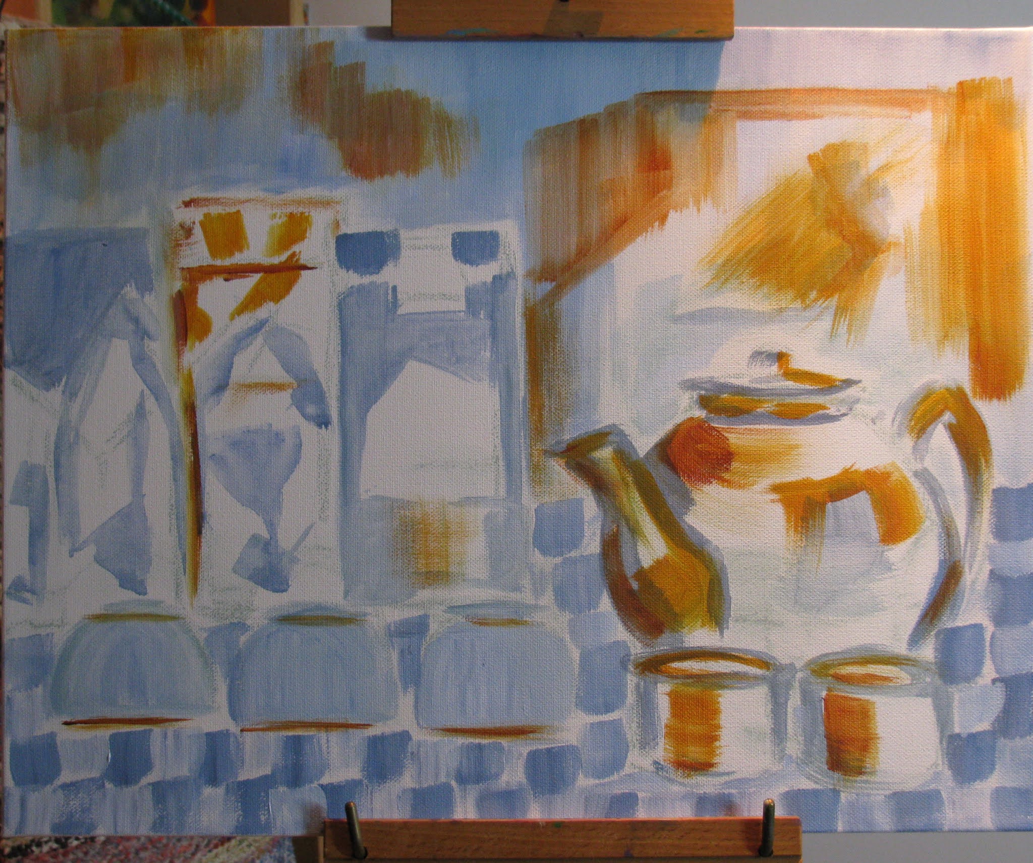
Coincidentally, as I began to develop the colour, I had another rash impulse. An artist friend who does exquisite linocuts happened to mention Georgio Morandi and a reference she'd spotted on the concept of "the space in between." I'd run into this early 20th century Italian artist in my early decades of drawing and knew that he could be pretty obsessive about line-ups of domestic vessels.
Should I paint over and start again, with more spaces between my coffee packets?

But no, I rather liked how I was handling the suggestion of BLACK in that line-up on the left. In most quarters, it's considered poor form (translation: Big Mistake) to use black "tube colour", and mine was a daring mixture of phthalocyanine blue, quinacridone magenta, and burnt siena. Say that three times fast and go to the head of the class!
That's not to say that I was very happy with the way this was going. I woke up one morning with de Staël on my mind and resolved to paint the whole thing over in light-coloured blocks.

But I couldn't bring myself to carry through. I was at that point of, "If you can't do something nice, don't do anything at all." I went back to developing the colour and considered it a wrap, "Another Dark Day at the Zodiac Café." (copyright 2021)

Probably the best outcome of this experiment was an addition to my Abstract studies – the new (old!) wood palette I'm breaking in, with its suggestion of the riverscapes in Jasper National Park that so intrigued me.

And now that we've had a bit of snow, winter is beginning to fulfill my wishes. First, a view of the special Galiano Inukshuk in my backyard – all bundled up like Bernie.

And then, to show that after all the good fun playing in the snow, an eventual spring melt will follow: The Inukshuk emerges.
(Huge hugs, as always, to L&B Multi-Talented Purveyors of Fine Objects for bringing all the wonderful Galiano rocks.)


No comments:
Post a Comment