Sunday, March 31, 2019

Maybe this is not your style?


I first spotted these twin Lawrence of Siberia lions with snow on their heads in early February.  By the time I'd returned with my camera, the snow was gone, perhaps just as well.  They're one of the wittiest treatments I've seen of the stereotypical gate on the stereotypical fence in front of the stereotypical Vancouver Special-style house. 

It's time for T-shirts to replace the thawbs (okay, I just looked that up, and you can, too) but I still have winter-clothed figures on the easel and for artistic purposes, I'm going to miss those winter garments.  The piece I just finished is based on a young woman I saw on the bus --white-blonde hair, light cream coat with black sleeves, rich golden-orange scarf and headband, and red boots!!!


Challenging myself to make an interesting painting of the prominent cream and black, I set to work.


But something had happened by the time I started laying in the colours.
  
 
I got bored.  Even though I'd planned ahead, I hadn't planned enough.  I had really wanted to do those red boots, but the figure's placement....yawn.   Decision:  Forget the boots and enlarge the figure.


Deep sigh.  Still boring.  But I *still* wanted to do this figure.  Decision:  White-out the whole thing and begin again.


Okay -- I liked the size now.  Will I be able to I pull this off?  (One of the questions I often ask myself mid-stream)
 
All right -- the placement of the darks seemed promising, and away I went.

 
And as I reached the final version of "Dressed for Winter",  I found myself really liking my big flat colour splashes:


It's almost a given that a painter's style evolves of itself as the artist keeps working -- trying new things, pushing boundaries, making experiments.  Best not to give too much thought to it except I can't help but notice an irrepressible impulse towards big shapes, definite edges, and vibrant colours. 

When my esteemed teacher Thomas came for coffee at The Yellow House, he said, "Just keep doing your thing."  And as he talked randomly, deliberately not wanting to give specific advice, he said, "Alex Katz is a painter you might like." 

I'd only vaguely heard of Alex Katz but when I checked him out (scroll down on the page to see the paintings),...yeah, I did like him a lot.  My beloved friend A. did better than that -- she confessed to *loving* Alex Katz and last fall in Maine took me to the Colby College Museum.  Katz donated about 400 of his works to Colby College, where they can be seen in rotation in a specially-built wing -- and there I saw the real thing, very much larger than life!
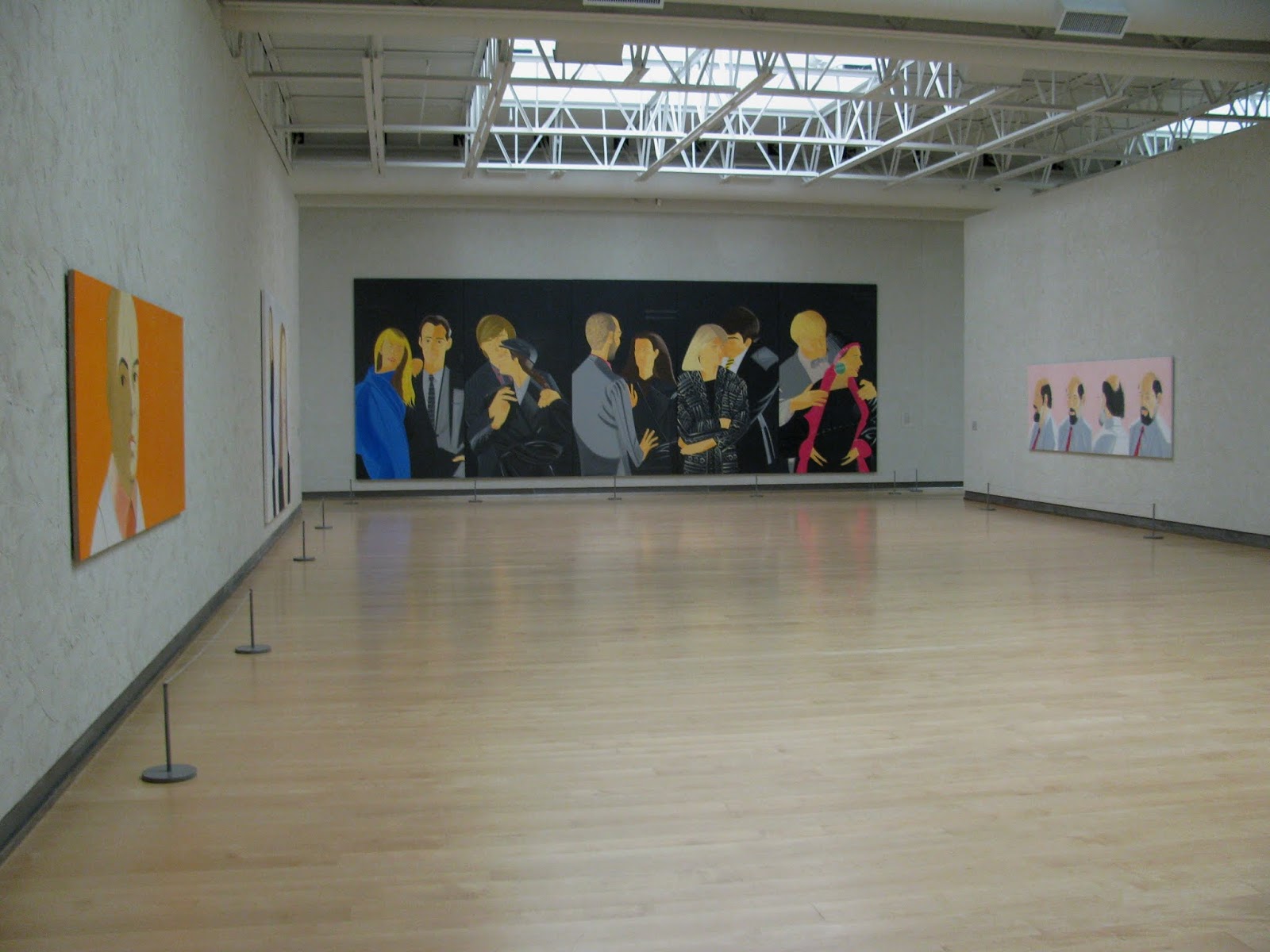


Katz, by the way, is still going strong at age 90, and he describes his own style this way:
"I like to make an image that is so simple you can't avoid it, and so complicated you can't figure it out."
Now, about those Lawrence-Lions that kicked off this discussion of style:--  They win a prize, but only second place.  The major award for "Most Distinctive Ornaments on a Vancouver- Special Fence" goes to a house several more blocks away, with the Seven Dwarfs each perched on its own brick pedestal.  Modestly accepting the prize is Bashful.

Friday, March 15, 2019

The black and white of it


Back at it!  Pictured here are two of the regulars who often show up at the same life drawing session I prefer:-- Thursdays, 10 am to 1 pm.  When these sessions are at their best, the model is inventive and steady, the room is silent, and we're all so focussed we're almost breathing in unison.  I love these kind of days -- so do my compatriots and it shows in our happy anticipation beforehand and good moods afterwards, whether or not it's been a "good day" or a "bad day". 

I've referred before to my bible -- Kimon Nicolaides' "The Natural Way to Draw."   A close runner-up is "The Art Spirit" by Robert Henri.  Nicolaides and Henri were hugely influential early 20th-century teachers at New York City's Art Students League; Henri, the elder by a generation, an accomplished artist.  Their books are still read and revered now, almost 100 years later.  Some timeless excerpts: 
   
"There is no such thing as starting where Cezanne left off. You have to start where he started... at the beginning." -  Kimon Nicolaides
  
"All real works of art look as though they were done in joy."  - Robert Henri

Maybe in some other lifetime, I'll be able to hit the Art Students League when one or the other is there teaching.  For now, I'll dip into my recent drawing sessions...just for the joy of it:


I've found it worthwhile to focus on just a part of the model if I'm not quite in synch with the pose.  Can you interpret this one? --


Just coincidentally, I hadn't worked with a male model in months so I was glad to see this guy show up -- someone with meat on his bones!


You might have noticed that I'm working on hands.


Now, in the coming two weeks, I'll be able to again attend the noontime drawing sessions that are offered free at the performance site of Vancouver's International Dance Festival.  It seemed like a good omen when one of last year's wonderful models returned for the first session I attended this year.


 When I got home, I took a couple inches off her head!  But this one, one of the last, was just about right:


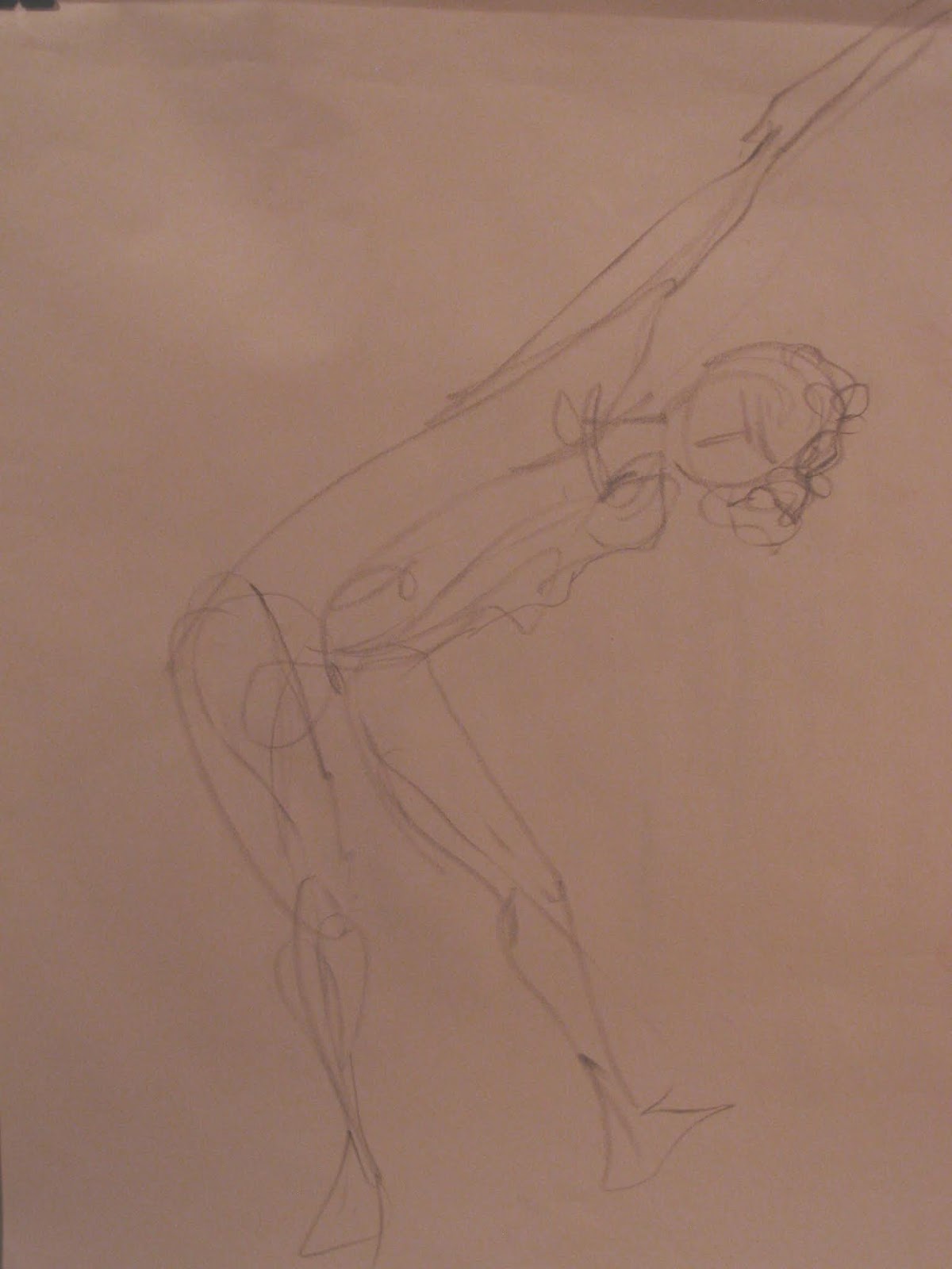
I don't know if she's a dancer (often they are),  but she certainly models with joy.  These free sessions are only an hour long.  As our time came to a close and I began to dismantle my drawing board she said, "Okay -- there's one more minute.  How about this?" -- and  went instantly into a kind of yoga pose, balanced on one leg, arms outstretched.  I slapped my paper back in place, grabbed my charcoal, and captured this impression by the time the minute was up.   Forget the oversized head -- it was an exhilarating conclusion!


Thursday, February 28, 2019

Youth and age


Despite the wild winter weather almost everywhere, we know we'll cycle through -- right?  The bulbs will be up soon and before long the flowering shoots of a favourite BC wildflower of mine -- "Youth-on-Age", so called because tiny new plants form at the base of the mature plants.

Big sigh.  Aging is an inevitable conversation topic these days among....people my age.  Call it art therapy, but I decided I'd confront the topic head-on.  It's another project that's been steeping since my trip to New York and my longed-for visit to the Metropolitan Museum of Art.  I was trying to pack as much as possible into a few short hours there, but every few steps I'd stop in my tracks to be amazed at something that wasn't on my short list.  "WHAT!!!  Rodin sculptures!!!"    I could only gulp and stop and take some photos.  This small study brought back a whole thought train:


I'd seen the final full-scale work reproduced in a Rodin book years ago and was so touched by its story.  The sculpture is variously called "The Old Courtesan", "Winter", or the one I prefer: "She who was once the helmet-maker's beautiful wife"; in French, "La Belle Heaulmière" ("The Beautiful Armouress.")

Rodin's version of a wrinkled sagging old woman was inspired partly by a poem of the medieval French poet (and criminal) François Villon.  It's pretty raw -- as is the sculpture -- but have a read.   Rodin evidently knew of the poem, as an educated French person would, and one day an old woman walked into his studio with her own story.

Seeing the Met's small study, I was reminded of the time I'd sat across from a much older woman in a medical office waiting room -- noting how beautifully groomed she was and what a fine-featured beauty she must have been in her day.  And so, about the time Valentine's Day rolled around, I decided to paint her from memory.


I made several attempts to be wrinklier (a word?), which made her look like The Night of the Living Dead.  I also realized at about this stage that I must shoot my paintings-in-progress under a better light.


At last I called it a wrap, borrowing the title -- "She Who Was Once the Helmet-maker's Beautiful Wife."


 Could she be the grandmother of my punk kids?  Maybe.


 Now what about that wrinklier face that looks back at me from the mirror?


Well, I've decided that if you didn't begin as the Helmet-Maker's Beautiful Wife, you don't have to worry about falling off from your old standards.  The Tomboy Vibe has stood me in good stead -- the pulled-down cap and the patched-knee trousers are just as true to type in my 70s as they were in my youth.

François Villon must have had a thing about lost beauties.  In searching for the Armouress poem, I discovered that the pre-Raphaelite poet Dante Gabriel Rossetti had translated another of Villon's poems on this subject (scroll down in the link for the poem).  Rosetti's big contribution perhaps was to coin the poignant term, "the snows of yesteryear." 

And right on cue yesterday in my photo gleaning project, I came across "She Who Was Once a 55-year-old Tomboy":-- two photos in an envelope labelled, "Feb 2000 - 18 inches of snow!"    -- the snows of yesteryear.


Friday, February 15, 2019

Scare-EEEEEE!


Oh, dear.  How did I get from Botticelli to this?!?  I'd better begin at the beginning to explain.

The on-line art course I enrolled in last year offered the structure of a master artist a week, followed by what was usually (to me, at least) an uninspiring video demo.  Early on, I decided to do my own thing with each week's artist.  When the week came around to Botticelli, I did a spin-off of his Venus based on Sara, the lovely young waitress (wait-person! server!) at the pub where I meet friends for coffee.
 
Like the fairy-tale princess, she is as good as she is beautiful -- but my Botticelli emulation was neither.  No matter.  Fate issued me another chance when later last fall, Sara rushed to show us her brand-new tattoo -- you get to see its full face sans the identity-protecting glasses I've installed on Sara's.


Well.  How could I resist?!  What's more, in my rambles through the internet, I'd come across a portrait demo made by an artist working in acrylic (as I do), and using sequentially seven colours in a linear format -- with surprising success.

Just maybe, if I'd stuck with that, I'd have had a different outcome.  But I decided to follow another artist's suggestion to begin with an underlayer of yellow ("the easiest to cover up in successive layers") and still another artist's suggestion to work atop a base layer of acrylic medium.  Here we go:--


I made one good decision at the outset:-- there was no way I was going to try for her lovely smile.  And the yellow underpainting wasn't a bad idea.  But the acrylic medium was  a Big Mistake.  Think plastic -- 'cause essentially that's what it is, and its slick  surface worked constantly against me.

Not far into the layout, I was out of control.  The Artist of the Seven Colours had started with violet lines, and mine were just too definite.  When I followed his further suggestion to make corrections in white (a common technique with acrylic -- in small patches), it all became horribly wrong.
 
Okay.  So I had to begin to make the rest of the painting as dense as the face and hope things would somehow even out.  As I worked on the tattoo, it became dense enough to resemble a carved wooden sculpture!


But I still wanted to see what I could salvage.


And at last, with apologies to Botticelli and Sara (who knows nothing about this)(nor does Botticelli), I called it a wrap.  Here's "At the Pub - Sara's Tattoo."


Then I went back to my collection of quotes from and about artists and found an encouraging nudge from author William Faulkner:--
"Get it down. Take chances. It may be bad, but it's the only way you can do anything really good."
So I'm making progress in a circuitous way, and I'll even offer advice to those couple of friends of mine who keep saying, "I can't even draw a straight line."

It's easy.  Really.  A simple four-step process:--  (1) Choose a snowy day. (2) Slip under the neighbour's fence and hit the ground running.  (3) If you must turn to avoid an obstacle, do so without guilt.  (4) Barrel on through!!


Thursday, January 31, 2019

Faces in the crowd


Here's a photo taken in just one of many moments in a busy day at Boston's South Station in mid-October 2018.  One of my lovely nieces had just escorted me through the labyrinth to connect with friends A and J for our bus trip north and our long-planned Excellent Maine Woods Adventure.

I was already filled with so much contentment and stimulation -- foremost from family and friends and unforgettably, too, from all the wonderful art I'd seen in both New York City and Boston.  You might have read my November post about the very special Pontormo exhibit I'd seen.  I was thrilled to see one of the actual paintings that had triggered my continuing enchantment with this artist and my continuing fascination with the "lesser" faces in major paintings -- the people on the sidelines or in the background; the faces in the crowd.

I still keep dipping into the internet for articles and videos about Pontormo and about that particular exhibit.  I wish I'd done so in advance -- I would have learned that the colours of his "Visitation"  (barely captured in my shot above) were so fresh and glowing because the painting had only recently been restored.  Fresh and glowing, too, was this unforgettable face in the background that has intrigued me ever since I first saw it in an art book reproduction.


 Intriguing, too, was that young woman in the crowd at the bus station.


 When I settled back home and began working regularly in my revamped studio, the two somehow came together for me:--  a painting to be called, "Art Students - The Twins."  And so I set to work.


 -- with many ups and downs, I might add.  There's a prevailing question in painting, which would be funny if it weren't so serious:  "How do you know when to stop?"  A common answer from professionals is, "When there's nothing more to be done."  In my case lately the answer has been, "When I know that if I do one more tiny thing, I will totally wreck what, for better or worse, I've achieved so far."

The ups and downs of this Excellent Adventure are shown here.  I'll blame a little bit on the not yet satisfactory lighting in my studio and my camera's tendency to go for the raw when I adjust the brightness.  I don't think I've done either of these young ladies credit, but here it is:--


I still think Pontormo's beautifully conceived face is one of the most compelling I've seen in Western Art -- even more so than Mona Lisa.  Even in my own inadequate version, I've savoured the time I spent studying her.


I've also considered what it means to copy a masterwork -- either for study or for fun -- and have come up with no hard and fast rules.   Speaking of Mona Lisa, look what some goofball on the internet came up with, called "When Mona Lisa Was a Half-Hour Late."


Tuesday, January 15, 2019

Uh-oh ---


You call this a fresh start?  Well, it's not quite The Scream, but I felt like screaming as my resolution to return to the life drawing studio on January 3rd dissolved in an eerie penetrating shriek.  Probably the model who selected this shrieking sound considered it "music," but it was more like the war-cry of deranged aliens.  I could stick it out for only an hour (of a usual 3-hour session) before I felt on the verge of a seizure. 

I packed up and left, having confirmed things I already knew: (1) that my drawing would be rusty after three months away; and (2) tomorrow is always another day.  So I returned the following Thursday and was greeted with peace and quiet, a small but focused group of compatriot artists, and a delightful model whose mop-head hairstyle just suited my kind of loose sketching.


Simultaneously, I'm committing my weekend studio hours to the new on-line course.  My cohort there, like that at the drawing studio, changes all the time since students do the lessons at their own pace (or not at all).  The curriculum starts with considerable emphasis on values in painting --  a key quality I've worked with many times since I first read the words of  Corot, one of my heroes:  "The most important things in a painting are Form and Value. Color comes last - like a friend you welcome."

The lesson called for choosing several master paintings and analyzing their value structure, assisted by a neat little trick:-- using one's computer software to translate the painting from colour to black-and-white.  For example, "The Scream" looks like this:--


and can be analyzed with this:--


Next it was time to do our own thing:-- Paint and submit a "baseline painting" (for later comparison), along with its value breakdown in black-and-white.  Here's my "Let's Talk," a recent re-do of a study I worked on a few years ago:


 And with a flip of the switch in my software, here's the black-and-white version:


Value studies are one of those things that artists return to from time to time, more or less forever.  One way to approach them intensively is to develop and use a grey scale -- most challengingly, a 9-step evenly modulated progression from white to black.


 Does this look easy?  It isn't!  I played up and down this xylophone so many times it was starting to emit sounds. (Scream, anyone?)  This final version results from some creative cutting and pasting from several different tries.

Now, for some additional strenuous exercise, I've followed the much simpler instructions to make a handy little viewfinder.  This enables one to isolate spots on 2-D surfaces or in the surroundings and selectively compare them against each other.


For example, suppose you're aiming for a fairly realistic painting of apples and oranges, and you need to get the values just right.
  

Yes, you can compare apples to oranges -- right down to the fine points in your model.   Are you confident of the lightest light?  Let's compare the light on the edge of the orange peel to the light yellow-green of the apple.


The difference in "lightness" might come as a surprise.  Then again, when value comparisons become automatic, you don't need to do this.

My biggest New Year's noise -- and it's a celebratory cheer -- consists of applause for my newly expanded studio, a major goal I'd set for the end of 2018.  Since we first moved here, I've had a dedicated room in the basement which opens like this:


 A further peek inside shows **SPACE** that used to be limited by my painting table.


My original studio is now The Drawing Room, and painting activities have spread out into the adjacent part of the basement -- where I actually have room now to stand back a bit to view my painting in progress.  Here's a not quite 180-degree view, starting at the door to The Drawing Room.


 Talk about shrieks of excitement!

I have a lot to accomplish in 2019, and I'm newly energized when I head downstairs first thing each morning.  C'mon, let's get going ---!