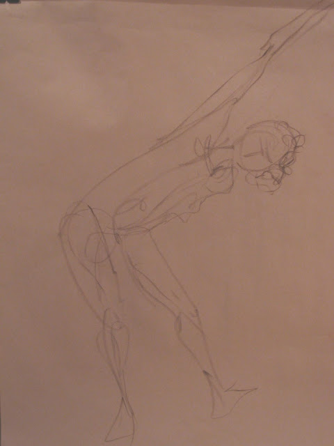
You call this a fresh start? Well, it's not quite The Scream, but I felt like screaming as my resolution to return to the life drawing studio on January 3rd dissolved in an eerie penetrating shriek. Probably the model who selected this shrieking sound considered it "music," but it was more like the war-cry of deranged aliens. I could stick it out for only an hour (of a usual 3-hour session) before I felt on the verge of a seizure.
I packed up and left, having confirmed things I already knew: (1) that my drawing would be rusty after three months away; and (2) tomorrow is always another day. So I returned the following Thursday and was greeted with peace and quiet, a small but focused group of compatriot artists, and a delightful model whose mop-head hairstyle just suited my kind of loose sketching.
Simultaneously, I'm committing my weekend studio hours to the new on-line course. My cohort there, like that at the drawing studio, changes all the time since students do the lessons at their own pace (or not at all). The curriculum starts with considerable emphasis on values in painting -- a key quality I've worked with many times since I first read the words of Corot, one of my heroes: "The most important things in a painting are Form and Value. Color comes last - like a friend you welcome."
The lesson called for choosing several master paintings and analyzing their value structure, assisted by a neat little trick:-- using one's computer software to translate the painting from colour to black-and-white. For example, "The Scream" looks like this:--
and can be analyzed with this:--
Next it was time to do our own thing:-- Paint and submit a "baseline painting" (for later comparison), along with its value breakdown in black-and-white. Here's my "Let's Talk," a recent re-do of a study I worked on a few years ago:
And with a flip of the switch in my software, here's the black-and-white version:
Value studies are one of those things that artists return to from time to time, more or less forever. One way to approach them intensively is to develop and use a grey scale -- most challengingly, a 9-step evenly modulated progression from white to black.
Does this look easy? It isn't! I played up and down this xylophone so many times it was starting to emit sounds. (Scream, anyone?) This final version results from some creative cutting and pasting from several different tries.
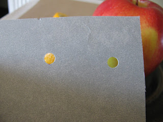
Now, for some additional strenuous exercise, I've followed the much simpler instructions to make a handy little viewfinder. This enables one to isolate spots on 2-D surfaces or in the surroundings and selectively compare them against each other.
For example, suppose you're aiming for a fairly realistic painting of apples and oranges, and you need to get the values just right.
Yes, you can compare apples to oranges -- right down to the fine points in your model. Are you confident of the lightest light? Let's compare the light on the edge of the orange peel to the light yellow-green of the apple.
The difference in "lightness" might come as a surprise. Then again, when value comparisons become automatic, you don't need to do this.
My biggest New Year's noise -- and it's a celebratory cheer -- consists of applause for my newly expanded studio, a major goal I'd set for the end of 2018. Since we first moved here, I've had a dedicated room in the basement which opens like this:
A further peek inside shows **SPACE** that used to be limited by my painting table.
My original studio is now The Drawing Room, and painting activities have spread out into the adjacent part of the basement -- where I actually have room now to stand back a bit to view my painting in progress. Here's a not quite 180-degree view, starting at the door to The Drawing Room.
Talk about shrieks of excitement!
I have a lot to accomplish in 2019, and I'm newly energized when I head downstairs first thing each morning. C'mon, let's get going ---!


This is so inspiring. As always.
ReplyDelete