I have more than one summer's ideas up my sleeve – although it will be hard to beat "Partial Eclipse (Partial Tondo)" which even earned admiration from my furnace repairman! I've resolved though, that while I'm experimenting with different media and techniques, I don't want to lose touch with my greatest interest, the human face and figure.
I decided to work with a master portrait as I experiment with different approaches – and just the right candidate showed up in a decades-old sketchbook. (I have a vast hoard of those and am trying to glean them….somehow). Here's the lucky candidate, the famous though world-weary barista in "The Bar at the Folies-Bergere" by famous 19th century painter Edouard Manet.
The assignment: First, make use of two supplies I haven't used before – a retarder (keeps acrylic paint from drying too fast) and a paper palette. (Late report: Neither of these turned out to be helpful to me, in the way I'm used to working.)
Then, work in a "reductive" or "subtractive" manner to pull out the portrait from a very splashy first layer.
Hmm. This looked so much better in a video I once watched. Moving on a little:
I'm now at the point of adding paint in the usual way – and this model is not easy, with that very slight tilt to her head, the wan expression, the indecipherable chin-line. This is as far as I'll take it:
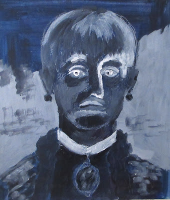
On to the next experiment. Now I'll do a simple black and white study, accepting the challenge to think in reverse, using white/light grey for the darks of the model and black/light grey for the lights. This took a lot of concentration and I didn't always succeed. What's more, it's downright weird.
Accepting that I'd probably make it even weirder, I turned to an electric colour combination and finished the session with this:
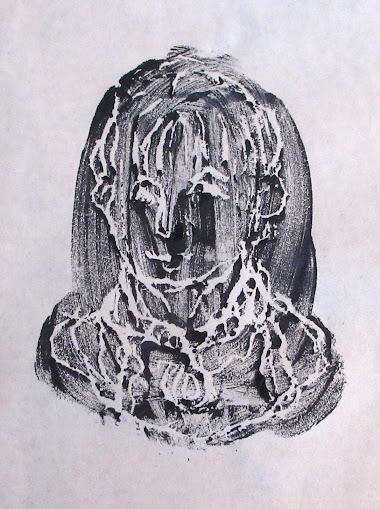
Then, along came the day assigned to bundling trash and recycling. I put aside another thin styrofoam tray that eventually, with others of its ilk, will have to be delivered to a special depot. But wait! Why not try something that's been in the back of my mind for a long time? – see how this kind of tray would work as a base for printmaking.
And I'll start with the most exacting way to print multiples – engraving. ("Multiple" is a printmaking term -- I'm not using the word in its current lazy sense.) As shown here, engravings are created by incising a metal sheet with a metal tool, applying and then wiping away the ink – which remains in the incised lines. Paper is laid on the metal, and both are passed through a press – and the results can be phenomenally detailed and gorgeous.
But:-- this isn't likely to work with styrofoam, is it?
First state, as they say in printmaking lingo:
Uh-oh. Too much paint.
Final state:
All right. I got that out of my system. Now it's time for a last extravaganza suggested by that sketchbook note from the early 1980s. That's when I'd first compared the scene at the Folies-Bergere to our local Topanga Café – which sadly burned down in 2018.
JT and I used to go there for an occasional Saturday night dinner, and all those years ago, I had imagined morphing Manet with Topanga. (That dark-eyed brunette and the guy with the balding head….? No, not us.)
First, a quick mental warm-up (otherwise known as A Walk Down Memory Lane). The Topanga was famous for its colouring cards, with the best ones framed and displayed in a rotating exhibit.
I could have asked – grown-ups used the crayons, too – but never got up the nerve.
Well, here we go.
And here's as final as this could get, three hours before my end-of-month deadline.
I'll probably fiddle a bit more with this painting, but tomorrow Summer Camp moves on to our next act. Two guarantees: Happy Hour prevails, almost any time of day and, two, there is one thing we will not do at summer camp, now or ever:--


No comments:
Post a Comment