Tuesday, June 17, 2014

A tight squeeze in the middle


It was a tight squeeze, but I've just finished the second painting -- the mid-section -- of the proposed triptych (a 3-part series, intended to work as a whole) I described in Inspired by the blue and white girls. That earlier post introduced the first (left-hand) panel, "Fishing With the Blue and White Girls" shown here:


With the second panel, I've learned some big lessons -- including what an innocent I was at the outset. The first lesson, one that kept my brain cells whirring for almost two weeks, was that I needed to find a way to break up the horizontal line of the table's back edge. Did I not foresee that I was going to have to deal with this line (and the blank space above it) travelling along to the right, across two more paintings? Obvious answer: No.

Okay. I'd planned to call this second one "Celebrating with the Blue and White Girls" so with the gorgeous Corsican hellebores blooming in our front yard, I decided to break up the space above the table line with (1) a big bouquet, and (2) a basket of party favours.


Early into the layout, I stumbled on the next big lesson, which might sound a bit like Math Anxiety Redux:


(A) 1 + 1 + 1 = 3 paintings = 1 triptych
(B) 2 + 1 = 3 paintings = 1 triptych
(C) 3 paintings = 1 triptych
(D) 1 long sheet of paper divided by 3 = 1 triptych

Statement D says it all. The best way to develop this triptych would have been to start with a giant piece of paper, lay out the whole 3-part sequence, then cut the sheet into thirds, and begin to paint. Alas, no such room in the small basement studio, and I soon realized it was going to be a neat trick to make a unified transition from the right side of "Fishing" to the left side of "Celebrating."

In any case, here's the final version of my latest (copyright 2014) -- you can view its evolutionary challenges here.

 
And just think: I'll be able to practice what I learned when I move on to the final right-hand panel and aim again for a seamless transition.

An unexpected pleasure of doing this series, though, is that another Blue and White Girl has surfaced among my friends. Well, why should I be surprised that my wonderful friends, unknown to each other, would meet, find common interests, and appreciate each other via my little corner of cyberspace?

Bouquets to all of you! (Luckily, I took this photo on Day 2 of my still life set-up, after seeing that the hellebores had unexpectedly straightened up and flipped themselves to the left overnight -- after I'd laid in the basics.  On Day 3, they had completely drooped over, and I had to refer to the photo more than once.).


Friday, May 30, 2014

The Sculpture Garden at The Yellow House


This month we celebrated two years since taking possession of The Yellow House. Almost faded from memory now is the gruelling 5-block move from our old place, an epic journey that went on into mid-July. Reflecting from time to time on where we've come from and where we've landed, one or the other of us will say, "Well, it's the best we could have done under the circumstances."

As this spring has shown, there are both old and new pleasures to cheer us on. There are still some surprises coming up in the garden we inherited here. And most of the plants we brought along have put down roots and are thriving, with one exceeding all expectations. Years ago, we brought to Vancouver from our cabin property a small clump of Rosa nutkana, the wild rose of British Columbia. In our old yard of "mixed sun and shade," it produced just a few blossoms. Here, against the sunny western fence of our small front yard, it's tripled in size and has been laden with scented blooms since mid-May.


Another remnant of Cloudburst (the name we gave our cabin, situated below Cloudburst Mountain) has come into its own, a half-finished sculpture called "A Bird in the Hand." It has a story, of course -- the story of my failed attempt to become a sculptor.

Our cabin property was amply supplied with huge cedar trees and lots of windfall, and I thought the giant logs had the makings of some statuesque figures. Coincidentally, as I began to make my plans, we fell into conversation with a logger from the next-door property, and I mentioned that I was planning to carve sculptures. "From what?" he asked. "Yellow cedar," I answered -- modestly proud that I knew the wood of choice for coastal First Nations' traditional carvings. "Where'd you find THAT?" he asked. "All over the place; we've got lots of it," I answered.

Rolling of eyes followed -- as he explained that although the wood might be yellowish, the trees surrounding us were RED cedar...not suitable for carving...and that yellow cedar grows farther north along the coast or higher up in the mountains. What's more -- though he was hardly the type we'd consider a soulmate -- he invited us to his cabin to see his own chainsaw carvings (which were not bad at all) and gave me a one-and-a-half foot high chunk of authentic yellow cedar.

With more realistic plans than I'd had originally, I made a small hand-sized clay maquette (model) as a guide to a larger cedar version to be called "A Bird in the Hand."


Throughout one summer, with chisels and mallet, I worked and worked and worked on that yellow cedar. It was hard, literally hard, and before long I was having trouble with the old shoulder injury I'd acquired years before from an Ontario canoe trip undertaken without adequate conditioning. Before long, I had packed it in.

The barely realized sculpture came home to Vancouver with us to live in a corner of the basement, where I almost abandoned it two years ago. But no-- why not let bird and cedar back into the open air, here at the Yellow House Garden, and let the weather take over where I had left off?


"A Bird in the Hand" has survived two winters now, with a sinuous clematis vine as its backdrop. It looks rather striking when rain darkens its wood or when the afternoon sun casts a shadow from the bird shape onto the curve of the right thumb. It's not a bad companion to nature's own sculptures -- first, the driftwood piece from a Howe Sound kayaking trip:


And second, a truly elegant "wing" of driftwood from the waste wood pile (can you believe it?!) at Kitsilano Beach:--


The Yellow House Garden also features dozens of cherished stones, some of them interestingly sculptural like the title photo above and this one, with mouth wide open:


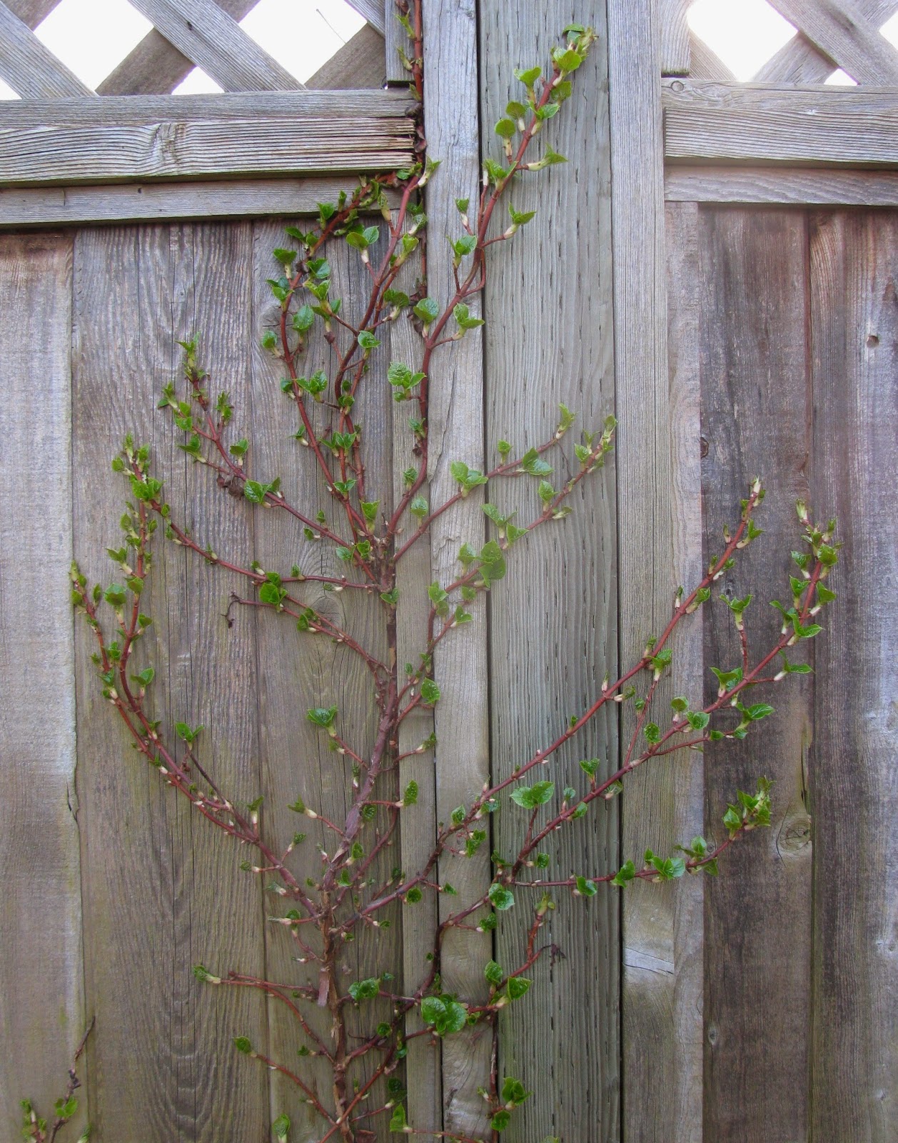
I was tempted to try sculpting once again with the amply-branched small tree in the back yard (Attention, Friend L: Is this a California lilac?). But topiary with this species turned out to be a mistake. Last fall I trimmed it into five globular shapes, imagining that its spring flowers would shoot off fireworks in all directions -- but the new leaf growth charged rampantly ahead of the flowers, turning it once again into A Small Tree With a Lot of Branches.


No additional sculptures are contemplated. After all, looking down into our front garden, we find that jungles have their own perfect charm.


Tuesday, May 6, 2014

Back to the bestiary -- it gets worse and then it gets better


I barely wince now when I go to the library and walk through the courtyard's unsavoury animal sculptures intended as "public art". For this, I can thank all my friends who read my earlier blog on the subject, courageously viewed the menagerie, and shared my gut response with comments like these:


- "I would never take my grandchildren to this library!"
- "If WE think these are scary, what impression do they make on a toddler or young child? This stuff belongs in a gallery or show, to be seen by choice. ...It doesn't belong in a library."
- "Shame on whoever did this."
- "Ooh...these ARE creepy."

With all this moral support, I was well fortified by late autumn 2013 when I arrived at the library one morning to find that the wisteria around the courtyard entrance had lost all its leaves revealing........oh, no! Two more distasteful sculptures that were previously (mercifully) hidden in the foliage.

There's an east-side Creepy Thing:


...and a west-side Creepy Thing:


What ARE these grotesqueries?? At first, I thought they were dugongs or manatees, or whatever marine animals are supposed to have inspired sailors' tales of mermaids. (Ha! Tell that to Hans Christian Andersen.) But on second (painful) glance, these creatures seem to have fur and claws, not scales and fins. Let's not speculate any further.

I've tried to be fair to this sculptor. Maybe his off-base series follows a little-known tradition in public art -- an idea suggested to me by a fascinating book I read recently. THE PROUD POSSESSORS, by Aline B. Saarinen (wife of the famous architect), recounts the experiences of famous (and not so) American arts philanthropists and recaps the beginnings of famous art collections in the US. She writes:


When the Philadelphian William P. Willstach made so substantial a fortune from selling saddlery hardware that in 1858, at the age of 48, he found himself in a position to retire, it seemed completely natural to spend the rest of his life collecting fashionable contemporary art to go into his fashionable contemporary house. If art in the home carried intimations of the cultural elevation of the owner, with equal logic ,art in the city would make Philadelphia "the Athens of America." This was the stated goal of the gentlemen who, in 1871, organized the Fairmount Park Art Association, the first group in America dedicated to adorning public parks and places with statuary. Their up-to-date taste led them to a Dying Lioness, Hudson Bay Wolves, and slightly constipated-looking marble figure called "Il Penseroso." (- The Proud Possessors, Aline B. Saarinen)

Dying lioness? Hmmm, sounds rather like our local sculptor's anorexic feline.


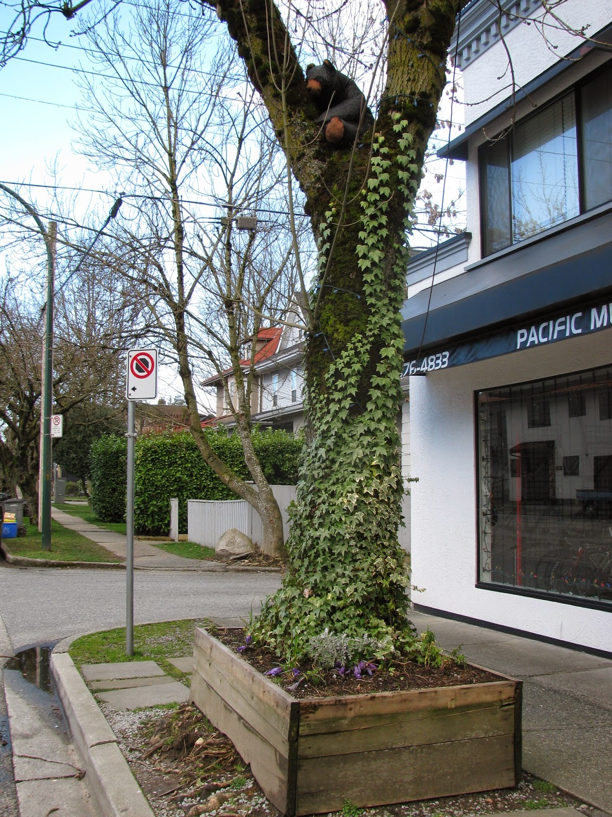
Ugh. So let's leave all this and travel eastward about ten blocks where.........meanwhile, in another part of the forest, an unsung, unpaid, truly philanthropic artisan has installed an unofficial but delightful work of art:


If those green scales suggest an alligator, it can only be a very harmless alligator enjoying the pleasure of hanging out with the most engaging bear in east Vancouver. The local public along this modest side street applauds this one!


Tuesday, April 22, 2014

Let the games...continue


Through the seemingly endless rains of March, I let loose again with my lively game of The Colourful Past Series. The goals of the game have been described before with two of my paintings "Small Front Windows (Colourful Past #1)" .....


... and "Three Neighbours on Quebec Street (Colourful Past #2)":


The objective is to plunge adventurously into colour, to Do Something with my fascination with the details of Vancouver's old architecture, and to work in a more experimental style -- sometimes having a fun splash with texture tools like those pictured at the top.

By now, I've "collected" in my sketchbook dozens of small residential windows, with their almost endless variations as to overall shape, size, shape and numbers of leaded mini-panes, borders, colours, themes...and on and on. For Colourful Past #3, I decided to group samples of three different shapes -- octagon, diamond, and square -- and arrange them in a design that suggests the decorative bands on old buildings, an architectural element called "beading" as shown here:


Then, with the combination of windows and beading, I couldn't resist titling this piece, "Glass Bead Game," (copyright 2014) ,with a solemn nod to Hermann Hesse -- whose own Glass Bead Game was considerably more cerebral.

There are no competitors in my own game. No scores are kept. The tournament season is determined by when the spirit moves me. When does the game end? ...when it ceases to be fun. For now, here's the third in The Colourful Past Series, with its progression shown here.


Tuesday, April 8, 2014

The essential season


Isn't it time?  Isn't it time for winter to finally end and for spring to come into being? So many people have had a tough time of it this year -- even here on the wet coast, where we can scarcely complain when distant friends have endured one "historic snowstorm" after another. At The Yellow House, even frosty porch steps or a 2" snowfall present problems, and in the usually mild islands of the Strait of Georgia, my friend L and her husband have had a gruelling time -- uprooting from one cherished home and facing big bumps in the road (now beginning to smoothe) on the way to the next.

My earliest springs -- into young adulthood -- were spent in the magic realm of Eastern and Midwestern deciduous trees where, when spring finally pops after a frigid snowy winter, it POPS. It's the stuff that poems are made of, and it happens that my two earliest favorite poets (both New Englanders) each have their own take on the season -- each in a different key.


Robert Frost's perfect mini-poem (one of those stored in my memory) reflects on the transitory:
Nature's first green is gold,
her hardest hue to hold.
Her early leaf's a flower,
but only so an hour.
Then leaf subsides to leaf.
So Eden sank to grief.
So dawn goes down to day.
Nothing gold can stay.
(-Robert Frost, "Nothing Gold Can Stay")


e e cummings' poem celebrates the ecstatic. Still in my memory bank decades after I discovered the poem, its first stanza would recur to me often when spring finally popped among the deciduous cottonwoods and red alders at our cabin property:

i thank You God for most this amazing
day: for the leaping greenly spirits of trees
and a blue true dream of sky; and for everything
which is natural which is infinite which is yes
(- e e cummings, "I Thank You God for most this amazing day")


I came late in life to the perfect poet Pablo Neruda. Regrettably -- and with apologies to my dear friends A and K who both, in different worlds, know and love Spanish -- I can read Neruda only in English. I first discovered him many years ago when I read Jon Kabat-Zinn's book FULL CATASTROPHE LIVING (worth a read!) which closed with a poem that begins:


Now let us count to twelve,
and we will all keep still.
For once on the face of the earth,
let's not speak in any language.
Let's stop for a moment
and not wave our arms so much.
(-Pablo Neruda, "Keeping Still")


Ever (or almost always) respectful of copyright, I've just nibbled
here at these poems. But the great paean to spring, Neruda's
"Deslumbra el dia" or "Dazzle of Day" must be consumed whole:

Enough now of the wet eyes of winter!
Not another single tear.
Hour by hour now, green is beginning,
the essential season,
leaf by leaf,
until in spring's name, we are summoned
to take part in joy.

How wonderful its eternal all-ness.
New air, the promise of flower,
the full moon leaving
its calling card in the foliage,
men and women trailing back from the beach,
with a wet basket of shifting silver.

Like love, like a medal,
I take in,
take in
south, north, violins,
dogs,
lemons, clay,
newly liberated air.

I take in machines smelling of mystery,
my storm-coloured shopping,
everything I need:
orange blossom, string,
grapes like topaz,
the smell of waves.
I gather up,
endlessly,
painlessly,
I breathe.

I dry my clothes in the wind,
and my open heart.
The sky falls and falls.
From my glass,
I drink pure joy.
(-Pablo Neruda, "Dazzle of Day")


I've done some reading about Neruda, and he strikes me as a great humanist. He came from a modest family in the Araucania region on Chile's northerly coast, a region even wetter than Vancouver -- thus "the wet eyes of winter." His literary gifts eventually took him to sophisticated intellectual and consular circles in Europe and then full circle home to Chile, as a trusted colleague of Salvador Allende.

The story is told that when Neruda campaigned for elected office in the most deprived area of the country, the harsh deserts of the north, the miners poured out of the earth to meet his train, chanting his poems and calling, "Neruda! Neruda!"  I learned also that this complex and sensitive man gathered an immense seashell collection -- and this, along with the lemons that appear often in his poems, inspired my 2002 painting, "Appreciation - For Pablo Neruda." (This is one of those Early Works that tells me that I am  making some progress)


Right now, we look out our front window to see nest-building crows snapping long twigs from the neighbouring trees. In and out of the massive clematis vine on our front porch, the pretty little house finches are bringing smaller bits of construction material to renovate two old nests and, we're sure, build some new ones.

So many good things are happening now in the lives of friends. Glasses raised?  Let's drink that glass of pure joy! It IS time.


Tuesday, March 11, 2014

Math anxiety: Additive and subtractive colours


Math was never my strong suit. I went as far as an elective pre-Grade 12 summer school course in Advanced Algebra, taken solely because two of my active crushes were math brains who thought it would be fun. When I heard the term "imaginary numbers," I was hopeful these would be something you could dress in costumes and write your own scripts for. When this turned out not to be so, my eyes glazed over.

Fast forward to my art studies and my current year's goals. At this stage in my self-study -- after ten years, I sometimes pretend I'm working on my "home-grown MFA" -- I decided I should complement my learn-by-doing approach with some formal knowledge. One area for study has been colour theory, and I started off by replicating the familiar colour wheel.


Almost everyone is at least vaguely familiar with this concept and the primary colours red, yellow and blue that combined in pairs make orange, green and purple. But that's only the half of it. Or the third, really. This is something I learned, with math-induced knots in my stomach, as I bumped into additive and subtractive colours. Huh?

In addition to the colour wheel system of artist's pigments, there's a system describing the interaction of coloured lights, such as stage lighting -- colours that are called "additive." There's also the world of transparent dyes, such as those used in printing and photographic processing -- a group of colours called "subtractive" -- or in my own terminology, Subtractive One. The colours and colour relationships in these alternate universes are, at first glance, so bizarre that I decided I needed some "pneumonic devices" (as someone I once worked with would have said) to help me get a fix on them. Then I had so much fun with this project I decided to share it.

Abacus ready?

The terms "additive" and "subtractive" in themselves make little sense to me, even after they're defined. To remember that additive colours = coloured light, I hold in mind an ad (get it?) for a theatre performance:


Now follow closely: With coloured light, the primary colours are red, green and blue-violet. Once you've accepted this (it took me several weeks), consider that each pair will produce one of the secondary colours: yellow, magenta, or cyan (a zesty turquoise tone). Red and green combine to make yellow. Red and blue-violet combine to make magenta. Green and blue-violet combine to make cyan. I know. Mind-boggling.

So here's my nifty pneumonic cheat sheet, with small fruit icons (sorry about the cyan-coloured lime -- closest I could come -- and as for the relationship between fruit and theatre performances.....?) for the colours, their relationships, and the stunning information that, when combined, these colours produce "white light" ...since all colours are reflected and none absorbed by the surface they're directed to.


On to Subtractive One, as I call it:-- The transparent dyes of print processing consist of the primary colours magenta, cyan and yellow, and the secondary colours red, blue, green. Magenta and cyan combined produce blue. Magenta and yellow combined make red. Cyan and yellow combined make green. Tricky, eh? Take a deep breath and browse through my colourful cheat sheet of "open book" icons and note the punch line: When combined, these colours produce black ...since all colours are absorbed and none are reflected.


Just think: You are now empowered to make a little sense of the small coloured test swatches that you'll find somewhere on virtually any printed packaging or publication.


Full circle now -- back to the original colour wheel and artist's pigments. These colours are also subtractive (aka Subtractive Two), since theoretically all the colours combined, as with Subtractive One, make black -- and for the same reason that all colours are absorbed and none reflected. This is the familiar territory of oft-quoted but rarely accurate maxims such as "Blue and yellow make green." The thing is that artist's pigments are mostly opaque so they don't behave like Subtractive One. And a "green" colour can be produced from various different "blue" and "yellow" colours because different chemicals can produce similar colours. In practice, blue and yellow are as likely to make mud as to make green -- one reason why there are literally hundreds of manufactured artist's pigments from dozens of manufacturers.

Here's a riff on the typical colour wheel, produced with all the tube colours I have on hand.


It's really rather absorbing, to the likes of me anyway. But without all this technicality, let's consider colour another way, as expressed by the artist Wolf Kahn. His paintings seem to have almost all the same subject -- the vertical tree trunks of a dense wood -- but each varies with his astonishing colour choices. He says:

(Because one)..."is more alert to the possibilities of color, all sorts of other possibilities go along with that:-- the possibilities of greater affection for all things, greater tenderness toward the world at large, greater generosity in life generally....If you are an artist in any kind of way, what you are really driving toward is to become a deeper person." -Artist Wolf Kahn

And a further note about something that's made my life more colourful: As it happens, I snagged a math brain after all. Little did I know 43 years ago that the love of my life would find it a pleasant recreation to get out pencil and paper and work on quadratic equations.


Friday, February 28, 2014

Inspired by the blue and white girls


You've read here before about my favourite blog:-- you know the one and it's getting better every week. I read it for a regular injection of my childhood friend's wit, creativity and down-to-earth take on life, as much as for the fascinations of her magic kitchen realm, which I travel via her experiences. She began a memorable post with the words, "My mother-in-law was a blue and white girl. I am, too." Accompanying the text was a photo of enchanting blue and white baking dishes and such (some inherited from her mother-in-law) against the blue and white tiles of her kitchen wall. To my ears only, it called out "Paint me!"

I'm a blue and white girl, too, and over the years my eye has been captured by all kinds of blue and white objects that might work in a still life. So why not now? I rummaged in my stash and found way too many bits and pieces for just one painting. Okay. Following my favourite painter/writer's advice to "constantly set yourself challenges," I decided I'd do a triptych -- an integrated work comprised of three parts, the "Blue and White Series." What's more, I'd work as large as I could with each of the three separate paintings the size of my art paper -- about 20" x 26" in finished format -- for a triptych total width of five feet.

After much fiddling, I arranged my set-up for "Fishing with the Blue and White Girls." A day later, the bowl would acquire some hard-necked garlic.   And those are beautiful weathered seedpods of Chinese Lanterns, which will stand in for their previous orange incarnations in the painting.


Uh-oh. With this set-up in the corner of my six-foot worktable (the main scene of action in my small 10x10 foot studio), there wasn't room for my easel -- !! A big year-end overhaul was obviously required to select and reposition the tabletop essentials. And lucky me! Coming along at precisely the right moment to see me through this project was a far-off friend's lovely gift of two hand-thrown pottery jugs, along with the potter's recommendation that they'd make great brush holders.

Here's the new worktable set-up (and the easel at an angle at which it would never be used!):


And in a starring role, at right stage centre back (?), are the two charming jugs -- one labelled STUFF  and the other TIME  -- "Just what you need," my gift-giving friend said.


Okay. We're ready for lift-off. This is the painting I described in my previous post, in which I began to work consciously on the idea of "painterly" vs. "linear."  Despite the fact that the composition is filled with anchoring lines, you can see from its evolution  how I tried to work with a broader brush. Here's the final outcome:


It's interesting -- to me, at least -- to compare this first painting of 2014 with one I finished in February 2007 -- exactly seven years ago, featuring that same irresistible cat-and-fish teapot and a similar colour inspiration. It's called "White Cats and Rumi Blue" -- gathering all the little gift cats (white ones, at least) I've ever been given and a particular shade of blue that led to my bonding with a cherished work-buddy as we discovered we both loved cats and a particular shade of not-quite-navy blue.


Whether my latest painting is painterly or linear, can we agree that I've made some progress? And who knows where the three-part series and the challenges I've set myself will take me?

As for the Blue and White Girls at the top of this post, they're no one in particular (except some magazine models). I was working on some colour studies with "chips" of colour cut from magazines and couldn't resist seeing what I could do with patterns clipped from the past year's LL Bean catalogs. Some Blue and White Girls just never grow up.