Tuesday, October 29, 2013

Danse macabre


Happy Halloween! In another amazing convergence, I happened on an old drawing exercise just at cucurbit season. The drawing exercise, I'm sure, was originally inspired by the Japanese artist Hokusai (October 31, 1760 - May 10, 1839) who did some fascinating drawings of skeletons in action.

The exercise proposed in my drawing book is this: Cut out a newspaper photo of a figure (dancers, athletes and rock groups work beautifully) and, with reference to anatomy charts, draw the bones that underlie the figure's position. Here are the reference photos for the two dancing skeletons shown above:


It's not easy, even in this casual playful mode. The pelvis, which someone described as "an elegant bowl" and the rib cage present particular challenges. As Dylan Thomas said in another context, "Oh, easy for little Leonardos!"  Whether or not it was easy for him, Leonardo permanently set the bar high:--


We saw his actual drawings in a travelling show of Leonardo's works from the Windsor Castle collection. It was the year after JT came home from the hospital, and we took a break from his busy rehab schedule for a special trip to the Vancouver Art Gallery. Along with the rest of the throng, we oohed and aahed until at a certain point JT said, "Maybe we've had enough now. This is starting to remind me of the Physio Department."

But back to Cucurbits and Friends! Here are this year's carefully chosen few -- with two small bitefuls (?) from the unidentifiable volunteer vine that sprung up in our garden in July.


Now here's my prototype plan for "Dancing with Cucurbits", showing the source photos with yellow paper stand-ins for the gourds:--


And here's the final version...definitely non-archival and intended Just for Fun:--


Projecting ahead to Cucurbits 2014, things can only get more exciting. We have a wonderful bond with our new Chinese neighbours (okay, we're the new ones; they're the established ones) based on my enthusiasm for their front yard trellis and its output:-- the same fascinating squash that was grown by the elderly Chinese man in our old neighbourhood.

This friendly couple has twice presented us with two of these intriguing vegetables. I was advised to wear gloves or use a paper towel when peeling them although theirs were not as spiny as those I saw on our old street. Delicately stir-fried with garlic, they taste something like a cross between honeydew melon and zucchini.


Searching for more information via Google Images, I learned that what I thought were "Chinese vegetables" are actually chayotes, native to Mexico and Central America.

Nonetheless, we've come to call them "Anita's squash" -- and Anita has promised to give me a whole plant next year! If all goes according to plan, our tiny front yard might actually sprout a Chinese-style trellis, and I'll be able to document the entire unfolding of what was once The Great Cucurbit Mystery.


Tuesday, October 15, 2013

"A Question of Scale"


About this time last year, I was just getting established in my new basement studio after all the months and angst of moving from our old house. Placing some of my cherished artifacts on studio shelves, I became fascinated again with their shadows cast against the studio wall/ceiling -- a similar fascination to the one that led to my 2008 painting "The Artist's Hand, the Artist's Eye." 

As I continued unpacking -- congratulating myself on saving treasures ranging from my mother's antiques to my own hoards of clam shells -- I couldn't help but note how much I enjoy unique labels on bottles and boxes, preferably anthropo- or zoo-morphic. (Maybe I should have gone into package design?) Then I suddenly remembered a coffee break conversation from an early drawing class.

The topic had shifted to our instructor's painting experience and he casually said, "Do you know what has always intrigued me about paintings?" "Colour!!" we answered in chorus. "Well, sure," he said, "but I'm talking about scale." Scale? We looked blank. "You know -- you'll have a canvas, maybe 2x3 feet, and on it are all these little people in a crowd scene -- or maybe a bowl of fruit with lemons larger than could ever be possible." Scale.

Suddenly, it became irresistible to play with this idea within a painting. I rearranged some objects to illustrate the point:


Then I decided, in keeping with the theme, that I'd need to do a carefully planned layout, to scale -- a decision that would cost me about 45 hours of work before I even set paint to paper, as described in a previous post

I started with a 10" x 13" drawing, which took me a mere 20 hours:


-- and eventually scaled this up to 20" x 26", the size of my painting paper -- to which I then transferred the outlines.


To accomplish the transfer of the same-size layout to my painting paper, I cut away sections of the large drawing, bit by bit -- more painstaking work, which much later yielded some amusing moments when I could place the pencilled figures against their painted counterparts.


And now...ta tum...five months in the making, here's the final painting: "A Question of Scale" (copyright 2013).


So what do we have here, contained within a space of about 520 square inches? Three human figures of different sizes, each larger than a mountain (see the blue mug) and smaller than a brandy bottle (Metaxa -- a delicious treat in days gone by; white wine does nicely nowadays); a wren-type bird larger than a seagull and a leopard's head (see the Metaxa box); two mugs of different sizes and two similar bottles of different sizes which, if stacked, would be twice the size of the mannikin human figure.

The evolution of this painting can be seen here  -- and it's not a process that I'm ever likely to get involved in again.

Holding this up against my general goal to make each painting "my best yet".... well, it's not. In fact, there are so many mistakes (about which the artist's lips are sealed), it could be a nice example of "What's wrong with this picture?" Still: I learned a lot and worked the idea out of my system -- but one has to wonder if the outcome was proportionate to the effort.


Tuesday, September 24, 2013

A colour for the season: Cadmium Yellow Deep


Many years ago, when I first ventured beyond a 5-colour student grade paint set, one of the first artist-quality paints I bought was Cadmium Yellow Deep. With a twisted tube and a dented cap, it was on sale for only a dollar. Post-purchase, I discovered that its deformities had allowed air inside the tube and only a small bit of the paint had not dried out -- but the colour was so inviting, I kept the tube around long after it was usable.

Cadmium Yellow Deep is a scrumptious warm dark yellow, perhaps best equated by some of the pleasures of an autumn garden. I've thought of my old paint tube lately as I've looked out our kitchen window at the volunteer cucurbit vines shown above. They sprouted in early July -- from a squirrel's cache?  For whatever reason (too much shade?), there's been no development of squash or melon, but the advancing vine and the gorgeous simple flowers are a joy.

A similar deep yellow can be found in variegated marigolds, JT's favourite. (The orange of the traditional marigolds of elementary classroom projects is closer to Cadmium Orange).


I'm always pleased when, on my own, I discover the insights or teachings of master artists. From our first spring in Vancouver, I've loved the sight of the city's abundant roses, rhododendrons, and cherry blossoms viewed on a grey day. Not too long ago, I read about a man who visited Monet in his original Giverny garden. The visitor was disappointed that the day was so dreary but thrilled that Monet enthusiastically toured him around -- until sun broke through the clouds. "We might as well go in now," said the artist, "the flowers can't compete with full sun."

It's an elementary principle of painting: Crowd the canvas with unrelieved intense colours and it's an overwhelming blur OR set the brights off against greyed or muted colours and it's a marvel.

As I write this post, the seasonal rains have begun, but still blooming in the garden is one of our great favourites and a prime example of Cadmium Yellow Deep -- Black-eyed Susans, popping right out of the dull landscape of autumn. Monet would have loved these grey days.


Friday, August 30, 2013

Public Art - the dark underbelly


I've always been suspicious of "public consultations" (on proposed urban rezoning, for example), and I'm even more cynical about "public art." In Vancouver these days, there's one offense after another, in either or both of these categories. I'll leave the dark rezoning stories to the many local blogs dedicated to the betrayal being felt by neighbourhoods under assault, and I'll stick to the art. The so-called art.

A few months ago, I started using the Kensington branch of the Vancouver Public Library, just two blocks away from us. I'd once returned books there several years ago and found that they'd just begun to install metal animal sculptures as the public art component of a new condo and commercial building complex that itself outraged the neighbourhood with its excessive height.

With those first small sculptures, the entrance to this lovely brand-new library became... ooh...ugh...creepy...repulsive...with RATS. I tried to think Pied Piper of Hamlin but, no, a vicious-faced beaver was leading the rodent pack.


Fast forward to 2013 when I happened on the full catastrophe, the completed installation, starting with this stomach-churning embrace of a giant pig and a python. ("Mum, is that the kind of snake that wrapped around the two little boys and....." "DON'T LOOK, KID, don't look!").


There's a smaller porcine sculpture which looks like a mass of congealed piglet, but mercifully my photo was compromised by the strong August shadows. ("They wouldn't want to see them anyway," said JT). And okay, there's one grouping that I almost like -- the otters who hang out near a mini-waterfall.


There's still something nasty about their facial expressions, though -- a weak spot of this artist, I think. I mean....does this bear look like it has anything but evil intentions? And does this child look like he's imagining a can of bear spray in his left hand? Definitely not Winnie-the-Pooh and Christopher Robin.


These animals lurk about the courtyard through which the library is accessed -- initially a big surprise to library staff and patrons who had no say in the selection of the public art nor its placement. (You can read more about what the series is supposed to represent here -- an article in the local newspaper that coincidentally appeared, just as I was thinking about taking these pictures). But imagine the surprise of the condo residents who woke up one morning to find perched on the heights, three storeys up, this vulture with a 12-foot wing span.


Okay, another admission: On my (short) preference list, the vulture ties with the otters -- but it's not MY balcony it's sinking its claws into.


At the bottom of my preference list is another Vancouver public art mistake:-- the $100,000 white plastic poodle-on-a-pole installed in one of the few remaining neighbourhoods that harbours small artisans, antique shops, small-scale jewellery and fashion designers, and ethnic restaurants and coffee shops. You can imagine the hackles raised there by this piece of kitsch.

The commissions for both the poodle and the Kensington animal sculptures were for mega-bucks and were awarded to out-of-province artists. That's how things happen in the dark underbelly of the City of Vancouver in these sorry times.

P.S.  As I sit in the library hurriedly posting this blog, I know the rats are waiting for me just outside the door.


Tuesday, August 13, 2013

Back to the future


"Obsessionated." It's a mixed-up word -- a malapropism -- passed along with relish by my lifelong friend, a food-and-fascinations blogger. I like it! It certainly describes my feelings about the features and individualities of old buildings, both the Downtown Details of my working days and the quirky charms of old family houses like those on our side of town that are falling fast to the wreckers' ball.

I'm fascinated by the variety in these old houses of windows, doors, porches, bays, roofs -- everything.


As I've sketched and occasionally photographed the details that catch my eye, I've finally decided to do something with them, in terms of painting. Meanwhile, I've also committed myself to exploring more adventurous byways in colour.

With this post, I'm introducing a planned series based on old architectural features and new (to me) colour possibilities. Here's the first of the series, "Colourful Past - Small Front Windows" copyright 2013).


In this series, I expect to be working in a looser style than in my traditional still lifes -- in this case, I textured some layers of paint by applying plastic wrap during the drying phase, an exciting process when the plastic is lifted from the dried paint, revealing unpredictable patterns of the underlying paint layer.


While I've already recognized some problems to be worked out, I've enjoyed this kind of splash. You can see the evolution of "Small Front Windows"here.

The works in the series might become more or less geometrical, more or less abstract, more or less colourful. Whether or not you like the concept, you'll be seeing more of the "Colourful Past" series from time to time. After all, I'm obsessionated.


Tuesday, July 30, 2013

Small change


This week, a friend from my last-ever job will retire. The workplace where we met was undergoing a time of change, when angst and tension ruled the day. She could do no wrong in my book, though, from my early days there when she rescued me from an environmental disaster. Always somewhat ignorant of trends in popular culture, I'd put the wrong kind of detergent in the dishwasher (who knew there'd be two kinds?), and immediately mega-suds erupted up and out onto the kitchen floor -- endlessly, it seemed.

Coincidentally, she walked through the kitchen at that moment, realized at a glance what must have happened, and dropped everything on her busy to-do list to take charge of clueless me and the frothy flood. In retrospect, it was just a hint of the wonderful supportive friend she'd be, when we shared an office in my last difficult year of working part-time and juggling home responsibilities.

What else could I do, then, but send her a card that said: "May you have as many happy times in retirement as there were bubbles when I used the wrong detergent and you rescued me."


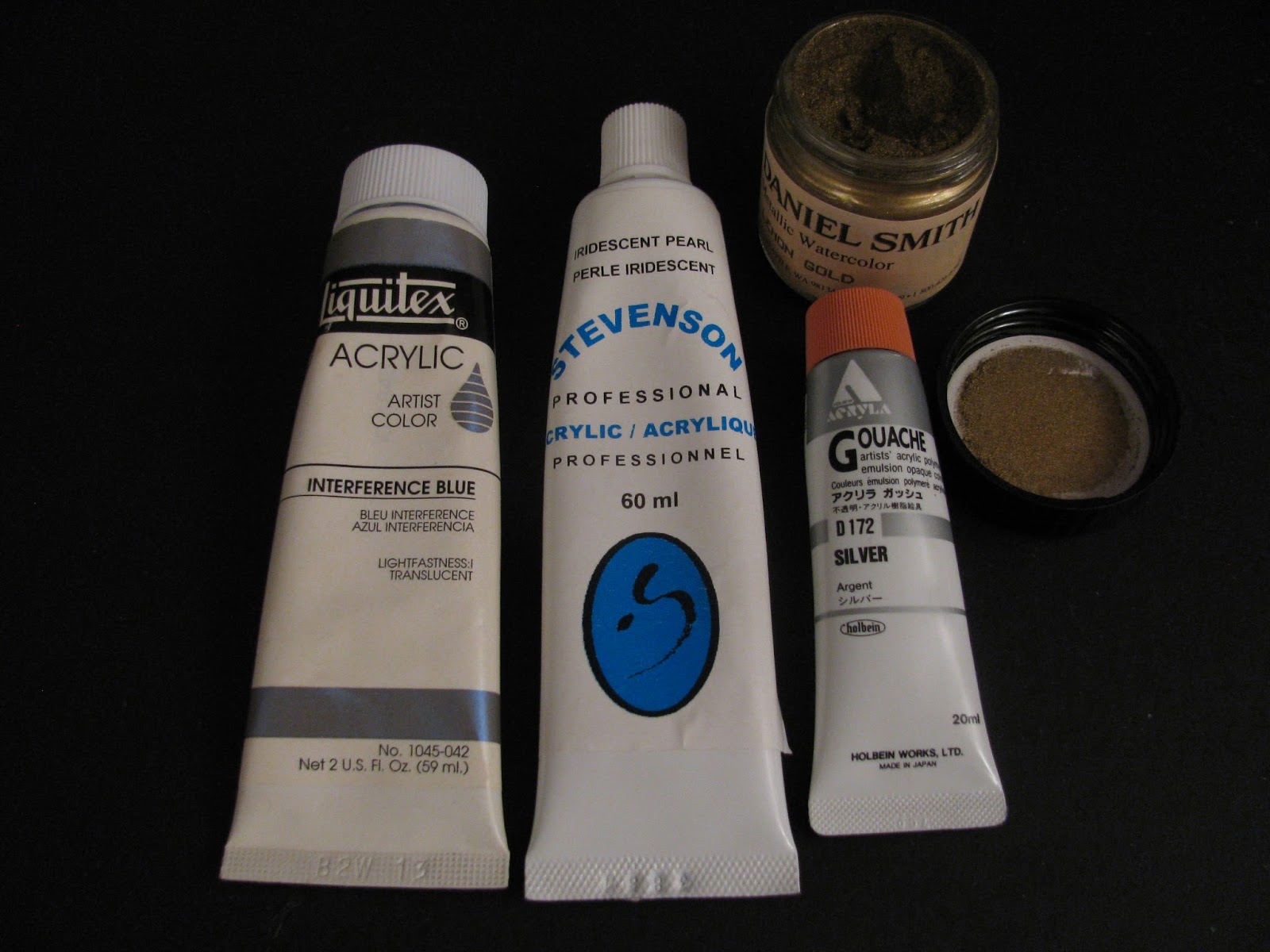
As I evolved this playful Work of Art, I thought how easy some things have become since my childhood. All I had to do to create iridescent bubbles was to mix and layer blue-green-red paints with some Pearlescent White, Interference Blue (which contains mica chips), Silver -- and even a splash of "gold dust." (Dried pigment in powder form)


The colour silver reminded me of a poster I painted in Grade 4, when our class was collectively entered in a March of Dimes publicity contest. I didn't know the word "banal" then, but it's definitely what I thought about both the contest and my own entry -- a band of humanoid (?) dimes, each a cross between Smiley Face and Mickey Mouse, energetically marching around the border of my paper.


The one satisfaction I had from this dubious project was imitating a credible silver colour by carefully blending white and grey crayons -- no iridescent anything in those days!  Oh, and I even won a prize for it. "And look at this!" the award-presenting teacher gushed. "Dimes that are actually marching." Oh, my.  Banal. The prize, though, was my own choice from a stack of new books -- and I selected "How to Make and Use Marionettes." Except for the papier mache puppet heads, the process was disappointingly beyond my capabilities. (Is this the source of my fascination with the artist's manikin of my previous post?)

A final thought on change and silver. I couldn't help remembering the song we sang at summer camp: "Make new friends and keep the old/ One is silver and the other gold." The words have quite a different ring to them at age 68 than at age 8. Who would have imagined then how far back the Golds would go, and at what an advanced age, I'd still be lucky enough to find Silver?


Tuesday, June 25, 2013

What was I thinking?


I was thinking. I really was. I was doing a lot of thinking about my art, where it was going, what I wanted to do with it. One thing I'd concluded, in keeping with my previous post about the pitfalls of intensive preliminary studies, was that I seem to work best when I go with the flow:-- when I get an idea I'm excited about, do a few black and white thumbnails to plan the composition, make a quick small-size colour study, and then plunge in.

So I got an idea I was really excited about..... The only thing was I could see that, for the effect I wanted for this particular set-up, I'd need to carefully size the objects to scale. This is a painstaking process that I've chosen to use only once before. You mark gridlines on paper (to serve as a stable reference to measure proportions) and then, as often seen in caricatures of artists, you view your set-up with pencil held at arm's length, sighting shapes and distances against the scale of the pencil -- then carefully marking these on your grid. If you create this grid on your proposed painting surface, you're now ready to go. In my case, I planned to "scale up" -- doing a half-size version and then transferring this to a second sheet, twice the size of the first, which would form a template for a painting of the same size.


Whew. It means a lot of measuring, calculating, pencilling...and erasing!

Contemporary artist Nancy Hagin, whose still lifes I admire, uses a simpler process. She takes a photo of her set-up and has it enlarged. Then she marks the gridlines on it, marks gridlines on her painting surface, and painstakingly transfers the shapes from drawing to painting surface.

I shouldn't even have used the word "simpler." It all takes a lot of time, concentration, and judgment. It took me about ten hours to complete the first drawing, and now, scaling up 50%, I'm at about Hour 20 -- and maybe 80% finished.

Among the many objects in my planned still life is the above pictured artist's manikin (femanikin?) similar to this one. In language uncharacteristic for me, I'll just say that she was a real bitch to do. Despite my lesson learned from Hemingway about resuming interrupted work, I've several times taken a wrong step when I've come back to this fiddly project. I had to do a major resizing of her hand and a double hip joint replacement, resulting in three repositionings of her foot. (-- illustrating why shopping mall rooftops that look good on the drawing board will sometimes cave in?)


Several times, I've asked myself if this is really worth doing -- but then, darn it, I want to see if I can bring off the finished piece that I have in mind. A quote that used to be posted on my old studio's bulletin board has urged me on:

When you feel the impulse to make something, do it no matter what the
cost. You can be sure of reward. So rare a thing it is to have a
desire that it is one's duty to act on it, and at once, for desire
evaporates if one delays. Forward, go to it! Be advised, act! That
is the most practical course one can take.
- Camille Pissarro in Letters to His Son Lucien, quoting his letter to
another son, Georges

I doubt that it was "so rare a thing" for Pissarro himself to have a desire (and I have tons of ideas myself) but his son Georges seems to have been a bit of a drifter, in need of his father's empathetic encouragement.

In any case, Forward, go to it!  Maybe I'll pick up some positive vibes from a wizard I know (whose recent Best of Show award is by no means reflected in her off-the-beaten path blog) and eventually pull off some magic.