Friday, August 30, 2013
Public Art - the dark underbelly
I've always been suspicious of "public consultations" (on proposed urban rezoning, for example), and I'm even more cynical about "public art." In Vancouver these days, there's one offense after another, in either or both of these categories. I'll leave the dark rezoning stories to the many local blogs dedicated to the betrayal being felt by neighbourhoods under assault, and I'll stick to the art. The so-called art.
A few months ago, I started using the Kensington branch of the Vancouver Public Library, just two blocks away from us. I'd once returned books there several years ago and found that they'd just begun to install metal animal sculptures as the public art component of a new condo and commercial building complex that itself outraged the neighbourhood with its excessive height.
With those first small sculptures, the entrance to this lovely brand-new library became... ooh...ugh...creepy...repulsive...with RATS. I tried to think Pied Piper of Hamlin but, no, a vicious-faced beaver was leading the rodent pack.
Fast forward to 2013 when I happened on the full catastrophe, the completed installation, starting with this stomach-churning embrace of a giant pig and a python. ("Mum, is that the kind of snake that wrapped around the two little boys and....." "DON'T LOOK, KID, don't look!").
There's a smaller porcine sculpture which looks like a mass of congealed piglet, but mercifully my photo was compromised by the strong August shadows. ("They wouldn't want to see them anyway," said JT). And okay, there's one grouping that I almost like -- the otters who hang out near a mini-waterfall.
There's still something nasty about their facial expressions, though -- a weak spot of this artist, I think. I mean....does this bear look like it has anything but evil intentions? And does this child look like he's imagining a can of bear spray in his left hand? Definitely not Winnie-the-Pooh and Christopher Robin.
These animals lurk about the courtyard through which the library is accessed -- initially a big surprise to library staff and patrons who had no say in the selection of the public art nor its placement. (You can read more about what the series is supposed to represent here -- an article in the local newspaper that coincidentally appeared, just as I was thinking about taking these pictures). But imagine the surprise of the condo residents who woke up one morning to find perched on the heights, three storeys up, this vulture with a 12-foot wing span.
Okay, another admission: On my (short) preference list, the vulture ties with the otters -- but it's not MY balcony it's sinking its claws into.
At the bottom of my preference list is another Vancouver public art mistake:-- the $100,000 white plastic poodle-on-a-pole installed in one of the few remaining neighbourhoods that harbours small artisans, antique shops, small-scale jewellery and fashion designers, and ethnic restaurants and coffee shops. You can imagine the hackles raised there by this piece of kitsch.
The commissions for both the poodle and the Kensington animal sculptures were for mega-bucks and were awarded to out-of-province artists. That's how things happen in the dark underbelly of the City of Vancouver in these sorry times.
P.S. As I sit in the library hurriedly posting this blog, I know the rats are waiting for me just outside the door.
Tuesday, August 13, 2013
Back to the future
"Obsessionated." It's a mixed-up word -- a malapropism -- passed along with relish by my lifelong friend, a food-and-fascinations blogger. I like it! It certainly describes my feelings about the features and individualities of old buildings, both the Downtown Details of my working days and the quirky charms of old family houses like those on our side of town that are falling fast to the wreckers' ball.
I'm fascinated by the variety in these old houses of windows, doors, porches, bays, roofs -- everything.
As I've sketched and occasionally photographed the details that catch my eye, I've finally decided to do something with them, in terms of painting. Meanwhile, I've also committed myself to exploring more adventurous byways in colour.
With this post, I'm introducing a planned series based on old architectural features and new (to me) colour possibilities. Here's the first of the series, "Colourful Past - Small Front Windows" copyright 2013).
In this series, I expect to be working in a looser style than in my traditional still lifes -- in this case, I textured some layers of paint by applying plastic wrap during the drying phase, an exciting process when the plastic is lifted from the dried paint, revealing unpredictable patterns of the underlying paint layer.
While I've already recognized some problems to be worked out, I've enjoyed this kind of splash. You can see the evolution of "Small Front Windows"here.
The works in the series might become more or less geometrical, more or less abstract, more or less colourful. Whether or not you like the concept, you'll be seeing more of the "Colourful Past" series from time to time. After all, I'm obsessionated.
Tuesday, July 30, 2013
Small change
This week, a friend from my last-ever job will retire. The workplace where we met was undergoing a time of change, when angst and tension ruled the day. She could do no wrong in my book, though, from my early days there when she rescued me from an environmental disaster. Always somewhat ignorant of trends in popular culture, I'd put the wrong kind of detergent in the dishwasher (who knew there'd be two kinds?), and immediately mega-suds erupted up and out onto the kitchen floor -- endlessly, it seemed.
Coincidentally, she walked through the kitchen at that moment, realized at a glance what must have happened, and dropped everything on her busy to-do list to take charge of clueless me and the frothy flood. In retrospect, it was just a hint of the wonderful supportive friend she'd be, when we shared an office in my last difficult year of working part-time and juggling home responsibilities.
What else could I do, then, but send her a card that said: "May you have as many happy times in retirement as there were bubbles when I used the wrong detergent and you rescued me."
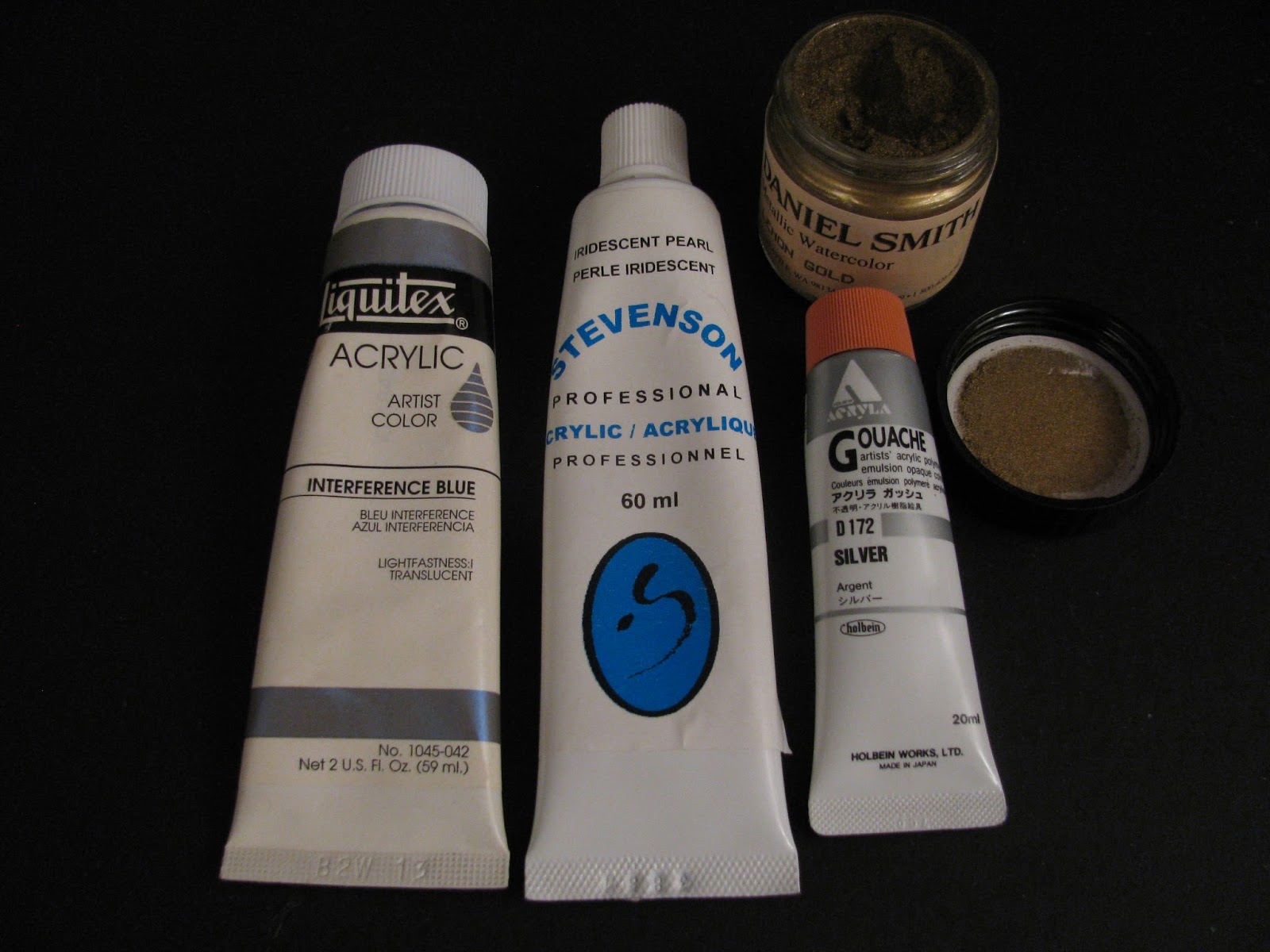
As I evolved this playful Work of Art, I thought how easy some things have become since my childhood. All I had to do to create iridescent bubbles was to mix and layer blue-green-red paints with some Pearlescent White, Interference Blue (which contains mica chips), Silver -- and even a splash of "gold dust." (Dried pigment in powder form)
The colour silver reminded me of a poster I painted in Grade 4, when our class was collectively entered in a March of Dimes publicity contest. I didn't know the word "banal" then, but it's definitely what I thought about both the contest and my own entry -- a band of humanoid (?) dimes, each a cross between Smiley Face and Mickey Mouse, energetically marching around the border of my paper.
The one satisfaction I had from this dubious project was imitating a credible silver colour by carefully blending white and grey crayons -- no iridescent anything in those days! Oh, and I even won a prize for it. "And look at this!" the award-presenting teacher gushed. "Dimes that are actually marching." Oh, my. Banal. The prize, though, was my own choice from a stack of new books -- and I selected "How to Make and Use Marionettes." Except for the papier mache puppet heads, the process was disappointingly beyond my capabilities. (Is this the source of my fascination with the artist's manikin of my previous post?)
A final thought on change and silver. I couldn't help remembering the song we sang at summer camp: "Make new friends and keep the old/ One is silver and the other gold." The words have quite a different ring to them at age 68 than at age 8. Who would have imagined then how far back the Golds would go, and at what an advanced age, I'd still be lucky enough to find Silver?
Tuesday, June 25, 2013
What was I thinking?
I was thinking. I really was. I was doing a lot of thinking about my art, where it was going, what I wanted to do with it. One thing I'd concluded, in keeping with my previous post about the pitfalls of intensive preliminary studies, was that I seem to work best when I go with the flow:-- when I get an idea I'm excited about, do a few black and white thumbnails to plan the composition, make a quick small-size colour study, and then plunge in.
So I got an idea I was really excited about..... The only thing was I could see that, for the effect I wanted for this particular set-up, I'd need to carefully size the objects to scale. This is a painstaking process that I've chosen to use only once before. You mark gridlines on paper (to serve as a stable reference to measure proportions) and then, as often seen in caricatures of artists, you view your set-up with pencil held at arm's length, sighting shapes and distances against the scale of the pencil -- then carefully marking these on your grid. If you create this grid on your proposed painting surface, you're now ready to go. In my case, I planned to "scale up" -- doing a half-size version and then transferring this to a second sheet, twice the size of the first, which would form a template for a painting of the same size.
Whew. It means a lot of measuring, calculating, pencilling...and erasing!
Contemporary artist Nancy Hagin, whose still lifes I admire, uses a simpler process. She takes a photo of her set-up and has it enlarged. Then she marks the gridlines on it, marks gridlines on her painting surface, and painstakingly transfers the shapes from drawing to painting surface.
I shouldn't even have used the word "simpler." It all takes a lot of time, concentration, and judgment. It took me about ten hours to complete the first drawing, and now, scaling up 50%, I'm at about Hour 20 -- and maybe 80% finished.
Among the many objects in my planned still life is the above pictured artist's manikin (femanikin?) similar to this one. In language uncharacteristic for me, I'll just say that she was a real bitch to do. Despite my lesson learned from Hemingway about resuming interrupted work, I've several times taken a wrong step when I've come back to this fiddly project. I had to do a major resizing of her hand and a double hip joint replacement, resulting in three repositionings of her foot. (-- illustrating why shopping mall rooftops that look good on the drawing board will sometimes cave in?)
Several times, I've asked myself if this is really worth doing -- but then, darn it, I want to see if I can bring off the finished piece that I have in mind. A quote that used to be posted on my old studio's bulletin board has urged me on:
When you feel the impulse to make something, do it no matter what the
cost. You can be sure of reward. So rare a thing it is to have a
desire that it is one's duty to act on it, and at once, for desire
evaporates if one delays. Forward, go to it! Be advised, act! That
is the most practical course one can take.
- Camille Pissarro in Letters to His Son Lucien, quoting his letter to
another son, Georges
I doubt that it was "so rare a thing" for Pissarro himself to have a desire (and I have tons of ideas myself) but his son Georges seems to have been a bit of a drifter, in need of his father's empathetic encouragement.
In any case, Forward, go to it! Maybe I'll pick up some positive vibes from a wizard I know (whose recent Best of Show award is by no means reflected in her off-the-beaten path blog) and eventually pull off some magic.
Wednesday, May 29, 2013
A studied approach
Some years ago, a work buddy whose birthday is one day different from mine brought me a beautiful silk stole from Hong Kong. I had no immediate occasion on which to wear it, but I knew immediately that I would love painting it.
I'd recently had my personal critique at the local art school and thought I'd act on one of the casual recommendations the artist-instructor had made. In answer to his question about the kind of planning I did before I started to paint, I'd said that I played with different thumbnail formats. "Fine," he said, "but that's just a start. Then, do lots of small-scale studies and try out different colours and compositions." When I asked how many studies he usually did, this painter of 20-foot-long abstract paintings said, "Oh, up to 16 sometimes." Gulp. I had no intention of doing 16, but I thought I'd give the studies a serious try.
The stole is a soft dove grey, with a small black-flecked overall pattern and accents of black Chinese characters and larger red Chinese symbols, a black border and "frog" closures. All that was needed in addition, I thought, was a single pomegranate.
And so I set to work, first making six small thumbnail sketchesn (shown above) as preliminaries to 8" x 10" studies. Here's the first study, trying out an overall blue tone:
Hmmmm. I could see that the Chinese characters and symbols, while enticing, could become just too much of a good thing. With Study Two, I reined in the fabric's pattern and tried a greenish colour to complement the red pomegranate.
No! Didn't like it at all. So with Study Three, I went back to the blue and thought I'd try a mirrrored duet of the pomegranate and a circular symbol.
Not a good idea. So I tried a fourth version, again rearranging the folds of the stole and the placements of the pomegranate, the border and the frogs.
At this point, I had two huge revelations: (1) Enough of the blue:-- I liked the actual colours of the stole and wanted to try working engagingly with grey and black. (2) I was working too close -- the effects I wanted might be better realized if I stood back to include more of the stole and its interaction with the flat background.
Oh, yes, another realization: I was becoming heartily sick of this study business, dangerously close to being bored with the whole thing. Four studies were more than enough -- certainly enough to demonstrate that this wasn't a working method I could see myself ever repeating again.
I took a deep breath, prepared my good paper, and came up with the best-yet placement of the fabric, folds and pomegranate. Here's the finale, "A Gift from Candice," copyright 2005.
What's more, unable to let go of that luscious pomegranate, I made a very quick small painting -- no preliminary study! -- that's still one of my favourites: "Pomegranate Float," copyright 2005.
Thursday, May 9, 2013
Streetview: Good colour theory or plain poor taste?
When we moved to our new digs last year, among the first things we had to get used to were the, um, distinctive accent colours on the white house directly across the street. During our first weeks, I'd imagine what colours I'd prefer to see as I looked out our front window. A pale olive with cream trim, maybe? Or a buttery tan with light olive trim? Or if it had to be blue, a subtle slate blue with a deft touch of black around white woodwork?
Blue is my favourite colour, and purple is one of its natural companions in a so-called analagous colour scheme (one based on adjacent colours in the traditional colour wheel). Recently, in planning a new painting, I found myself testing a mix of these very two colours -- "Cerulean Blue" and "Prism Violet," in the terminology of Liquitex®, my preferred brand of acrylics.
But on their own, this blue is just too blue for a house, and the purple too purple for just about anything.
It's a curious thing that every time I've tried to view our own house in Google's Streetview, the viewing window refuses to travel our block. No matter the direction from which I navigate, as soon as either corner of the block is reached, the scene immediately snaps to either the alley north of us or the alley south of the white house. Maybe these colours are the reason why.
Thursday, April 25, 2013
Enduring thoughts from "A Moveable Feast"
When I was an aspiring teenaged writer, Hemingway was all the rage. The sparse style and macho preoccupations of his novels didn't move me, but his memoir "A Moveable Feast" enthralled me. It was my introduction to the romantic view of 1920s bohemian Paris.
If you are lucky enough to have lived in Paris as a young man, then
wherever you go for the rest of your life, it stays with you, for
Paris is a moveable feast.
Rereading this book recently, I smiled to see again in the first chapters two guiding thoughts that have stayed with me all these years. The first was a practice I found equally useful in writing university papers and later in "managing complex administrative projects over time." (a nifty phrase I invented for my resumés). Of his self-imposed daily stints over a long cup of coffee in cheap cafés, Hemingway wrote, "I always worked until I had something done and I always stopped when I knew what was going to happen next. That way I could be sure of going on the next day." In my working life, I'd make a simple note-to-self, "START HERE" with some bulleted to-dos, and found this a sure-fire way to instantly pick up where I left off. In a less structured way, I try to do the same with a painting in progress.
The second thought is less advice than observation and recognition of a gift.
A girl came in the café and sat by herself at a table near the window.If you have the eye, the artist's eye that sees and remembers, you do indeed have a whole feast of images perpetually in your memory bank. I've thought of Hemingway's encounter whenever I've recalled My Little Chinese Lady.
She was very pretty with a face fresh as a newly minted coin if they
minted coins in flesh with rain-freshened skin, and her hair was black
as a crow's wing and cut sharply and diagonally across her cheek.
....She had placed herself so she could watch the street and the entry
and I knew that she was waiting for someone. So I went on
writing...The story was writing itself, and I was having a hard time
keeping up with it...and I watched the girl whenever I looked up.
I've seen you, beauty, and you belong to me now, whoever you are and
if I never see you again, I thought. You belong to me and all Paris
belongs to me, and I belong to this notebook and pencil.
In my first years of retirement, I settled into a routine of taking the bus Wednesdays to the library and Saturdays to the IGA -- the same bus I'd taken to work, but an hour later. It wasn't long before I noticed, on almost every bus trip, the most fascinating Chinese lady. She was perhaps in her early 80s and must once herself have had a face like a newly-minted coin. What she had retained were glowing eyes, sparkling with intelligence, and an infallible sense of style. Regardless of the weather, she was always turned out in a dashing brimmed hat, beautifully coordinated coats, jackets or sweaters, her jade pendant and earrings, darkly pencilled eyebrows, and deep scarlet lipstick. (Should I mention -- I'm sure she pretended they didn't exist -- the support stockings and Sensible Shoes?)
I watched for her on every trip and felt disappointed if I didn't see her. I caught her occasionally glancing incisively at me and wondered if she found me with my Goretex jacket, heavy walking shoes, and plaid shopping cart as fascinating as I found her. Once, for some reason, maybe just an accident of the bus schedule, I missed her for almost two months -- and then one day, she was "back." As I sat down in the only empty seat available, right next to her for the first time ever, she looked at me drily and said, "Long time, no see."
From that time, we were fast friends -- well, in so much as fellow bus riders without a fully shared language can be. Certainly, she spoke more English than I did Chinese, and we were able to moan together about rainy days and achy arthritic knees (hers and JT's), whether or not I was "going to liberry" that day, and -- I think but am not 100% certain -- she once told me, with a wicked grin, that she was 92 and her husband was 76!
One of the sketchbook games I play is to try to record from memory people's faces or garments or actions. More than once, I tried to capture her, never quite managing those bright intelligent eyes...
Then JT regained his driver's license, we moved, and I no longer took the bus to the store or library. Recently, remembering back over a year, I tried another sketch and came close:
Then I was tempted to see if I could really catch her in paint, and my hunch was right. Here's "My Friend on the Number 8 Bus" (copyright 2013).
The VanGogh-ish background covers two unsuccessful attempts to get the hat to fit. And those of you who don't like the centered image (...and I know who you are...) might take note of the currently trending Duchess of Cambridge portrait. (Yikes! is that a role model?)
I'm quite pleased with the likeness. Even if you'd never seen her before, you could use this image to pick her out of a line-up....waiting for the bus...
...for wherever you go, the Number 8 bus is a moveable feast...
Subscribe to:
Posts (Atom)