Wednesday, January 19, 2011

Cézanne et moi


A few years ago, I bought this beautiful plate at a thrift shop's moving sale -- the sale a wondrous occasion for a still-life painter and the plate worth every cent of the $12 it cost me (over-budget for my usual thrift shop browsings). For a long time, it sat on a studio shelf, and occasionally, I'd team it up with different objects and try out small studies like this one:


I tried placing objects to its left, to its right, on top of it, behind it. Nothing moved me, and I came to wonder about my intentions. Did I actually mean to...re-paint this already painted plate? (Little known fact: The young Renoir painted ceramic plates in an early attempt to make a living). Then one day, as I puttered around cleaning up brushes, my eye travelled across a reproduction of a Cézanne painting that I'd posted on my bulletin board:


Voilà. He'd placed an object in front of his plate! So that's what I tried, in a slightly different orientation, when I turned the failed painting "Winter Window" upside-down and planned to start anew.


In early December, winter light was closing in and my thoughts turned to the failed painting, its resurrection, and a salvage project with the blue plate. The red pears just arriving in the grocery store were the very thing, along with the little bottle vase I'd used in the early study. I looked at my quick sketch and at the Cézanne and realized that I also had an ink bottle resembling his so I added it, too.


My aim was by no means to copy or even imitate Cézanne's Le vase bleu (..which would be one awesome exercise and not one I'm up to) -- but just to see where the placement of the plate and the ink bottle would lead me. It led me here, to my "Blue Plate Special" (see how it developed here).


I admit: The ink bottle was a mistake, after all. But I smiled all the way along, thinking how the master artist had guided the placement of my thrift shop plate...and how, judging from his stern self-portraits, he'd have found my travails no laughing matter.

Tuesday, January 4, 2011

Eat Paint Pray


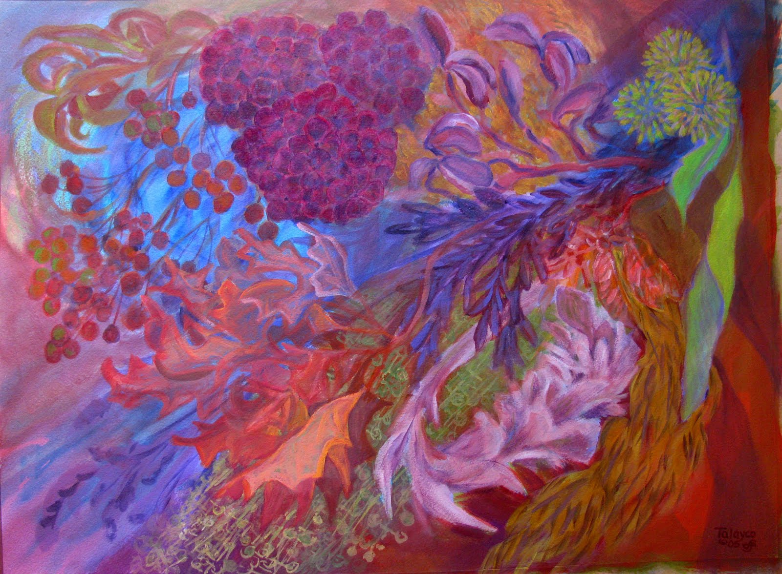
Almost every painting I've made has something edible in it -- if not edible by humans, as in "Pomegranate Float" (2005) above, then by insects as in "Dreams of Wild Botanists (Warm)" (2005):--

...or even by seaworms, as in "Driftwood" (2003):


This sort of Edible Art is one thing, and here's another described in a 2010 article in American Artist magazine on the general theme of (Buzz Word Alert!) "green" artists' materials.

Glob (http://www.globiton.com/) in Berkeley, California, touts the fact that its six paints (lemon verbena, tangerine, plum purple, berry blue, pomegranate, and basil green) are made from fruits, vegetables, flowers and spices, and are biodegradable, non-toxic, gluten-free, soy-free and vegan.

Following the link to Glob -- as I thought fondly of my youngest and newest friend, a specialist in gluten-free delectables (hi, JV!) -- I discovered they're serious about "environmental synergy" and apparently market to children who, if not already fond of eating their art materials, will soon develop the habit.

Well, they're following in historical footsteps, it seems. Writing of colourmen (early European producers and purveyors of artists' pigments), Victoria Finlay (mentioned in my previous post) reports:

Colourmen first appeared in the mid-17th century, preparing canvases, supplying pigments, and making brushes. In France, some of them were originally luxury goods grocers, selling exotica like chocolate and vanilla, along with the cochineal (a sought after red pigment derived from insects -kt), but most quickly turned to full-time art supplying.

In my years of painting, two lessons on edibility have stayed with me: (1) Inside the studio, food and drink should not be consumed in order to avoid the risk of possible contamination with toxic substances; (2) Outside the studio, chocolate is always in good taste.

Tuesday, December 21, 2010

"A Brown Study" -- at 65


Some months ago in my reading, I came across that old Victorian expression "a brown study." She sat at the window in a brown study. Today we'd say "lost in thought." Within a week, I happened to find another reference to brown in a wonderful book COLOUR: TRAVELS THROUGH THE PAINTBOX by Victoria Finlay. She's an Australian journalist who relates the history of various artists' pigments as she travels in the 1990s to their geographical sources. About brown, she notes:

Social anthropologists B. Berlin and P. Kay in a controversial 1969 study researching colour terminology found that every human society distinguished between dark and light although some had no words at all for specific colours. In cultures that named three colours, those were black, white, red. The fourth and fifth to be added (in other cultures) were green and yellow in either order; the sixth would always be blue. Only at that level would there be acknowledgment of brown which, inevitably, was the seventh to receive a name.
Well, interesting; and at that point, I conceived the idea to do a painting entitled "A Brown Study" which would play on different shades of brown. When I found our old brown teapot in the basement (sans lid, which had broken), things began to hum. My beautiful raku-fired vase presented greyer tones; a tannish teak dish came out of a studio corner; it was "that time of year" when the ornamental gourds call me and this striped one took me back to brown's roots in yellow and orange. When I put them all together, I decided to break the common rule (aren't they made to be broken?) to avoid placing things in the absolute centre of the composition. Cascading branches from our old pear tree (its trunk is shown above) would, I thought, break the dead-centre stability and project forward into space.

I did a quick preliminary study, grabbing a small blue-green panel that I had on hand, and thought there was something magical about the brownish objects set against the sea-toned background. Then, when I laid in the first burnt sienna underlayers, (you can see the evolution here) I knew I'd find it hard to sacrifice that orange glow. So, as is usually the case, it didn't turn out quite as planned.

What did turn out is that this is my 65th logged painting, my 65th year (this journey was related previously -- and it's the best I've done so far.


Tuesday, November 30, 2010

Speaking Sushi

They say one's early years are the best time to learn a second language, before the brain's circuitry gets set in its way. That seems as good an explanation as any for why I don't speak sushi -- I came too late in life from too far away to bond deeply, as most Vancouverites do, with raw fish and seaweed. Mind you, I've enjoyed some great lunches with my friend Rumi, but that's because of her tactful guidance in menu choices, her deft wielding of chopsticks, the gracious way she seems truly not to notice when my eyes are bulging from having carelessly downed way too much horseradish, and most of all, the pleasure of her company.

I guess that's why I tend to smile favourably on sushi restaurants and couldn't help but take an interest when a new one went up last year along my bus route, right where I sometimes get off to make a transfer. First the "for lease" sign was replaced by a scrawled "coming soon" notice. Then tradespeople went in and out the curtained doorway for several weeks, and eventually a homemade banner announced the next week's grand opening. Then, remarkably, fate intervened and that very weekend, a car went out of control, ramming right through the new windows. But the new restaurant rose from the ashes (or shards) and finally opened six weeks later.

The hand-made signs were replaced with formal graphics, and I made a memory drawing of a scene I'd glimpsed from the bus one dark autumn morning: A very tall guy whose splotchy jacket echoed the circular motif of the restaurant's graphic design.


Not long afterwards, the new Hime Sushi restaurant gave me an opportunity to observe how instantly and creatively the mind fires -- or misfires. One drizzly Saturday morning, I was standing under its awning waiting for my bus. Cold and a little sleepy, I absent-mindedly noticed the hand-lettered menu on a large whiteboard inside the door. Suddenly, my mind snapped to attention. I'd never heard of stuff like this! And in the space of what must have been less than a minute, I'd read and analyzed the six menu items as follows:

1) BORB FULGHAM
Why does this remind me of "bulghur wheat"?

2) ANAREA AGRO
Maybe this is their vegetarian menu? ...Because of "agro"? Oh, don't be silly.

3) MALANI MANSARAS
This doesn't sound anything like California rolls...or tempura...or
okinomi-yaki.

4) DEVE PANNER
In fact, this menu is sounding more South Asian than Japanese. Is this like
"paneer" maybe, that cottage cheese kind of stuff?

5) ASHOK PURI
Ashok? I think I once knew someone named "Ashok"....

6) COLLEEN RILEY
Colleen Riley?? Colleen Riley?? Wait a minute, what's going on here?

Now thoroughly wide awake, I noticed a small printed card taped to the top of the whiteboard: "Enter to win free dinner for two," and written across the empty lines where people were to record name and phone number: "Congratulations to first winners!!" I quickly reviewed the "menu": Barb? Andrea? Melanie? Dave? Lack of sushi fluency had led me astray, but it looked like Hime Sushi's management had done a pretty fair job of interpreting the bad handwriting of their customers. First the car crash, now the contest. Good fortune surely follows them.

Tuesday, November 9, 2010

Full Circle: Spices and Punk Cabbage


"Okay, I've started the last in the Astrological Plants series," I announced from halfway down the stairs after a mid-September studio session, excitedly calling out the name of the sign and its flora.

JT heard me from a distance and, with just a touch of yuk in his voice, called back, "Spices and Punk Cabbage?!?!?"

Okay. He knew I must have said "Pisces" -- which is not only the last in my 12-piece series, but with a nice symbolism, is also the final sign in the astrological year. (Unplanned; I didn't paint them in order). But from two rooms away, the name "Skunk Cabbage" had become distorted.

Pisces is ruled by Neptune, and of the plants assigned to Neptune, it's said: "Little is yet known concerning (these) plants...it is probable that plants possessing strange and occult properties...belong to (this planet)."

And there is something occult, I'd say, about the way the large yellow capes of Skunk Cabbage burst up through the coastal wetlands, as early as late January -- sometimes in an expanse of dozens of flowers, without evidence of the huge floppy leaves that follow. Far from occult, of course, is the plant's odour which contributes its common name.

Neptune's colours are black and white (as in skunk?) deep blood red, mauve, lavender, burnt umber, burnt sienna. From the first splash on the paper, I felt it would be eerie good fun to try to bring these colours together within my usual complex symbol system. You can see Pisces' evolution here.


-- and TA TUM, the whole completed series here.


I've been asked about the source of the personality traits in each sign's painting. I select them from lists of "emotional characteristics" and "intellectual characteristics" in the book Astrological Keywords by Manly P. Hall (1958) -- and "select" is definitely a key word in the process. (Would I, a Gemini, have selected "duplicitous" as one of the traits for the Gemini painting?") I admit: I tend to reject the more negative descriptors and then check the positives against "natives" of each sign who are people I know and like.


It happens that two awesome Pisces women have played important roles in my life. One is an almost-lifelong friend, originally a penpal from the age of 12. The other is the remarkable Uber-Boss of the two non-profit organizations where I spent my last and happiest working years. Coincidentally, both have birthdays on March 13th. Characteristics: Compassionate; check. Introspective; check. Philosophic; check. Intuitive; check. Executive; check. Sensitive; check.

As for the success of the Pisces painting, I'm pretty pleased with it. It's kinda skunky. It's kinda punky. It's more than a little bit funky. And now, what to do with the whole Astro-Plants series? Maybe I should delve into my horoscope for....a sign.

Tuesday, October 19, 2010

Paper: The senses remember


With one last painting to go in the Astro-Plants series, I ran out of paper (the backyard wasp's nest wouldn't do) and had to hike out (2 bus transfers!) for a pristine 10-pack of Strathmore Gemini 140# Cold-Pressed 22" x 30" watercolour paper. The very description is mouth-watering. Back home, I savoured its weight and texture with a satisfaction that was almost physical. Well, no wonder. Paper and I go a long way back.

I spent most of my first eight years in a little paper mill town in the foothills of NY State's Adirondacks. In that simpler post-WW II era, it was a child's wonderland of endless summers roaming free and unaccompanied in fields and woods, and winters of deep snows and crystalline games. For adults, though, the horizons and pleasures must have seemed smaller. When our family had out-of-town guests, for example, the major entertainment was a tour of the mill, conducted by my father who was its Chief Engineer (shown here).


Of course, I would tag along -- ordinarily, the mill grounds were off-limits to kids. We'd go on a Sunday, when visitors wouldn't be in the way of the skeleton crew that kept things moving. In the timeless design of millworks, the building descended in steps along the slope of the falls. We'd enter at the street level of my dad's office and walk down deserted hallways to the wire-cage elevator that could carry a full shift of men to the depths -- a device open on both ends, which I found rather scary.

Scarier still (though I was an old hand at mill tours) was the clanging roar that literally shook the mill building -- the great metal rollers that (at tour's end) spewed out huge ripply expanses of newsprint, the mill's stock in trade. But it was an earlier stage in the process that's imprinted in my memory -- the pulp room, the place where sulphur hit wood chips in a great steaming mass.

Outdoors, the sulphur sat in a storeys-high yellow-green pile ("Why can't we play in it?"); indoors, its taste and smell pervaded the whole working part of the mill, and we'd be breathing it before the elevator hit bottom. (When we first came to Vancouver and I spotted the North Shore's conical sulphur pile, my heart skipped a beat). My father would hold us back a minute with a cautionary, "Careful now," and we would almost glide out onto the wet floor -- wet from the steam of the brewing pulp. Great vats of this greenish-yellow mash churned and burbled, producing a humidity that made your clothes stick.

Fast-forward to the mid-1980s, when I read a fascinating book that chronicled the reactions of American workers whose traditional industries were rapidly computerizing. One interviewed mill worker said (and yes, I remember it almost verbatim):

I've worked in the pulp room for 20 years, and my job is to keep the mash brewing with the right mix at the right rate and the right temperature. In my new job, I sit in this glass room looking out over the vats, and I look at these gauges and they're supposed to tell me. I used to work down there in the room, and you didn't even have to think about it. You smell it. You taste it. You feel it. The minute you walk in the room, you know if things are brewing up right. They say this new way is better, but I don't know.

I knew exactly what he meant.

Whether or not "the new way was better," the Gould Paper Company's days were already numbered. By the mid-1950s, my family and those of all my friends had moved on as the men (yes) found greener pastures in the post-war economic boom. The mill limped along, with different owners, until it folded in 2000. The town is still there, less vibrant I'm sure than my memories.

But for me, there are so many legacies from those days: Among them, a treasured friendship, an intense rapport with the natural world, and a thrill at the whiteness of paper.

Thursday, September 30, 2010

Dark stars, autumn roadsides

Two more in the series Astrological Plants of the Squamish Valley -- and the year's not over yet! For several months, I've been looking forward to switching colour gears and working on these two signs together: Sagittarius and Capricorn. Sagittarius is ruled by Jupiter, associated with the colours blue, violet, purple, red-indigo, deep midnight. Capricorn is ruled by Saturn, associated with indigo, grey, black, dark brown, sage green, mottled tones. My aim was to "work in the dark" to create a strong tonal contrast within the overall Astro-Plants series.

Here's Capricorn, which can be viewed in progress here.


The plants assigned to Saturn include leathery-leaved plants like holly, ivy and wintergreen so my choice of our omnipresent salal seemed a natural. (To non-locals, the name's pronounced "sha-LALL" -- as in the Latin name. But maybe everyone knows this if salal truly is omnipresent -- years ago, we saw salal in a Parisian florist's sidewalk buckets). Salal's scrumptious-looking deep blue-black berries, dried in quantity to last the winter, were a staple of traditional First Nations diets. My mouth was watering as I tried my first -- and last -- salal berry. It tasted just like eucalyptus-flavoured Mentholatum. The painting's rather austere, but it's turned out to be one of my favourites.

Along our Upper Squamish roadsides, salal is often the background to an abundant autumn display of snowberries -- the plant chosen to represent Sagittarius.


You can view it in progress here.

Jupiter, the planetary ruler of this sign, is the champion of berries of all kinds so I couldn't miss with this choice. I know snowberries from our years in the East and, wisely I think, never gave them a taste. I don't remember their growing as abundantly there as they do in our coastal valleys. The sight of them hanging in bright white bundles against the rich dark coppers, deep magentas, and olive-blacks of wet fading leaves has always stirred me.