Monday, February 15, 2021

Coming to the close of a very dark winter


I've tried not to whine too much about the long rainy winter and to seize the good parts.  These include, when it's not raining, winter's gloriously vivid sunsets – best visible through the neighbourhood trees if I take my camera out to the middle of the street.


And why should I complain when I'm cozily wrapped up in my Zodiac Café series?  If you've lost the thread, my plan is to expand my themes beyond the Zodiacal portraits to still lifes and settings.  Just another wacky idea but it's fun to work in a series and see how one idea bounces off another.


I wanted to do another "Beverage of Choice" still life, inspired by the many types of coffee packets and tea containers either tucked away in my cupboards or saved in recent months for just this purpose.  I started playing with a set-up – giving myself a little laugh with the sunbather basking in the teapot.  She's simply holding a place for the lid that was missing in action at the thrift shop where I found a classic Sadler Brown Betty teapot.


Then I chose one of the small panels I'd made in my holiday Semi-Abstract Workshop to paint over and use as the base for a study.


This one had been a spin-off on the works of the artist Nicolas de Staël.  As I splashed down this checkered tablecloth, I smiled to think what he might do with a bunch of coffee and tea containers.


How close or how far apart should I place these objects, some of which I'd now rearranged (or eliminated)?  And what about the background?  After a few experiments, I kept the suggestion of a figure in the distance.
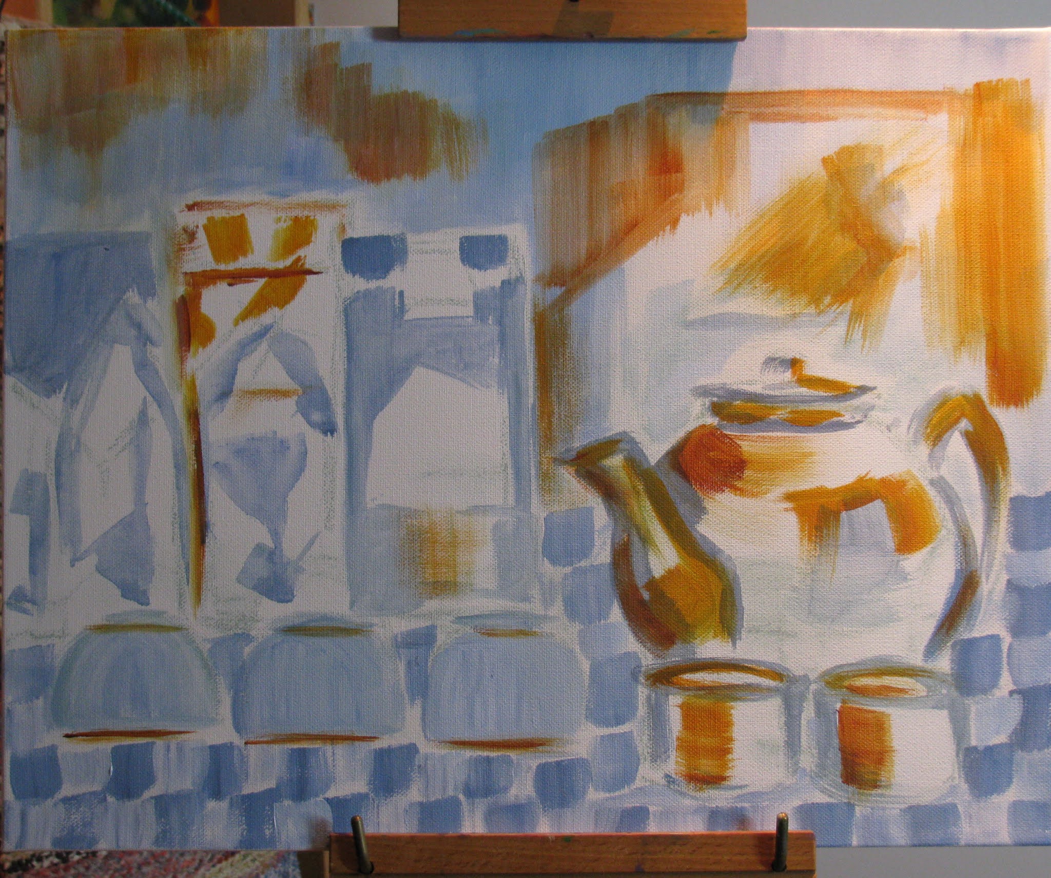


Coincidentally, as I began to develop the colour, I had another rash impulse.  An artist friend who does exquisite linocuts happened to mention Georgio Morandi and a reference she'd spotted on the concept of "the space in between."   I'd run into this early 20th century Italian artist in my early decades of drawing and knew that he could be pretty obsessive about line-ups of domestic vessels.


Should I paint over and start again, with more spaces between my coffee packets? 


But no, I rather liked how I was handling the suggestion of BLACK in that line-up on the left.  In most quarters, it's considered poor form (translation:  Big Mistake) to use black "tube colour", and mine was a daring mixture of phthalocyanine blue, quinacridone magenta, and burnt siena.  Say that three times fast and go to the head of the class!


That's not to say that I was very happy with the way this was going.  I woke up one morning with de Staël on my mind and resolved to paint the whole thing over in light-coloured blocks.


But I couldn't bring myself to carry through.  I was at that point of, "If you can't do something nice, don't do anything at all."  I went back to developing the colour and considered it a wrap, "Another Dark Day at the Zodiac Café."  (copyright 2021)


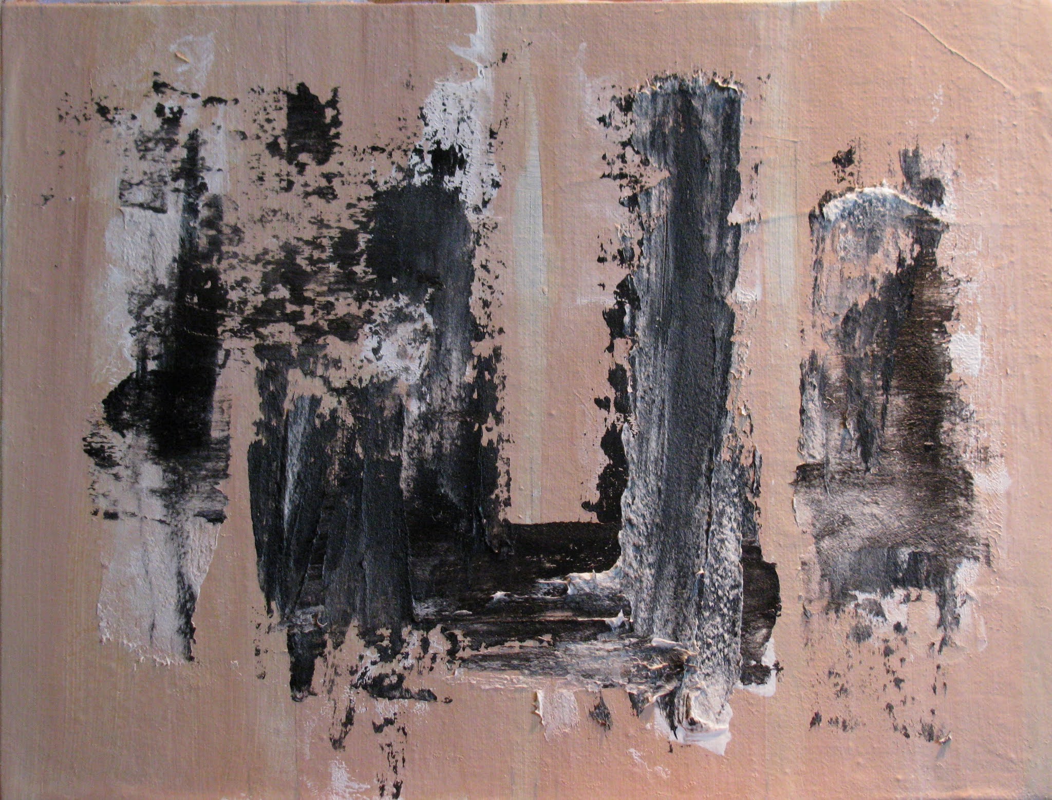
Probably the best outcome of this experiment was an addition to my Abstract studies – the new (old!) wood palette I'm breaking in, with its suggestion of the riverscapes in Jasper National Park that so intrigued me.


And now that we've had a bit of snow, winter is beginning to fulfill my wishes.  First, a view of the special Galiano Inukshuk in my backyard – all bundled up like Bernie.


And then, to show that after all the good fun playing in the snow, an eventual spring melt will follow:  The Inukshuk emerges.


(Huge hugs, as always, to L&B Multi-Talented Purveyors of Fine Objects for bringing all the wonderful Galiano rocks.)


Saturday, January 30, 2021

COMING not SOON enough


A frosty mid-January at VanDusen Garden, and there's Dr. Menzies, my favourite of the celebrated botanists, looking out on the dormant rose garden.  No doubt he's dreaming of that August afternoon when, to indulge some visiting art students, he agreed to hold his pose.


Right now:  Could the rain please stop?  And could the days please get longer SOONER?  Well, what choice do we have but to put up with it and maybe try to remember there are charms, if sometimes eerie, to what the French call "l'heure entre chien et loup" – "the hour between dog and wolf."  Dusk.  Twilight.  When it's hard to distinguish what's there and what's not.


It was about this time last year when I'd started an all-day Monday art workshop on Granville Island.  Just reaching the bus stop at the end of the day, I was astonished at this woman's pose in the window of a darkening Starbucks.  The bus was rolling up and with my little-used phone camera, I quickly grabbed this shot:


The scene came back to me early this year as I began to extend the Zodiac Café series with still lifes, surroundings and interiors.  Of course, the Zodiac Café is a much cozier place than Starbucks, any of time of day, and it exists in a parallel universe where people socially distance only by choice.   I did a quick study, giving it some cedar siding, and an off-the-beaten track setting among shrubbery and trees.


I also made some early choices about the windows, not as regimented as the faux-industrial looking ones at the entry to Granville Island.  Of course, the woman's figure was the focus, and I did a quick study of the face, thinking that it might present a challenge.


 Then I did a  more complete study, ¾ -size with markings I'd be using to scale it up.  Oh, dear – what was I thinking, with all these straight horizontals and verticals?   Well, there was nothing for it but to press onward.


 In the quick layout on the full-size canvas, I quite liked the couple in the background.  Sometimes these early stages and even the studies are better than the final outcome (spoiler alert!).


And now I was under way…


…and becoming more and more uncertain as I tried to recapture the impact of the original photographed scene.


This was not what had struck me at the bus stop – nor was I trying to duplicate the scene.  But the reflections were confusing, and the actual lighting was paradoxical.  That is, it seemed that the inside of the coffee shop was darker than the outside – and with exceptions, it wasn't clear at all what was being reflected.   So….?  What the heck.  I decided to plug in some of the light reflections of the background buildings and call it a day. Here, for better or worse, is "Winter Evening at the Zodiac Café," (copyright 2021)


 I signed off on my notes and records and went upstairs, still thinking about the paradoxical reflections.  This brought to mind other nighttime scenes that have enticed artists – successfully!


There's VanGogh's familiar "Café Terrace at Night". Check towards the bottom of this link, and you'll see a photo of his café as it still exists.


And of course, there's the magnetic "Nighthawks" by 20th century American artist Edward Hopper.   I gleaned through my art books to check some good reproductions, half wondering if there were any reflections to offer guidance.


Then I went to my computer and the morning's email brought one of my art newsletters.  There, by remarkable coincidence, was 2021's version of fame:-- Bernie Sanders among the Nighthawks!! 


 Should I go back and plug him into "Winter Evening"?   Oh, I couldn't resist – but this took me an hour to figure out – and meanwhile, somewhere in the depths of my new computer sits an image of Bernie in solitary splendour, with just his chair and his mittens, unencumbered by the white border.


Friday, January 15, 2021

Kinda-sorta-maybe


If you weren't too overwhelmed by world events, you might have dipped into my final 2020 post and viewed my first experiments in a challenging little workshop I devised for myself.  Inspired -- or let's say, invited -- by the gift of a beautiful book on the 20th century artist Nicolas de Staël, I set aside about two weeks of the holiday season to study and play in the sometimes rowdy schoolyard of  abstract art. 


The second half of my workshop took me to semi-abstract art.  The current definition of "semi" exactly suited my purposes: 

"semi-. a combining form meaning "half" (semiannual), "partially," "somewhat" (semiautomatic; semidetached; semiformal)." 

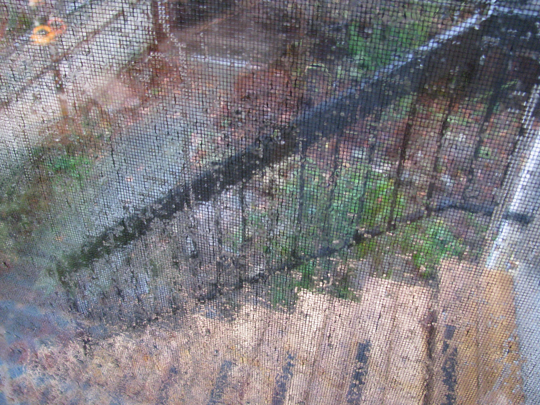
There's not a precise recipe for semi-abstraction, no hard and fast "one-half tablespoon of super-bubbly yeast," so my title image above qualifies.  It's a kinda-sort-maybe view of my new front steps through the windowscreen on a day when Niagara Falls rained down.


My starting point in the second half of the workshop was a de Staël spin-off, emulating his characteristic repeated rectangles.


I modelled this on one of his pieces that, with a few more adroit horizontals, resembles an urban landscape.  At this point, I should give a nod to two eminent Canadian artists, particularly acknowledged in Vancouver as two home-town boys made good:  Gordon Smith and Jack Shadbolt.  Take a quick scroll down throught these links, and you'll see many examples of recognizable subjects with a semi-abstract twist.


One motivation for my workshop was to revisit the possibilities of abstraction that I'd wrestled with after a visit to Jasper National Park in 2019. 


Photos like this can't begin to capture the power and vastness of those mountains, the great forests, the changing convergence of the river's sands and waters.  I came home from that trip thinking that only abstraction could begin to capture it all.  I wasn't satisfied with what I did in late 2019 -- nor as it turned out in this workshop, despite my earnest efforts.


Nope, no good -- and so once more, with feeling, I developed a heavily textured version:


Still, not there.  What about this one, "Storm over the Rockies"?


You caught me, didn't you?  It's another swatch from my palette, showing accidents can sometimes outperform effort.  Well, Jasper is beyond my capabilities, but the palette splash led me to try "Autumn Roadside."


With that, I moved on to my preferred theme of human faces and figures.  When something I've done gives me a  hearty laugh, I know I'm on my game, for better or worse.  I *love* this one (also painted over a Jasper art-fail of 2019) -- "Hand/Eye Coordination."


Remember:  You need to play "Let's Pretend" along with me and imagine that all of these are wall-sized displays.   There's another fantasy element you've probably seen in cartoons -- the question of whether it matters if an abstract piece is hung upside-down.  Well....sometimes it does, sometimes it doesn't.  Here's "Squeeze, Spatter, Pour" from the early half of my workshop:


When I turned it upside-down, I began to see possibilities for a figure in the background spatters above the textured coil.   Here's the result -- called  "Puppetmaster."


In signing off on these reflections into abstract and semi-abstract art, I did a somewhat straight piece called, "I am the mirror - I reflect."


So what's this abstraction business all about, anyway?  As the text for my workshop, I dipped into a library edition of "Cubism and Abstract Art" by the eminent 20th century art historian Alfred H. Barr, Jr. , the founding director of MOMA (NYC's Museum of Modern Art).  He's justifiably credited with having lit the posthumous fame of Van Gogh with a blockbuster 1935 exhibit  -- followed a year later by another blockbuster, the 1936 "Cubism and Abstract Art" exhibit to which this book  is a companion piece.   Wow and double wow.  Check out the links and scroll to "Installation Images" where MOMA makes available photos of the original exhibits, as well as their catalogs -- Barr's incredible publications.


Pointing out that awareness of abstraction is by no means new, Barr quotes from Plato's "Philebus."

"Socrates:  What I am saying is not indeed directly obvious.  I must therefore try to make it clear.  I will try to speak of the beauty of shapes, and I do not mean, as most people would think, the shapes of living figures, or their imitations in paintings, but I mean straight lines and curves and the shapes made from them, flat or solid, by the lathe, ruler and square, if you see what I mean.  These are not beautiful for any particular reason or purpose, as other things are, but are always by their very nature beautiful, and give pleasure of their own quite free from the itch of desire; and colors of this kind are beautiful, too, and give a similar pleasure."

Well, that's one way to look at.  But I kinda-sorta-maybe prefer this quote I recently found by the mid-20th century American writer Dorothy Parker:

"Creativity is a wild mind, and a disciplined eye."


Thursday, December 31, 2020

Fwd: Year-end Reflections


In recent years, my Christmas Day tradition has been to walk around Stanley Park and its waterfront.  This year was different -- as we all know, in so many ways.  When Christmas Eve offered a sunny break in the endless rain, I grabbed the opportunity instead for a walk around closer-to-home Trout Lake.


Among my reflections that day, I decided to pull together the results of a made-at-home workshop I've been doing and make a splash for New Year's Eve.  The workshop idea came to me some weeks ago when I was looking through the gorgeous book that my artist friend Y gave me on the artist  Nicolas de Staël.  It's a very special book  indeed -- published in 1981 by a distinguished arts publishing firm in her native Switzerland -- edited by her gifted mother, designed by her artist father. 


I knew something of de Staël and liked some of what I'd seen -- quite different, in my view, from earlier abstract artists like Kandinsky who I had definitely NOT liked when I wrote a  paper on him in 8th grade.   Maybe this was my nudge to learn more about some of these vital art movements that marked  the 20th century.  So I decided to enroll in a self-designed Workshop on Abstraction to mark the end of 2020 and right up to January 6th, the traditional end of the holiday season in my family.  Here we go, with reference at the outset to a capsule summary on Abstract Art courtesy of the UK's Tate Modern. 


I started gathering supplies and tools -- realizing that my small experiments would not require buckets of paint or bulldozers.


Even though I knew I'd be working in small scale, I decided to play "Let's Pretend" -- and I invite you to join me.  The only rule is that we must all pretend that each work occupies a good part of the wall of a museum, like Picasso's "Three Musicians" that I saw and photographed at MOMA (Museum of Modern Art) in New York City in 2018.


As I poured my morning coffee before the first workshop, I looked out my back window and saw wonderful block-ish markings where the rain had stuck on the cement wall across the laneway.  This was my impetus for the piece that I've called "First/Most" -- because I spent the most time on this and learned a whole lot.


The outcome might not appeal, but what I learned from the process was significant:  Every mark counts.   At this starting point, I could only go by some of  the questions I routinely ask, as I work on a recognizable piece:-- Where does the eye travel?  Will this mark add or detract? Should this shape be larger or smaller?  Or maybe the same?  Or many more of them?  Colours?  Darker? Lighter?  Where? -- and on and on; dozens of questions with each potential move. 


At first,  I planned to focus on a different element of design and composition in each work -- texture, for the second work, and in a very definite blob.


Then I let loose with my inner Jackson Pollock to produce "Squeeze, Spatter, Pour."


This called to mind a stuck-together pile of paint remnants I couldn't bear to throw out.  It's normal for me to use the caps of little bouillon jars to hold my mixing sticks as I paint.  Every once in a while, I scrape out the bits that have collected and end up with colourful discs.   One of those cast-off discs was so pretty, I had to immortalize it on the lid of my jar of pushpins.


I glued some of the other cast-offs onto transparent plastic, and the finished piece is quite striking dangling from a hook in my studio with light behind it. 


Just imagine it ten feet high, with the title "Cosmos," hanging in a window of  the Whitney Museum of American Art.  (from My Historic Trip of 2018 -- what's New Year's Eve for, if not nostalgia?)


 Let's fast forward now.  Here's "Bullet" -- maybe a little reminiscent of Malevich who I don't like any more than I like Kandinsky.


And how about "Black Reef" -- which initially reminded me of Adolph Gottlieb's "Blast",   unforgettable from one of my first painting books.


Now to my favourites.  If these measured, say, 10 x 10 feet or thereabouts, I'd actually enjoy seeing them on my living room wall.  First, "Dream State."


And "Surf's Up." 


Whew!  What an exhibition.  ...as in "making an exhibition of oneself"?  Well, Jackson Pollock has the last word on this:--


"Painting is self-discovery. Every good artist paints what he is."


But I can't claim the Best in Show, which evolved entirely by accident.  Here's the dramatically gorgeous piece that revealed itself as I scraped down an old plywood palette -- layers upon layers of just-glimpsed old paint.    I've called it "Excavation."


Tuesday, December 15, 2020

Quiet season at the Zodiac Cafe


A few weeks back, I assembled the last of summer -- dried seed heads from my sizable alliums and my neighbour's graceful crocosmia.  Those with eagle eyes and a long-ago shared experience will realize that that perfect vase is lab glassware -- a Creative Packrat find from olden times at The Lab when, in about 1985, we had to clean out the storage room in a soon-to-be-sold building next door.


It's impossible these days for the whole Zodiac crowd to celebrate en masse, but that's okay.  My purpose all along has been to keep a hint of the cafe as I connect with different theme areas -- still lifes, interiors, maybe even some landscapes sighted from the outdoor patio.


I briefly considered painting the dried bouquet at almost full height, but what would be the point? (and besides, I didn't have a canvas large enough)  So I shortened the vase and focused on the widest part of the bouquet and got to work.


As I moved along with this, I thought about the teas and coffees that might be on the menu.  Then I realized that the drinks at the Zodiac Cafe are likely to resemble Mary Poppins' elixirs:-- they will taste exactly like each person's own favourite drink, regardless of what they're called.


This one steeped pretty quickly.


And by this time, in the spirit of Mary P, I decided to name my intended series of 4-6 with simply a number -- this one is "Beverage of Choice - #1." (copyright 2020)


If you fell in love with that lab glassware, as I did 35+ years ago,....watch this spot, where something is taking root in a charming sample of rectangular lab glassware. (And if you wonder what that was used for -- old-time lab folks turned up their noses when I asked):--