Thursday, March 16, 2017

Stone, paper, scissors


-- and colour! Give me paper, some kind of marker, and some kind of colour, and I'm happy. A pretty stone paperweight (taking a bow in the upper right corner), and scissors are nice extras -- and lately in my art class, I've enjoyed playing with all of the above. Are you ready to whisk through three weeks of homework with me?

Here's a nifty exercise in "reduction" -- getting down to how much of an object's detail is needed for someone else to recognize it. Here we go, in a series of 2-inch squares. First one: A simple drawing of a recognizable object.


Second: Reduce the object by cropping so that it can still be identified.


Third: Crop further so that an innocent bystander wouldn't have a clue what it was.


Fourth: Reverse the tones -- what was white becomes black, what was black becomes white.


Then, add another two squares -- one using black, white and one colour; the second using black, white and several colours -- and put all of them together into an engaging composition.


Okay. I did the project but I'm not wildly satisfied with the outcome -- despite hours and hours spent wracking my brain on what to choose and how to put it all together.

The next week's homework had nothing ambiguous about it, just a lot of hard labour doing something that looks deceptively easy:-- making a 9-step tonal scale from white to black. Last semester, we did this in dry media which was tough enough.
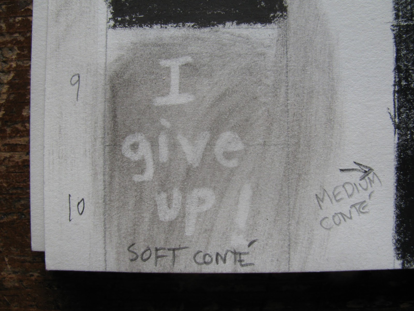


It's even harder in paint. But here's the outcome in all its glory:-- the 9-step grey scale, with colour chips matched in tone to the greys. On the right, an exercise in seeing how the same tone of grey (the small square at the centre) appears to be a different tone on each of several different backgrounds. (Some of these subtleties cannot be captured by the camera)


We're into colour now! Hurray! Our first experiment was reproducing some of Chevreul's theories on colour perception. We each made a simple design using two colour complements (opposites on the colour wheel).


Then we viewed our own for a minute or so as it hung on the white classroom wall, and then we turned our gaze to the wall itself. Voilá ! Against the white, the colours reversed -- my prominent red-orange leaves showed as blue.

With these colour exercises under our belt, we created a tonal series based on our own simple design. The first: Shades of grey. The second -- exactly the same object, in shades of one colour (tube colour + different amounts of white or black). The third -- same object in analogous colours ("neighbours" on the colour wheel). The objective was to match all the tones, from one panel to the next -- so that if you blur your eyes, the lightest shape in the centre panel matches the lightest grey in the first panel, and so on.


Even before I started, I knew I'd be longing for coffee -- and that image kept me going, especially the third panel with its warm orange/brown tones.

As I write this, I'm preparing for my 8th and final class. You'll be seeing the coffee mugs again and some much more exciting stuff. But right now, this is the moment I've been waiting for to share a picture I saved from last summer:-- a perfect 9-step grey scale that neighbours down the block painted on their front porch steps. It's a little distorted by the bright early morning sunshine and the shadows from the porch railing -- but they absolutely nailed it.


Monday, February 27, 2017

Mad about art?


Salvador Dali would probably have had a good laugh that his words are immortalized on pencil souvenirs at the Salvador Dali Museum in Florida. (Who knew?) But two weekends ago, when I had my art class on Saturday and a separate 5-hour art workshop Sunday, I ended up feeling a little Dali-esque myself. (Think sagging watches....) 

It's all been good, though, and here's a quick recap. In early February, we did a cool in-class exercise, outlining reproductions of masterworks on acetate sheets and then analyzing their compositional components. Given a spread of choices, I opted for Seurat's "Bathers at Asnières" while my class buddy, the tattoo artist, went for the Dali.


The following week, we slogged along on the subject of the Golden Mean, or Golden Section, or Golden Ratio. 


Oh, I shouldn't say "slogged;" it's just that my eyes glaze over with the math part of it. But it's another one of those things that I knew about theoretically but had never worked with -- until this very useful course. That week's homework was to photocopy a number of images and use them to make a composition using the Golden Mean.


I controlled my impulse to use a whole bunch of stuff and selected just two images to work with - sunflower petals and a painting artist figure (which, yes, could have benefitted from an added pair of boots).


After a fair bit of fiddling, I settled on five repeats of the figure, contributing to the key vertical and horizontal lines that are placed on the Golden Mean.


The next class, we honed in on line itself as an element of composition. Our assignment was to find or make images in which the composition depended on vertical, horizontal, diagonal, organic and implied lines. I sorted through my stash of postcard reproductions and then went totally crazy. With coloured paper and cutouts, I created a gallery exhibit for them in a scrolled format -- an April Fool's spoof, with a sneak preview in February, as the exhibit was being installed. (With a tip of my new ear-flapped cap to my friend L, who professionally installs gallery exhibits with flair and authority).


First, the Vertical Room:


Next, the Diagonal Room (with the paint barely dry on the walls):


Then, the Organic Room. Can't you see those draperies writhing along with the paintings?


On to the Horizontal Room:


And finally, the Room of Implied Line -- where the repeated shapes of Altdorfer's magnificent horseback trumpeters create dynamic curved lines that cut forward into space.


With a Canadian holiday and no class that week, we were given double homework. The second assignment was to use ruler and pen and -- in no fewer than 200 (yes, two hundred) straight lines -- create an interesting composition.


And now hold onto your pencils for that extra mid-month workshop at the City of Burnaby's Shadbolt Centre, where our session was held in one of the older buildings in the lovely park.


Our instructor in "Anatomy and Figure Drawing" covered lots of ground, and we did lots of drawing. Here's a quick sampler, starting with the traditional quick poses:


Then a contour drawing, trying not to look at the paper -- a sure way to create a vanishing wrist.


A focused drawing on the lower back torso:


A neat and challenging project placing the model's poses in perspective:--


WHEW! It was a wonderful experience but good to have that weekend behind me and get back to my tranquil early morning weekday hours in my studio. Here's the view as I walked in the door, the week I was working on my "On the Line" exhibit. What's that saying that used to be posted in every workplace? "You don't have to be crazy to work here, but it helps."


Tuesday, February 14, 2017

All we have to do is....wait for it


For a while there, it seemed that it would never end. The snow that usually breezes in for a day or two before Christmas was like the visitor that just didn't know when to go home -- called up their friends, in fact, and invited more of the same.

Still: It *was* an excuse to go outside and play. My best memory of the endless snow shovelling was the morning that the sidewalk ice was beginning to loosen enough to pick up shards, which I had fun placing along the fence top of The Yellow House.

Beating me at my own game, my pals down the block exceeded all expectations the next day when they excavated huge ice slabs from the street in front of their house and ringed their corner of the block with a mini-Stonehenge.


Remarkably, this looked very like the medieval stone fortifications called cheval de frise that we saw years ago in Ireland around the remains of old forts.

The snow was also an exercise in patience. All one had to do was sit tight and wait -- something I thought about on my studio mornings as I worked on the fourth in my Flash Mob Series -- "Sit Tight." For once, I stuck successfully with my original sketched plan.


Again, I worked over an old painting and found the early stages eerie and fascinating.


In fact, even as I continued obliterating the old stuff, I found that I couldn't quite let go of some of its patterns.


And here it is -- a bright sunny day in the future when the Winter of 2017 is just a memory, the finale of "Sit Tight" (copyright 2017).


For the work in progress, click here and repeat the mantra, "Flash Mobs are everywhere."


Monday, January 30, 2017

Taking the New Year’s plunge


Yup. That's the approach of my favourite (and so far only) ECUAD teacher as we plunged right into my second semester art class, "Basic Form and Composition." Among many things I like about this teacher is her way of developing class camaraderie. Our right-off-the-bat classroom project was typical of her methods:--


It was totally fun for me to work companionably with a young woman who is honing her skills to be a tattoo artist and -- take a bow -- our composition garnered some favourable reviews in the class critique that followed. A point of focus for all of us was the importance of making the negative shapes (background) as interesting as the positive shapes themselves.

Onward, then, to a bigger and better group-generated composition. As we gathered around a large sheet of white paper on a black table-top, we were each given a handful of black paper squares of several sizes. Someone was nudged to place the first black square and then, more or less as the spirit moved us, we would each place another square with the aim of developing an engaging composition.

Our homework assignment was to do roughly the same thing --make that FOUR things -- within specifications. First, we were to prepare black paper cut-outs of a single shape (square, circle, triangle, etc.) and create a STATIC composition. You know: regular, balanced, predictable, somewhat boring. Cautioned that diagonals inherently work against "boring," I nonetheless wanted to see what I could accomplish with triangles.


Then, we were to use more cut-outs of this shape for a DYNAMIC composition full of energy and movement.


Part 2: Variations on a theme:-- Using cut-outs of several shapes, create a STATIC composition:


Then, for the fourth piece, use similar cut-outs to create a DYNAMIC composition. Here, I decided to set myself a little puzzle and cut a duplicate set of the assorted shapes -- so each composition used the same shapes to different ends.  I couldn't help but think of this twosome as "before and after the earthquake."


It's a funny thing. If you're into this kind of stuff, playing around to get the "perfect" composition can be addictive. There was something not quite right, so I added an extra piece:


And still... it wasn't quite right. So I added a second additional piece.


And then I called a firm halt -- this could have gone on for hours. Back in class, we all displayed our work and received feedback. The verdict? Not that we actually received grades, but you could consider mine to be a bunch of F's.


F = Fail, for the upper left (single shape, static). Waaaaaay too dynamic!
F = "Fantastic," (direct quote from my teacher) for the upper right
F = Flawed, lower left -- too much negative space surrounding the blocks; needs a little more F-for-Fiddling.
F = Frivolous but promising, for the lower right

Nonetheless, I had lots of F-for-Fun. Give me a piece of paper, a marker or pair of scissors, and I'm happy.


Sunday, January 15, 2017

Things that never have been...


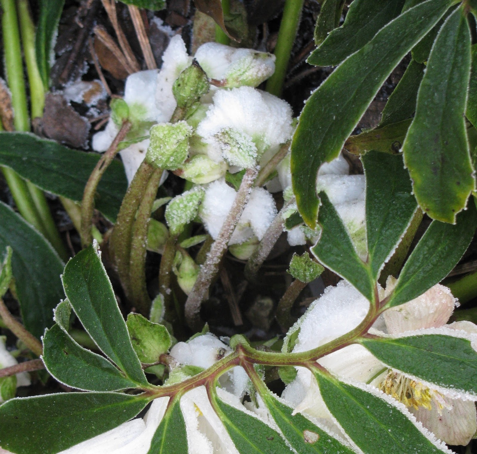
"Come let us welcome the new year, full of things that never have been." Now midway through January, the new year as welcomed by Rilke, has begun to reveal some of its promise. These hellebores that bloomed so early in November and caught the first frosts in December are now solidly hibernating beneath three feet of snow dumped from the neighbours' tarp -- but they'll be back, ten months from now?

And "Hunker Down," the third in my Flash Mob series that was started just as I began my fall art class, finally came to completion just as 2017 rolled in. It started with my usual quick sketch and colour plan.


Once again, I worked over an old painting whose time had come. As I began to place the outlines, this took on an odd abstract quality.


Before very long, I felt I'd misplaced and/or mis-sized the sprawling figure in the upper left corner. But that's the wonder of acrylic paint -- you can usually paint over your mistakes --

.
and try again.


Once I finished my fall semester art class and art homework, I moved along pretty quickly in my morning studio hours, and finished it up. Well, not quite. One of the things I like about my flash mobs are the negative spaces of the background colour showing between curved or outstretched limbs -- and this just didn't have enough colour slices showing through.


Aha! Adding a simple sleeveless top to the guy in the lower right gave me another spot of colour vs. flesh -- and that's it. Here's the finale:--


For the whole work in progress, see here. And to view the two preceding flash mobs, check here and here.

In the back of my mind, I have plans for more in this series, drawn from sketches in my old Aquatic Sketchbooks. I'm thinking ten would be a good number for the series, and then I'll have mouse pads made from all the images. Ha, ha. That's a joke. The mouse pad part.