Wednesday, January 23, 2013

X-ray vision


X-rays have been ordered. Yay! (Double yay because they're routine ones for monitoring purposes; nothing to worry about). While one of us gets X-rayed at the hospital outpatient department, the other will sit in the waiting room, viewing a particular piece of donated art that once evoked a visionary experience.

The pre-vision began in my final working years when I rode the bus to and from work, passing through Vancouver's oldest streets -- now part urban decay, part tourist mecca, part controversial gentrification. I have a thing about old buildings, and this route made for an an exciting ride. Boarding the bus, I'd dash for a window seat, take out my small sketchbook, and each day record a passing glimpse.

I love the varieties these early 20th century buildings offer of windows, bays, mouldings, columns, "elbows" (the V-shaped supports beneath roof overhangs), decorative stone, terra cotta, and brick. Many of these buildings have been designated "protected" and many others preserved in photos, thanks to the organization Heritage Vancouver. Some of my bus-ride buildings can be seen in one of their albums here. And closer to home on a more stable stretch of Main Street, I've recorded my own examples of the kind of things that catch my eye.


In the photo below, the small strip of "beading" at the top of the moulding, I learned coincidentally from the dictionary, is a design called "egg and anchor".  Seen close up, that's just what it is -- alternating rounds of "egg" divided by tiny "anchors."


As my sketchbooks developed, I started to imagine a series called "Downtown Details" -- although I was never quite sure how I'd use these fragments in a finished piece. One studio morning, I decided to do a purely experimental combination of architectural elements, each segment in a different mix of media -- pencil, coloured pencil, ink, pastel, oil pastel, watercolour, acrylic.


It was not long after this, now about three years ago, that an earlier X-ray brought us for the first time to the hospital outpatient department. There, in a little used waiting room, I happened on a magnificent framed engraving (lithograph?) by the 19th century master printer AndrĂ© Durand  from what I later learned was his collection entitled Album Toscane.

It showed a fantastic imaginary building/cityscape that combined architectural elements of notable buildings from all the cities of Tuscany -- "my" concept taken to an elegant, expert level. What a vision!

But now the double yays have turned to double disapppointment. First, the hospital has reorganized some spaces and we were sent to a different building for X-rays. Second, despite extensive searching, I cannot find Durand's Cities of Tuscany on the internet.

I'll just have to hold the vision and eventually see what I can see.


Wednesday, January 9, 2013

Depths of Winter


Dark winters.  Rivers and their environs.  Rural France and the Pacific Northwest. -- A combination of emotions and memories led to my latest painting.

One of the most moving paintings I know is Camille Pissarro's "The Banks of the Marne in Winter." I came late to an appreciation of Pissarro the painter although I'd always liked what I'd read of Pissarro the person -- his doggedness in pursuing his art in the face of grinding poverty, the unfailing encouragement he extended to other artists, his warmth for his family (even if he couldn't feed them properly).

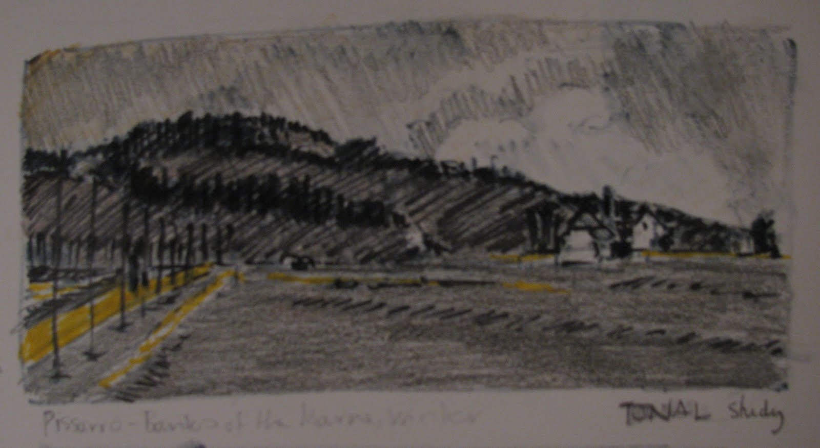
As I began to look at reproductions of his paintings in recent years, "The Banks of the Marne in Winter"  struck me with all the force of his writings and biographies -- please view it via this link although the small digital reproduction is scarcely adequate. If there is any question about whether painted landscapes can convey feeling, this painting to me is the answer.

I made a study of its tones:


...and whenever I see this simple reminder in my sketchbook, it evokes Pissarro's story and, through it, the painful lives of the rural poor in 19th century France, the exhaustion of never-ending physical labour, the daily effort to put food on the table, Pissarro's family's constant relocation from one cheap inadequate cottage to another where -- credits to Mme. Pissarro -- he was enabled to continue to paint. There's a feeling in this painting of loneliness and desolation but also of determination and endurance.

Far removed from that time and experience, I've found myself as I age to be more and more affected by dark winter and its depths. In the last few years, I've tried to plan a "depths of winter" painting to shine a little light in the darkness. This year, before we'd even hit the depths, there was a convergence: I noticed my old sketchbook study. Then one of my upside-down photos  caught my eye in a certain way:


...and I was reminded of another river -- the Squamish, whose banks we used to observe in every season as we drove to and from our cabin. I made a rough drawing of these river bank memories, in a layout suggested by the upside-down photo.


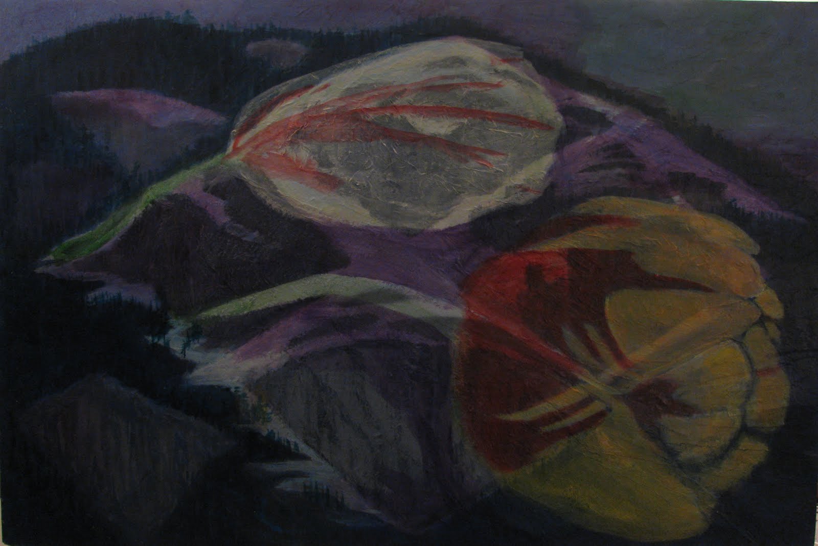
Then I faced the fact that I'm still without a stash of artists' paper, and I hauled out an old but large (24" x 36") panel (pressed board "cradled"/stabilized with cross bars on the back) that had seen two false starts on a collaged surface -- one (horizontal) a view of Cloudburst Mountain, just above our cabin; the other (vertical) some Rembrandt tulips.


I grabbed some tissue paper that had just arrived, wrapped around mandarin oranges, and began to develop the base layers of "The Banks of the Squamish in Winter." You can view its progress here --and see how the underlying collage of the earlier false starts presented a problem that eventually was solved (or not?) with the addition of a patch of salmonberry bushes in centre stage.

Here's the final outcome:


The solitude of these Squamish river banks has less to do with humankind than with vast nature verging on wilderness. Old stumps remain from early 20th century logging days, and one doesn't have to travel far up the river to see new depredations -- accelerated logging practices and "run of river" power stations. But our stretch of the river was marked in winter by deep slow water, eagles overhead or feeding on the shoals, and the occasional call of ravens -- an "aloneness" rather than a "loneliness."

Reviewing my goals: Have I done "my best painting yet"? -- not by a long shot, I'm afraid. In fact, I have a hunch that this panel is destined to be reinvented again some day when I'm short of paper. For now, though, I've immersed myself in the depths and come through feeling heartened by memories of winters past.

Wednesday, December 12, 2012

Let's talk


Let's talk. I could start by saying that just as I'm hitting my stride again, I'm out of my fine arts paper, and it's a logistic exercise to get to the art supply store.  Meanwhile, I have to do something.

In an ideal world, I'd like to paint the human figure -- people in their home environments, for example -- but I'm the kind of artist who needs a model. For this reason, like my early virtual mentor Harriet Shorr, I turned to still lifes. So right now in a less than ideal world, I consulted my figure sketches (made from memory, from people observed on the street from the car or bus) and my file of "study photos" to do some figurative mini-paintings from imagination.

I have lots of sketches of people in the act of just sitting around -- at bus stops, in coffee shops, in parks. I decided to use some of these for a brief series of seated figures called, "Conversations," working on 10"x14" paper from a pad of samples.

In "Conversations - 1", I simply started splashing -- no preliminary planning, just an impulsive plunking down of paint where I thought faces and arms might fit or coffee mug shapes be saved in the base yellow.


That same week, I actually spotted the entire scene of "Conversations - 2" and tried to recapture it from memory:


As I was painting this second one -- again, with no preliminary colour plan, just working step by step -- I was reminded of the observation of another cherished virtual mentor, Mary Beth McKenzie.  Writing about her interest in the artist Pieter Bruegel the Elder, she talked about how he used small spots of the colour red to move the eye around and through his complicated crowd scenes.

Time to get out of the coffee shop! This time, I worked from some "bus stop" sketches and rather consciously thought about the placement of colours. As I'd done with the male figure in "Conversations - 2", I started by pencilling in the figures and caught myself in the act of committing one of my bad habits:-- getting too precise.


The resulting "Conversation - 3" was a pale imitation of a Vancouver bus stop -- and of a successful painting, for that matter. (Overall, I think the impulsive "Conversations - 1" is the best of the lot).

In my final splash of this mini-series, I decided I'd use vibrant colours against a grey background. The artist and teacher Jeanne Dobie calls this "mouse power," referring to the oomph that grey gives to adjacent colours. Again, I couldn't resist pencilling in the figures at the beginning.


As I worked through "Conversations - 4", I carefully considered where I'd repeat colours, where I might add pattern, where I would leave some white paper untouched. As I filled outlined spaces with carefully chosen colours, I began to think that working this way, without a preliminary plan, was quite a profound and meaningful exercise.

And it was so much fun! ...and it was the fun and the satisfaction I had in looking at the four completed "Conversations" that brought home the truth:-- Whether or not this was a deeply meaningful exercise, its origins were my pleasure in working absorbedly in my colouring books 60 and more years ago!

Thursday, November 22, 2012

I am not kidding


For about 25 years, I've subscribed to a well-known magazine for artists and wannabes. Over the years, its look and editorial focus changed periodically, usually for the better. I was always excited when an issue arrived in the mailbox, and I'd spread the pleasure of reading it over a week or more, finding something to learn from almost every article.

All this changed in 2010, when a new editor took the helm and what I could only assume was a hidden cabal proclaimed that the publication intended to be "the voice of the New American Realism" -- versus a rag for mere hobbyists. Gradually, the style of the new regime emerged in critiques like this one, of the October 2012 cover painting pictured above:

"Consider Harvest, which depicts a polar bear in a poppy field, with a
downed helicopter in the background. The image offers a potent
critique of global warming, drug trafficking, and the failure of
international security forces to defeat organized criminal interests.
The blooming poppy field, veiled in toxic yellow air, provides the
ideal setting for the polar bear, whose bee-stung paws indicate that
the beast has had his hand in the honey jar -- implying that his
presence in this contested turf is not entirely benign."
I am not kidding.

Obviously a clique was running the show, and their kind of stuff was not at all my kind of stuff. (For the record, I'm no fan of the demented eyes of Bo Bartlett's figures, the pouty provocative adolescents of Nelson Shanks, or the oddities of non-realist non-American Odd Nerdstrom. Don't expect me to link to their websites).


Along with the bombast were subtle suggestions that the magazine's resources were increasingly limited: most articles were written by the two senior editors, the advertising "supplements" sometimes usurped a third of an issue, and there were more historical articles (requiring only a few hours at the library?) than the usual insightful interviews with working contemporary artists.

Before long, I almost dreaded the arrival of each new issue. Oh, man, what will they inflict on me this month? Why not just pull the plug on my subscription, see if I can get my money back, and by golly, I'll subscribe to the competition's art mag!

....and so it came to pass, courtesy of the gods of the marketplace. Just a few weeks ago, I found in the mailbox the very magazine I had in mind as Plan B, with a message advising that my original subscription had been transferred to this new outfit. A little internet research revealed that the parent company of my old faithful magazine had been bought out, and the magazine had "ceased publication."

I was a little miffed that I'd had to dig for this explanation. Couldn't they have informed me by postcard? But then I learned that after 75 years as a print publication, they'd announced their imminent demise with a one-liner on their Facebook page.

I am not kidding.

Wednesday, November 7, 2012

Eight months without a paintbrush


When it became clear in December 2011 that we'd have to leave our old house, I resolved to immediately start gleaning and packing my studio.  My customary pre-dawn working hours turned into an industrious though reflective time of assessing old paintings and drawings, scrutinizing old sketchbooks, weeding out reference material, packing fragile artifacts, and planning how to transport painted papers and panels. I hadn't chosen this interruption in my painting life, but I decided to view it positively so I made notes along the way of themes and threads I wanted to pick up when life became normal again in a new location.

Finding and moving to a new home worked out pretty well for us, all things considered. My new studio is small but workable. Its low ceiling will just accommodate my table-top easel with mounting board that holds my frequent choice of 20" x 26" paper in a vertical orientation, with about 1/2" to spare!


When I'd organized my new studio, I set one goal: To get back to work as of September 1st and be able to say about every new painting, "This is my best yet" -- to equal or exceed what I still think is my personal best, "A Brown Study at 65" shown here:


My first new-studio effort was "The Green Pear" -- not at all my best yet although I'm rather fond of the pear itself, even in its earliest stage. Maybe it's "my best part-of-a-painting yet" (which sounds like one of those very low-level Academy Awards).


And so: Back to the drawing board. I gathered up some of the objects I'd cherished in my old studio, glad that I'd resisted any urge to "declutter" the large basket, the metal gears, the pine cones, the oyster shells...and no way would I have decluttered my grandmother's little sewing basket! I also decided to take up the challenge I'd encountered years ago as a suggested exercise:-- to produce a "poster" for one's own (imaginary) exhibit.


So here's the outcome:  New Studio Painting #2 -- "Wheels Within" -- which can be viewed revolving itself into existence here. Visualize it as a poster, and see if you think it's My Best Yet.

"Things in Themselves"
The Still Life Paintings of Kelly Mo
On exhibit at The Yellow House Gallery
From now until the next time

Wednesday, October 17, 2012

Six Degrees of Separation


When I was young, my father told me a story that seemed straight out of a folk tale. It concerned The Sugar Refinery (as our family called it) on the Hudson River waterfront, where he was Chief Engineer through the World War II years.

When I was just two, my family moved north to  paper mill country so I had no memory of this place, but the memory of his story is golden -- or copper. As he explained, the refinery process depended on copper vats, in which the raw cane syrup was boiled down.


Wearing thin from the constant intense heat,the vats had to be routinely inspected and almost annually patched and reenforced. And the people best equipped to do this painstaking specialized repair were a father and son team of gypsies -- authentic Rom -- who travelled the country and reliably reported in at The Sugar Refinery every spring.

At that time, gypsies were figures of great fascination to me, thanks to the operetta that was always performed at the YWCA camp I attended for three summer sessions. (Surely this operetta would now be deemed politically incorrect, but the libretto is still going strong on Amazon.com)


The father and son at work in The Sugar Refinery were just as described (it seemed to me) in the opening chorus of "Little Gypsy Gay":
Mending tins and mending pots,
busy all day long.
While the brazier's burning hot,
sing this happy song!

But I wasn't able to verify this. I was born too late. I had just missed seeing real gypsies in action!

But lately, I discovered a currently more meaningful link, via The Sugar Refinery, that I have with one of my favourite artists, Degas.

Degas' route to fame in North America had been through the early and abundant purchases of his work by New York multi-millionaire Henry O. Havemeyer, urged by his wife Louisine, as advised by her best friend, the artist Mary Cassatt, a close friend and colleague of Degas. The eventual outcome was Havemeyer's stunning 1920s bequest of Degas' and other Impressionists' paintings to NYC's Metropolitan Museum of Art.

All this I knew, but only recently I happened on the fact that Havemeyer's fortune derived from his vast sugar empire, centred on The American Sugar Refinery. SUGAR REFINERY?!?!!  I went straight to Google maps, and there was The American Sugar Refinery, on the banks of the Hudson in "our" New York City suburb. The Sugar Refinery.

It's true that by the time my father came along, a Havemeyer son was running the business -- but it was a classic Six Degrees of Separation.
1) Degas
2) Mary Cassatt
3) H.O. and Louisine Havemeyer
4) Havemeyer Son -- the one who might have walked the plant in my father's day
5) My father
6) Me

I was pretty excited -- until, tracking down these old pictures, I found reference to Havemeyer's American Sugar Refinery in Brooklyn. Wrong suburb! A little fact-checking revealed the casualties of industry in the 20th century United States. My father's sugar refinery had actually survived and snagged the American Sugar name, after buying out Havemeyer's and many other refineries.

So I'm no more connected to Degas than to the father-son gypsies -- nor they to each other. But I still count Degas as one of my favorite artists, I still know more politically incorrect lyrics from "Little Gypsy Gay" than I'd ever sing out loud, and The Sugar Refinery still prevails on the Yonkers NY waterfront.


Wednesday, September 26, 2012

"Saw a green pear; thought of you"


Saw a green pear; thought of you. Flashback to a year and a half ago: Green pears had just arrived in IGA's produce department (where I get some of my best ideas), and they made me think of my last-ever boss, whose funky foot-high wooden green pear presided over the meeting table in her office. I almost sent her an email with this title and then thought better of it. But all this time, two thoughts have stayed with me.

The first thought, of course, was to make a painting with a green pear at centre stage. I've just completed it, as The First Painting in the New Studio.


You can view the evolution of "The Green Pear" here. It's an exciting drama in which a stone wrapped in green tissue paper stands in for an actual pear until midway through the process. Then a carefully chosen real pear, painstakingly selected by the artist to match the shape of the pseudo-pear, comes on-stage for the finale and applause. Here's the outcome:


The second enduring thought is that ordinary objects and daily encounters often suggest happy associations with friends near and far.  (Of course, in other cases, there could be unhappy associations, but why go there?) Imagine this phenomenon as a kind of game: "When I see...(example: a green pear), I think of...(my last-ever boss L)." Here's just part of my personal list of things that happily recall friends and (sometimes) their foibles:

"When I see/see reference to.......I think of..........."

Anne of Green Gables
Australia
Big Leaf Maple
Blue, the shade between navy and cobalt
Boxing
Bread Baking
Calligraphy
Cats
Cellos
Cocker Spaniels
Dubrovnik
Eggs being cracked
Family histories
Female solo explorers
Firemen shopping for groceries
Frog motifs
Girl Scouts
"Gluten-free"
Green, any shade
Horseback riding
Ireland
Italian weddings
Joggers
Jugglers
Laundry hung in the sun
Lemon meringue pie
Metronome
Nova Scotia
Paper mills
Papillon dogs
Paris
Penpals
Penske rental trucks
Photographers
Quilting
Raccoons
Rainbow trout
Red wine
Redheads
Roses
San Francisco
Saskatchewan
Schiperke dogs
SPCA
"Sustainability"
Teapots
Tennis
Turks-cap roof ventilator
Ukelele
Winnipeg
Wisconsin

As I made a light-hearted colour study for an upcoming painting, I realized the game works both ways -- and that some day a friend might send me an email with the title, "Saw a hazelnut coffee; thought of you."