Tuesday, June 28, 2011

Heading for summer camp

I have such happy memories of summer camp -- six 2-week stints at two different girls' camps in the years I was aged seven to twelve. What was so memorable, over fifty years later? Living in the woods in tents or cabins, swimming every day, hanging out in a relatively egalitarian environment, singing songs from around the world (Take it from the top: "Waltzing Matilda." I know all the verses and even the meaning of "jumbuck" and "billabong"). Maybe what was best was stepping outside the routine, doing different things just for fun.

And in this spirit, I decided it was time to go off to summer camp -- every morning, in the studio. All kinds of preliminary plans for paintings routinely drift in and out of my mind and sketchbook (I'd just finished a big one that I'll post next time), and I'm putting this mental list on hold for a while. Instead, I'm going to play, just for the fun of it. Oh, some of this will be painting, but maybe I'll try some odder ventures than usual.

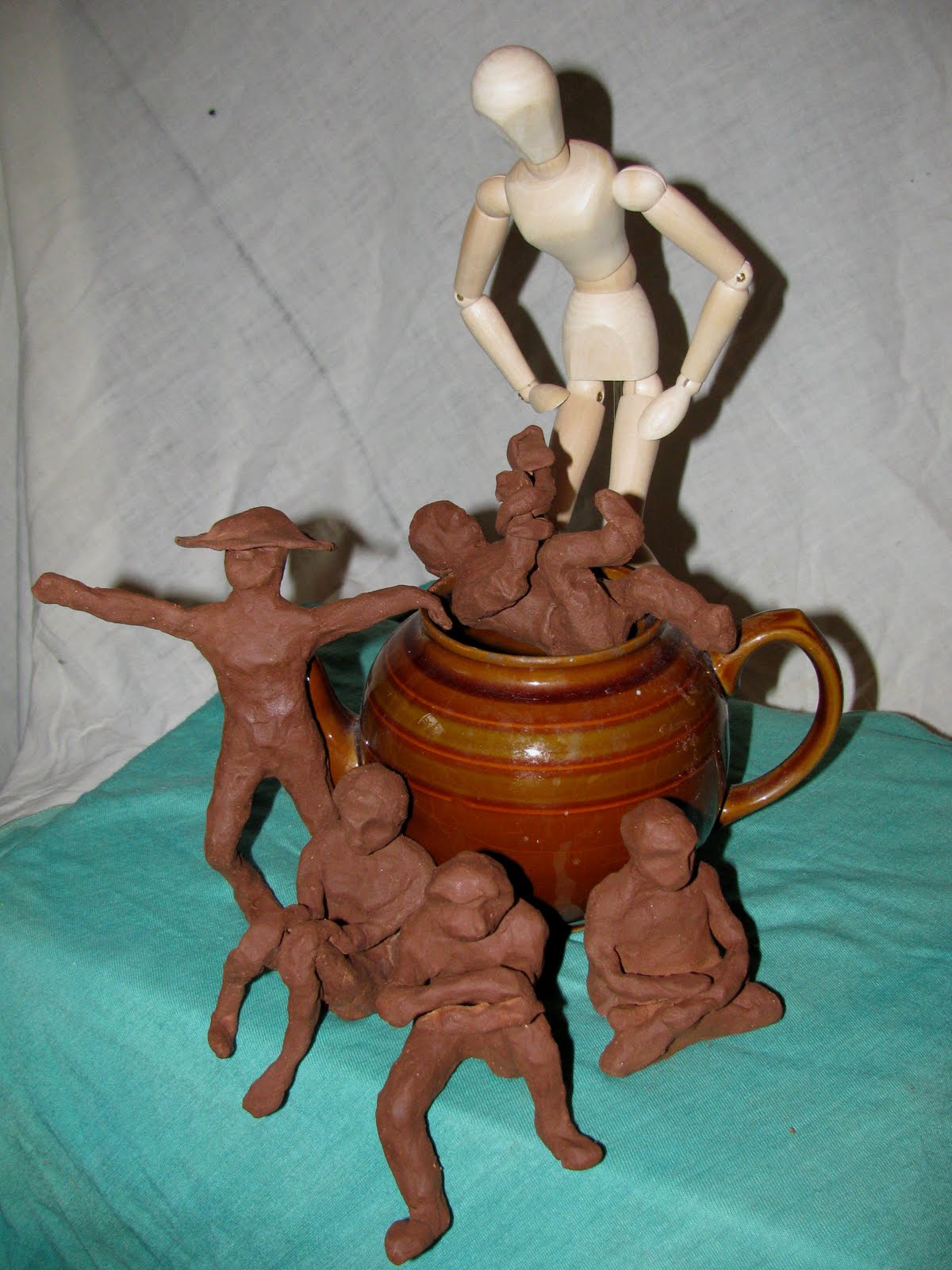
My first session at camp started two weeks ago. I cracked into an unopened pack of modelling clay and summoned up the spirits of Campfires Past. By the solstice, I'd assembled a tent's (or teapot's) worth of little girl campers.


This was not without its challenges. The clay began to dry within the 45 minutes I worked on each figure and would dry further with each passing day. This meant that the first figure, securely anchored to the edge, lost its balance overnight -- and required firmer seating on a little deck chair (and a hat to hide her embarrassment).


I had to invent some odd poses to connect the figures to the teapot.


One small paddle-like hand broke off and had to be reattached with a
"towel" -- leaving this camper looking like a snake-handler.


And I admit, even for little girls, they all look quite asexual.


I thought I'd have clay enough for only four figures but saw, with some scrimping, I could manage five -- but she's pretty anorexic.


So what camp-in-a-teapot is this, anyway? I could borrow a page from the book of my friend B, tea drinker and out-of-the-box leader extraordinaire, who did a whole employee recognition riff with custom-made tea boxes with labels like sereni-tea, facili-tea, curiousi-tea, flexibili-tea. But these girls (and their counsellor) seem to occupy another dimension. In fact, they strongly resemble extraterrestrials. Maybe it's a place called Camp E-Tea. ??
Monday, June 13, 2011

Rembrandts rule!


A few years ago, I came across an article about tulipimania , the 17th-century Dutch rage for exotic and hugely expensive tulip bulbs. The phenomenon is now billed as one of the first economic bubbles since fortunes were lost when the inflated tulip market collapsed. What's more, the intriguing tulips of old Dutch paintings owed their stripes (called "flames") to a virus -- so they turned out to be a botanical bust, as well. The flames in today's versions have been hybridized (no virus), and once I understood that the now so-called "Rembrandt Tulips" are easily and inexpensively available, I had to have some and I had to paint them!

Serendipitously, I found them in my favorite mail-order garden catalog, and while the bulbs wintered in our garden, I had a chance to consider what I'd do with those stripes in the spring. (You know my methods, Watson. If one patterned object is good, two or more must be better...) Some months later, the tulips, a Gala apple, and some striped fabric converged in "Rembrandt Stripes" (copyright 2008).


This year, there's been a further convergence. The Rembrandts again bloomed in our yard, my series of "Plate" paintings was on my mind, and meanwhile, I'd discovered the most marvelous book and author/art historian:

The time was right to haul out that striped fabric and do something more with the Rembrandt tulips and a golden-yellow plate. I adjusted my original set-up, changing the plate's placement vertically (more fabric at the bottom) and reversing the colours of the fabric's stripes. Here's the outcome: "Yellow Plate Special" (copyright 2011)-- you can watch it materialize here.


I see it as the middle portion of a triptych, with "Blue Plate Special" to its left, and "Orange Plate Special" to its right. And for now, I'm putting the "Plate" series to rest.

Tuesday, May 10, 2011

Plate tectonics


No sooner had I finished my "Blue Plate Special" -- after wrestling with how to position the plate -- then a plate appeared in a painting every time I opened an art book. I saw them flat, flat with objects on top, tilted, stacked, upright, dead centre, moving out of the picture...what else?

This world of possibilities rekindled my long-standing interest (dating from the time I bought the blue plate) in doing a series of paintings, each with a different coloured plate. I have some odd plates but none with a gorgeous design like my thrift store blue plate's. So I decided that in my second painting -- "Orange Plate Special" -- the rich pattern element would come, not from the plate itself, but from accompanying objects: a small Mexican dish and a piece of fabric. I did a small study with these three elements, and overall I thought the composition would work.


Guess what? It didn't -- and this became evident rather early in the process. You can follow its evolution here and watch a fourth object recruited almost at the last minute to fill some space. Not the way I like to work -- but here's what we have so far in The Plate Series: "Blue Plate Special" and "Orange Plate Special" .


After I pulled this off (more or less), I recalled a comment by Matisse in a wonderful collection of his writings I've recently discovered. Originally, his point about "squaring up" didn't entirely make sense to me, but I see now that "Orange Plate Special" -- in its small 5" x 7" study versus the finished 15" x 20" version -- is an example of just what he talked about. The guy knew his business!


"Composition, the aim of which should be expression, is modified according to the surface to be covered. If I take a sheet of paper of a given size, my drawing will have a necessary relationship to its format. I would not repeat this drawing on another sheet of different proportions...nor should I be satisfied with a mere enlargement....An artist who wants to transpose a composition from one canvas to another larger one must conceive it anew in order to preserve its expression; he must alter its character and not just square it up onto a larger canvas." (- Matisse, Notes of a Painter, 1908)

Monday, April 25, 2011

Horse Projects then and now


Almost every week, I'll have reason to think of a friend's talented daughter K and something that happened several years ago. One morning, her mom (then my boss) was almost late for work, and K for school, because of K's Grade 5 project on one of her passions -- horses. As I heard it, the project was huge, complex, and creative, and K worked on it every available minute. When it came time to leave home one morning, K was not only still in pajamas, she was IN THE ZONE.


...or, as creativity guru Mihaly Csíkszentmihályi coined the phrase, she was in a state of flow:


"...being completely involved in an activity for its own sake. The ego falls away. Time flies. Every action, movement, and thought follows inevitably from the previous one, like playing jazz. Your whole being is involved, and you're using your skills to the utmost." (This quote courtesy of Wikipedia, which provides no guidance on the pronunciation of his name!)


On good studio mornings, I've been IN THE ZONE myself...until suddenly, Omigod, what time is it?


K's story touches me for its own sake and also because of its pre-quel and sequels.


The Pre-quel: At a much younger age than K was then, I had my own personal Horse Project. For endless Saturday mornings (in my memory), I sat at my little desk, writing and illustrating a multi-volume geneaology of "Blackie the Colt," my most prized stuffed animal (though hand-me-down and threadbare).


A sample page shows Blackie with her uncle and the aunt named after a friend's older and greatly admired sister.


A couple years later, we moved to another town where a new classmate was a cool kid with a horse. Yes, her own real horse. Coincidentally, she was named Judy, and she could draw horses like a dream. Of course, she knew everything about horses, and I realized from something she said that "Blackie the Colt" must, in fact, be "Blackie the Filly."

Sequel #1: K takes riding lessons and she's progressed so much that she's teaching younger kids now. She's going into high school next year and is getting rave reviews for projects even more sophisticated and comprehensive than The Horse Project. Obviously, this gal spends important time IN THE ZONE.

Sequel #2: Judy-The-Person (vs. Judy-Blackie's-aunt) has grown up to be, in her daughter's words, "still a cool kid, but now with two horses." After a lapse of some decades, she reignited her career in professional photography and as you'll see here, she spends a lot of time IN THE ZONE.

Sequel #3: In my adulthood, my mother retrieved my own Horse Project from her treasure trove, and I was astonished that it comprised only three folded pieces of cardboard. Time (and a realistic view of output?) warps when you're IN THE ZONE. These days, the author/illustrator of "The Books of Blackie the Colt" makes about one painting a month and writes a blog about..............Omigod, what time is it?


Monday, April 11, 2011

And now for something completely different

Over the years, I've done dozens of drawings of wild and garden plants in their various stages of unfolding, and finally I was struck by the obvious: For so many plants, each aspect of its being -- buds, leaves, roots, seeds -- is as striking as its flower. I had the idea of a series of paintings on this theme, an idea now partially realized with my March 2011 painting, "The Seed is the Flower."

It started with September's hastily gathered bouquet of crocosmia and rudbeckia seed heads, which sat on the front porch through the winter. One day, the time was right, and I brought it into the studio and placed it on a box well below eye level.


I made a quick study which almost immediately planted the seed of an idea.


As I worked at the painting, something kept nudging my memory. It wasn't just that the stems reminding me of my own "A Brown Study" -- but the spaces between the stems suggested...something. But what? I finished the painting -- as shown below, it's rather different from my recent still lifes. (You can view the whole progression here)


It was only then that I recalled a series of drawings/paintings in one of my art books by, surprisingly, Mondrian, master of stern geometries. Look at this sequence, and join me in wonder, at where "the spaces between" took him:--

Wednesday, March 23, 2011

The artist's hand, the artist's eye

One of my great mentors (a "virtual mentor," I suppose, since the relationship is a literary one) is contemporary artist Harriet Shorr. I accidentally came across her insightful book THE ARTIST`S EYE almost 20 years ago, and I've continued to be inspired by her beautiful paintings and her observations about the process of painting and about being an artist.


She describes her interest in painting objects, not for what they are or what they represent, but for their form and colour -- a bias for abstraction through the lens of representation. About the content and style that tend to "choose" an artist (as children are said to choose their parents!), she writes:

Certain objects call to the painter because they resonate with the painter's sensibility -- an attraction to particular kinds of forms, to particular kinds of space. These attractions are formed by the innate visual sensibility of the artist and, perhaps of equal importance, the art that, as a young person, the artist first saw and loved. These primary influences, which together help to form an aesthetic sensibility, are what lead the artist to her subjects.

In my childhood home, there was no art to speak of, and it was many a year before I set foot in an art museum (and such a museum -- The Art Institute of Chicago!). But what my family home provided, and its female line nurtured, was a calm enthusiasm for interesting old things. Still in my possession are many second-hand finds (whether or not they are actually "antiques") brought home by my mother, my grandmother, my great-grandmother -- a pitcher, a jar, candlesticks, a figurine, baskets, some pieces of jewellery.

I expect my own eye, my own choices as an artist, have been informed by these objects and, as well, by a reflected interest in the human hand and mind -- sometimes a remote hand and mind in the past -- that made the choices that led to their creation. Several years ago, re-reading Harriet Shorr's book and the quote above, I made a painting on these twin themes and titled it in explanation: "The Artist's Hand, the Artist's Eye" (copyright 2007).


I learned a lot from this painting -- working in a limited colour scheme, with the objects just at eye level and the shadows cast by an upfacing light. Working with intensity, one becomes very acquainted with the individual things themselves.

Dipping into Shorr's website last week, I saw that one of her more recent paintings is called "Things of Use to Me." It's another of her characteristic huge still lifes (measured in feet rather than inches), and she has assembled perhaps two dozen objects that I recognized immediately -- they each played a role in at least one of her gorgeous paintings of the 70's and 80's, reproduced in her book. Wow. What a concept. The familiar objects, the close acquaintances, are gathered together as if at a family reunion. Already I see the temptation...!

Tuesday, March 1, 2011

Slimming down, scaling up

Just after Christmas, JT started giving the cats and me an official daily report on the increasing minutes of daylight -- a reminder that I'd need to work fast to capture a scene in my studio corner that has fascinated me since the days turned dark. Here's the scene -- against a bulletin board, the intriguing shadows of two randomly placed bows and some roses hanging to dry.

I knew that the success of my painting (in my eyes at least) would depend on an exact placement of the objects and shadows and that some artists' techniques I rarely use would be needed. You're probably familiar with the first, a stereotype of artists in cartoons. You hold a pencil or other straight-edge at arm's-length as a guide to eyeballing distances and angles in the original set-up. Inch by inch, I developed a small study, and this showed me that for the effect I wanted, I'd need to use a narrower format than usual (13" x 26" vs. my usual 20" x 26").


In another few breath-holding sessions, I transferred these shapes and lines to my painting surface with a technique called "scaling up" -- one inch on my study equalled two inches on my paper. Meanwhile, I'd realized that if I added the stems and shadows as a final stage, they'd look tacked on -- so I made an early decision to work dark to light, leaving the defining darks intact and building up light tones around them -- quite exciting! You can view the whole process here .

Here on the easel are the original study and the final painting:


And here on its own, is the finished painting, "Studio Corner - Hanging Out to Dry." (copyright 2011)