Monday, January 30, 2017
Taking the New Year’s plunge
Yup. That's the approach of my favourite (and so far only) ECUAD teacher as we plunged right into my second semester art class, "Basic Form and Composition." Among many things I like about this teacher is her way of developing class camaraderie. Our right-off-the-bat classroom project was typical of her methods:--
It was totally fun for me to work companionably with a young woman who is honing her skills to be a tattoo artist and -- take a bow -- our composition garnered some favourable reviews in the class critique that followed. A point of focus for all of us was the importance of making the negative shapes (background) as interesting as the positive shapes themselves.
Onward, then, to a bigger and better group-generated composition. As we gathered around a large sheet of white paper on a black table-top, we were each given a handful of black paper squares of several sizes. Someone was nudged to place the first black square and then, more or less as the spirit moved us, we would each place another square with the aim of developing an engaging composition.
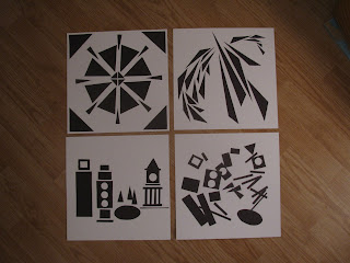
Our homework assignment was to do roughly the same thing --make that FOUR things -- within specifications. First, we were to prepare black paper cut-outs of a single shape (square, circle, triangle, etc.) and create a STATIC composition. You know: regular, balanced, predictable, somewhat boring. Cautioned that diagonals inherently work against "boring," I nonetheless wanted to see what I could accomplish with triangles.
Then, we were to use more cut-outs of this shape for a DYNAMIC composition full of energy and movement.
Part 2: Variations on a theme:-- Using cut-outs of several shapes, create a STATIC composition:
Then, for the fourth piece, use similar cut-outs to create a DYNAMIC composition. Here, I decided to set myself a little puzzle and cut a duplicate set of the assorted shapes -- so each composition used the same shapes to different ends. I couldn't help but think of this twosome as "before and after the earthquake."
It's a funny thing. If you're into this kind of stuff, playing around to get the "perfect" composition can be addictive. There was something not quite right, so I added an extra piece:
And still... it wasn't quite right. So I added a second additional piece.
And then I called a firm halt -- this could have gone on for hours. Back in class, we all displayed our work and received feedback. The verdict? Not that we actually received grades, but you could consider mine to be a bunch of F's.
F = Fail, for the upper left (single shape, static). Waaaaaay too dynamic!
F = "Fantastic," (direct quote from my teacher) for the upper right
F = Flawed, lower left -- too much negative space surrounding the blocks; needs a little more F-for-Fiddling.
F = Frivolous but promising, for the lower right
Nonetheless, I had lots of F-for-Fun. Give me a piece of paper, a marker or pair of scissors, and I'm happy.
Sunday, January 15, 2017
Things that never have been...
"Come let us welcome the new year, full of things that never have been." Now midway through January, the new year as welcomed by Rilke, has begun to reveal some of its promise. These hellebores that bloomed so early in November and caught the first frosts in December are now solidly hibernating beneath three feet of snow dumped from the neighbours' tarp -- but they'll be back, ten months from now?
And "Hunker Down," the third in my Flash Mob series that was started just as I began my fall art class, finally came to completion just as 2017 rolled in. It started with my usual quick sketch and colour plan.
Once again, I worked over an old painting whose time had come. As I began to place the outlines, this took on an odd abstract quality.
Before very long, I felt I'd misplaced and/or mis-sized the sprawling figure in the upper left corner. But that's the wonder of acrylic paint -- you can usually paint over your mistakes --
.
and try again.
Once I finished my fall semester art class and art homework, I moved along pretty quickly in my morning studio hours, and finished it up. Well, not quite. One of the things I like about my flash mobs are the negative spaces of the background colour showing between curved or outstretched limbs -- and this just didn't have enough colour slices showing through.
Aha! Adding a simple sleeveless top to the guy in the lower right gave me another spot of colour vs. flesh -- and that's it. Here's the finale:--
For the whole work in progress, see here. And to view the two preceding flash mobs, check here and here.
In the back of my mind, I have plans for more in this series, drawn from sketches in my old Aquatic Sketchbooks. I'm thinking ten would be a good number for the series, and then I'll have mouse pads made from all the images. Ha, ha. That's a joke. The mouse pad part.
Subscribe to:
Comments (Atom)


